Maison Margiela transforms a Paris concert hall into a playground of white tailoring and beautiful disorder.
For SpringSummer 2026, Maison Margiela stages a concert that refuses to behave.
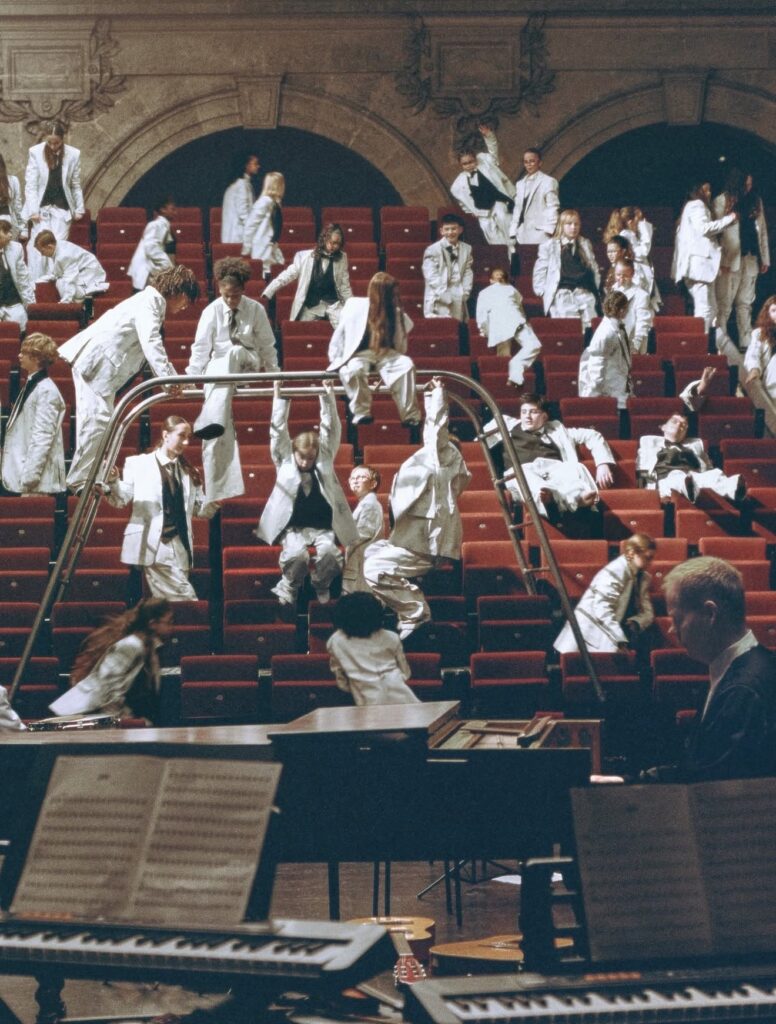
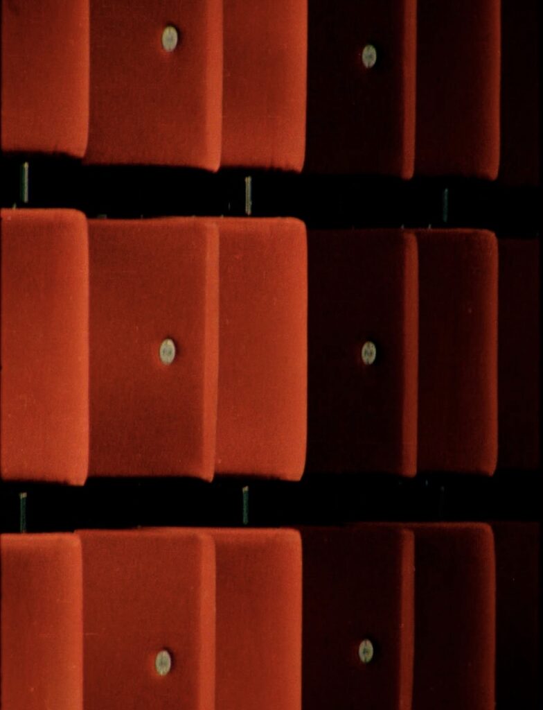
Inside a Paris concert hall, rows of velvet theater seats frame a classical orchestra setup. Sheet music sits perfectly arranged. Instruments wait for precision.
Then the room erupts.
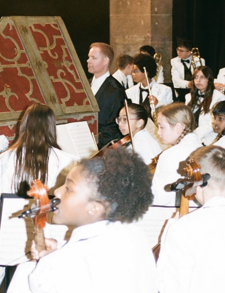
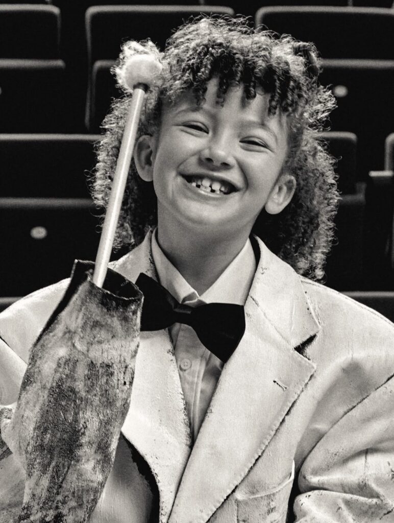
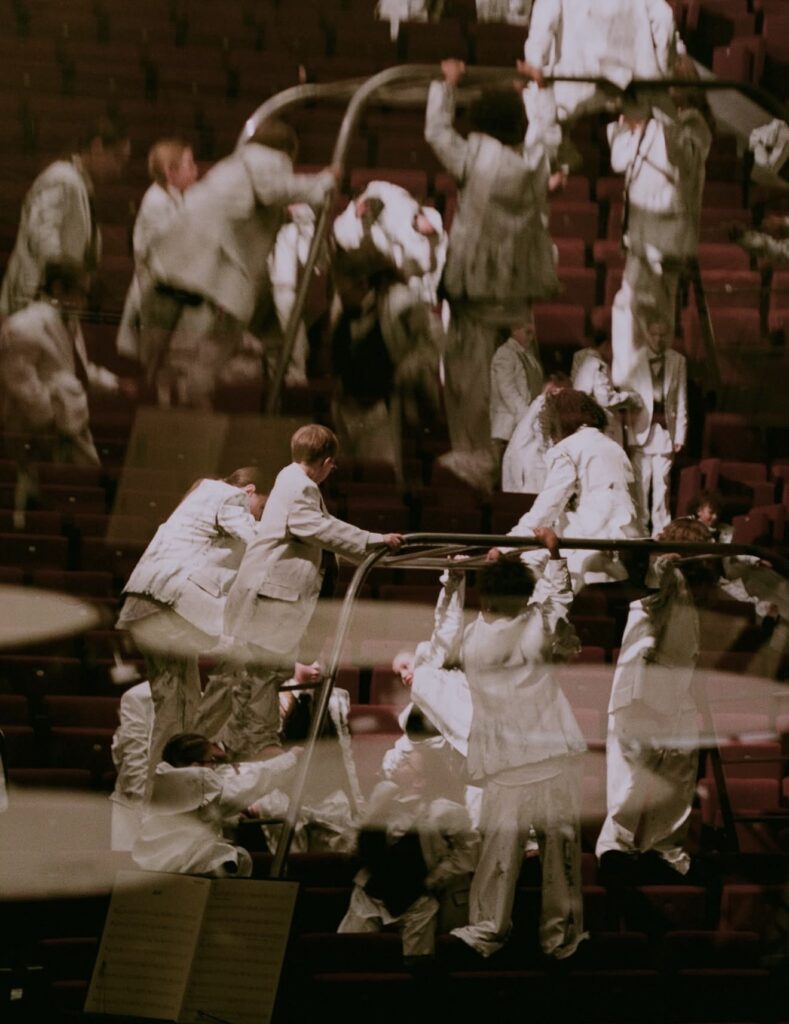
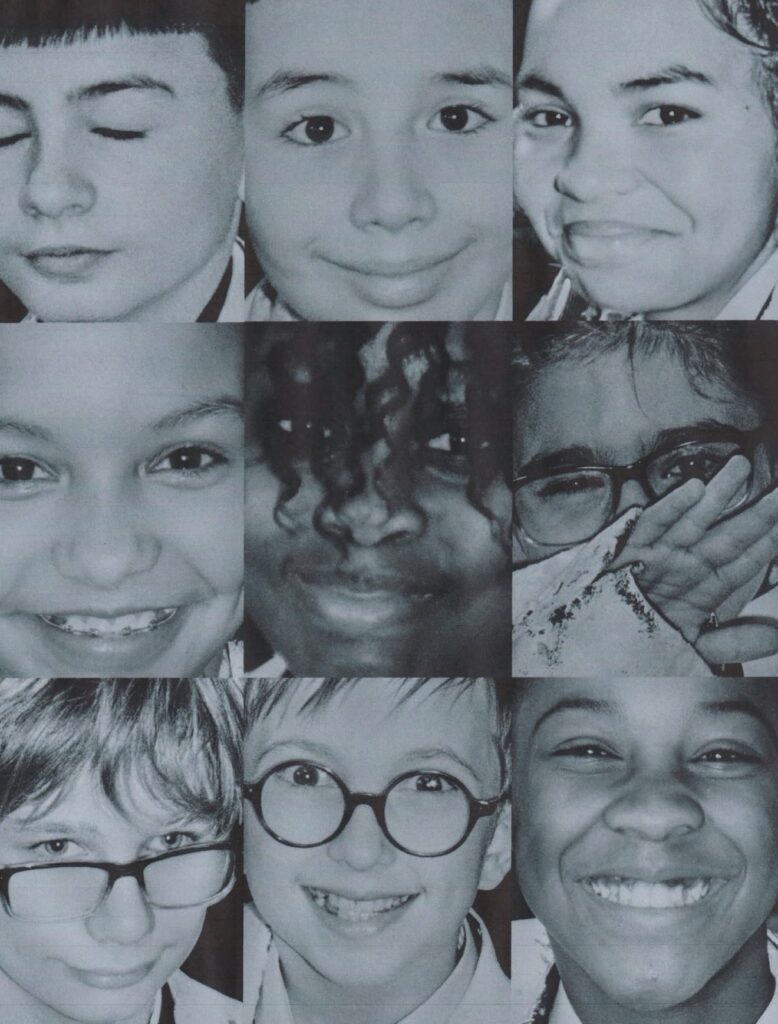
Dozens of children dressed in white tailoring scatter across the auditorium climbing rails, sliding down aisles, swinging between rows of seats. What should be a disciplined orchestra rehearsal becomes something closer to controlled chaos.
The campaign, titled Joy, moves like a short film rather than a fashion advertisement.
At the center sits composer Max Richter, performing a score while the young ensemble surrounding him dissolves the formality of the space. The musicians shift between structure and spontaneity, mirroring the tension Margiela has always explored between construction and deconstruction.
The uniforms tell the other half of the story.
White tailoring dominates the frame jackets, trousers, waistcoats treated with Margiela’s signature Bianchettofinish, a technique where garments are painted white so the original layers reveal themselves through wear and movement. The effect feels unfinished, almost ghostlike, as if the clothing itself is mid transformation.
Accessories quietly introduce new pieces from the house as well, including the return of Margiela’s architectural heel less footwear and a structured leather bag built through thermo molded construction.
But the campaign isn’t about product.
It’s about disruption.
A concert hall represents order. Rules. Tradition.
Children represent instinct. Movement. Noise.
When the two collide, the result is something Margiela understands well beauty inside disorder.
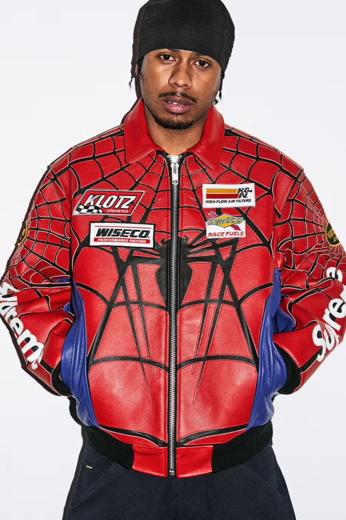
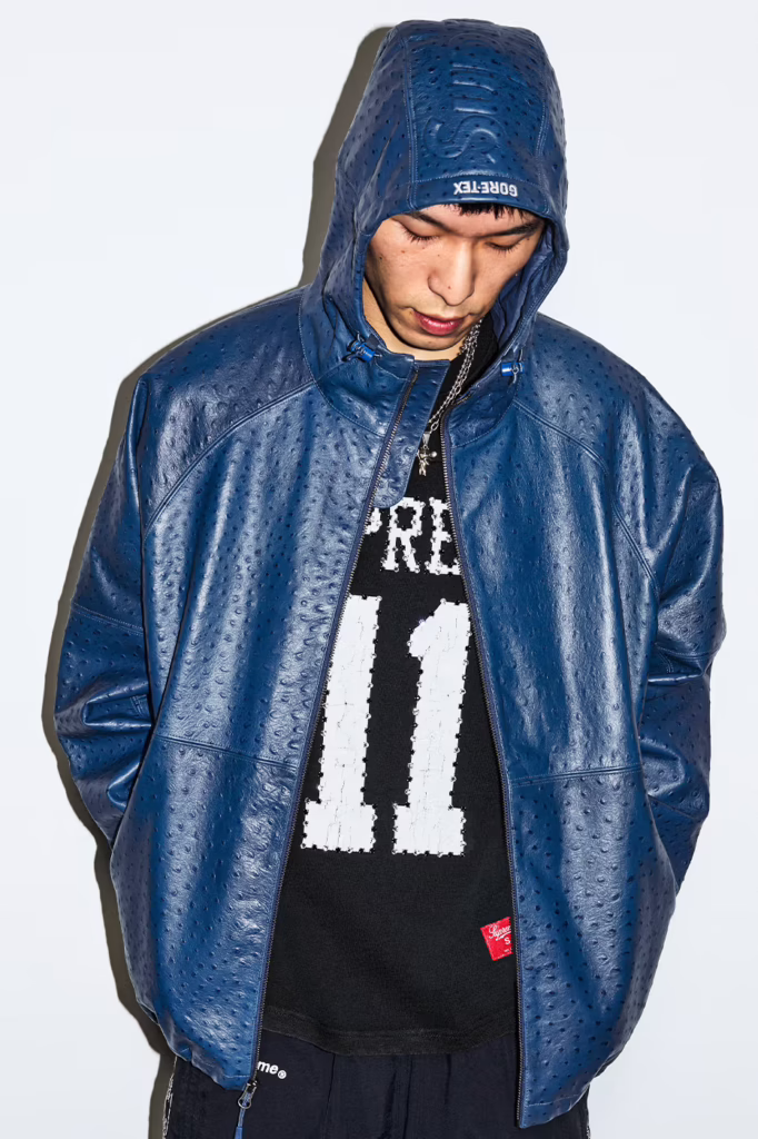
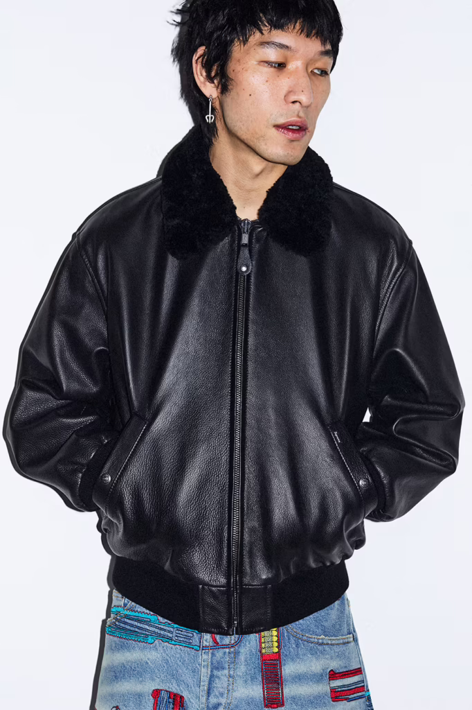
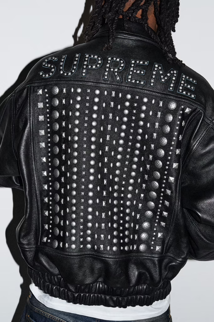
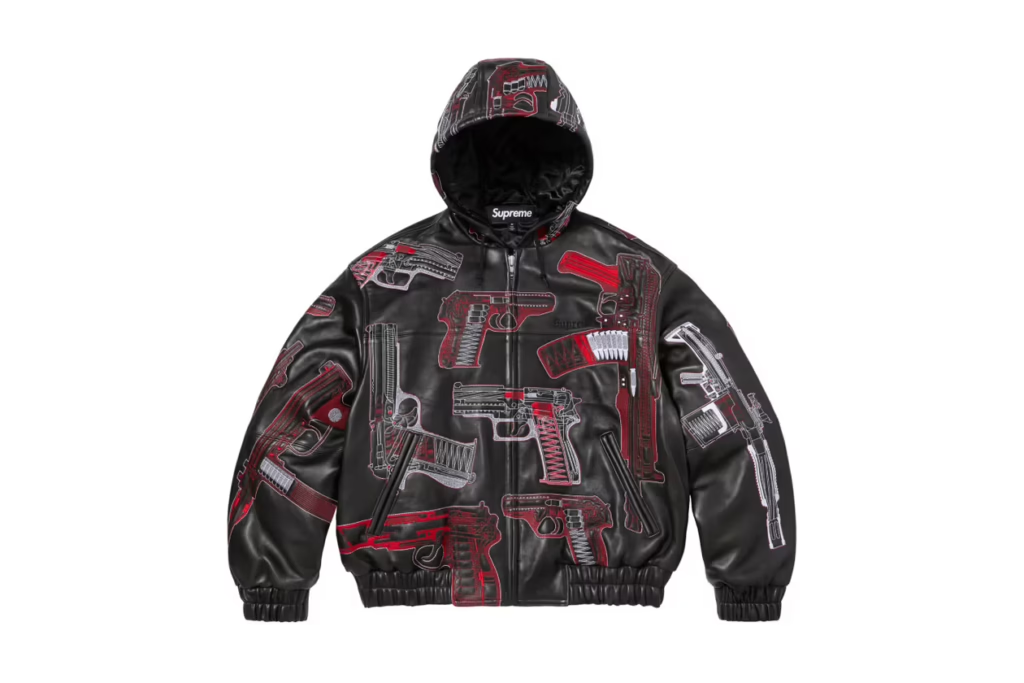
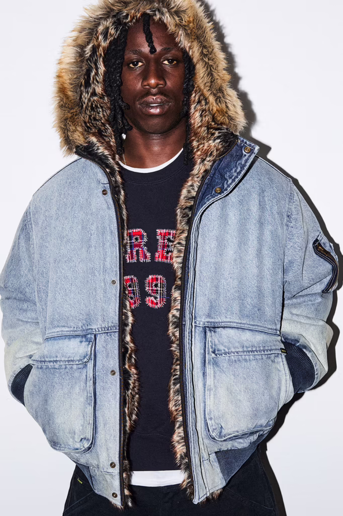
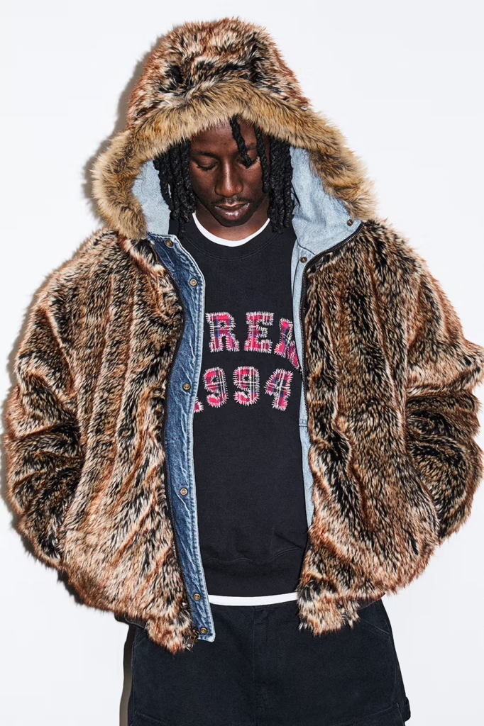
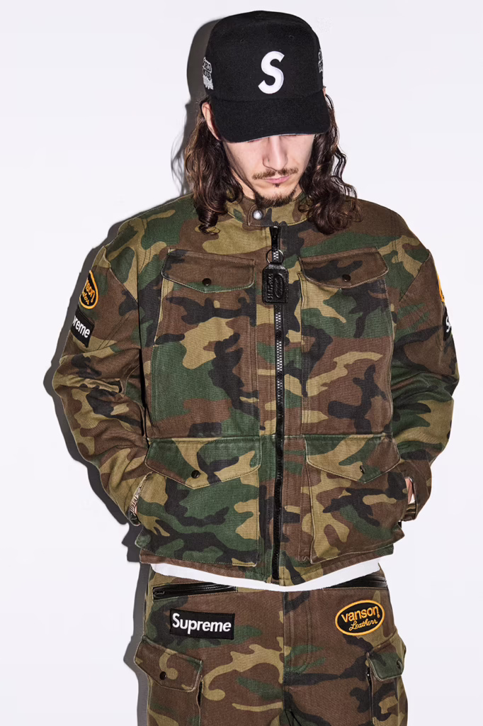
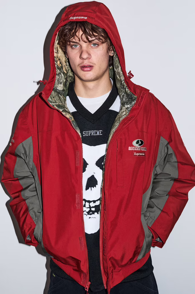
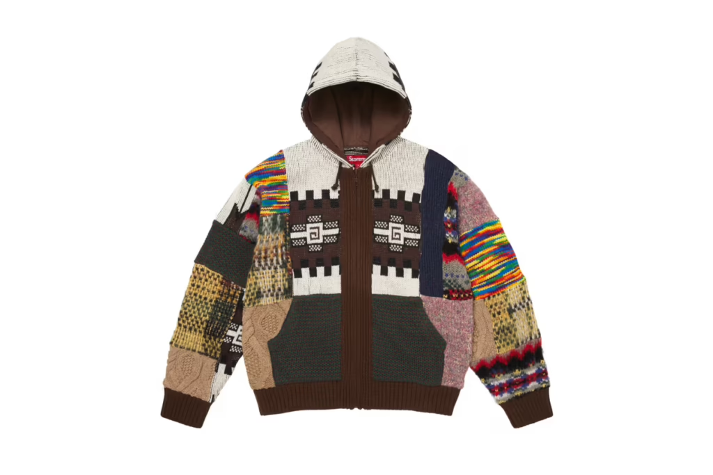
Spring/Summer 2026 is Supreme in its most maximal form less collection, more cultural detonation. It reads like a downtown manifesto stitched in ostrich leather, printed in gunmetal ink, and blasted across a boxing ring in the middle of nowhere.
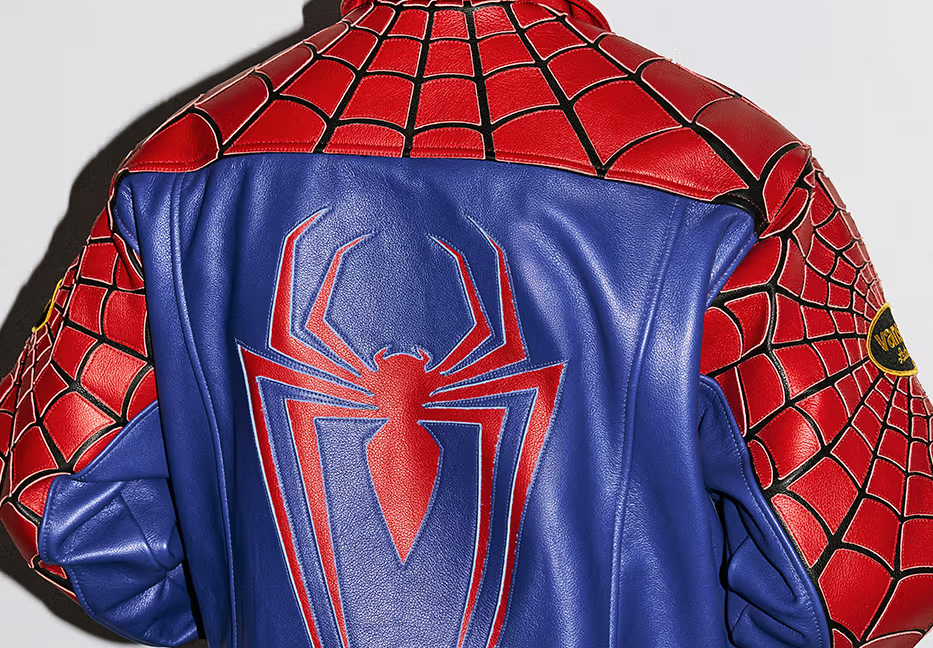
The headline collaboration Spider Man colliding with Vanson feels inevitable. Comic book mythology wrapped in American road armor. Web graphics drip across heavyweight knits and leather outerwear like urban folklore rewritten for the pit lane. Alongside it, heritage American grit surfaces through partnerships with Schott NYC and The Great China Wall, reinforcing that Supreme still understands lineage before it disrupts it.
But what makes SS26 resonate isn’t just collaboration it’s texture and confrontation.
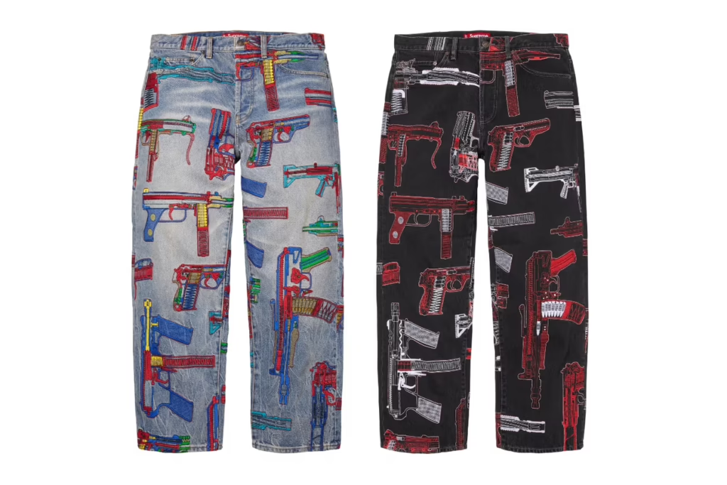
Sea Island cotton meets camo cable knits. Mohair stripes arrive loud, unapologetic, almost theatrical. Patchwork hoodies feel intentionally chaotic. Across leather, denim, and bags, the raw gun sketches of Alfredo Martinez slash through the season like a recurring motif defiant, political, unfiltered. Art Dealer injects his own graphic tension, pushing the collection deeper into art world territory rather than simple streetwear repetition.
Pop culture doesn’t cameo it dominates. Ghostface returns in graphic form. MISFITS iconography bleeds into the lineup. The Arabic Box Logo re-emerges, resurrecting the hysteria of seasons past with calculated precision. A Spider Man graphic swinging across a Supreme billboard feels less like merch and more like New York myth making.
Athletic codes surge throughout basketball mesh, hockey silhouettes, racing jerseys all drenched in branding that refuses subtlety. Denim is stamped with oversized block letter logos down the leg. Leather trousers arrive ostrich-embossed, equal parts luxury and threat. Cargo pants lean tactical. Star spangled prints oscillate between patriotic theater and dystopian satire.
Even the softer moments feel ironic. Tapestry florals reminiscent of a grandmother’s couch land on sweats, recontextualized as high fashion street armor. Varsity typography clashes against Monster Jam adrenaline graphics. It’s nostalgia weaponized.
And then, as always, Supreme shifts from clothing into spectacle.
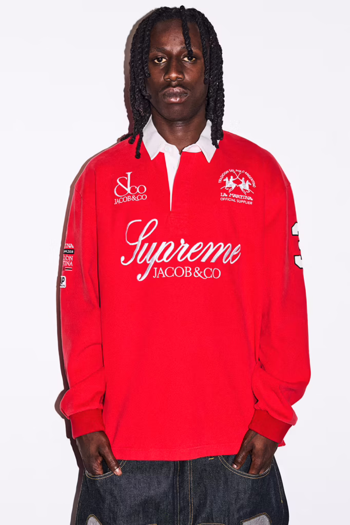
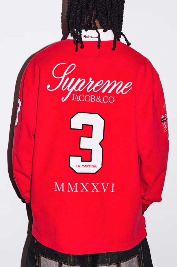
A fully branded boxing ring. A leopard lined coffin. A custom Fender bass. Gold bars and iced out Ghostface pendants courtesy of Jacob & Co.. Retro camcorders. Podcast microphones. A Fort Knox toolbox. Objects that blur the line between retail, performance art, and provocation.
This was never built for utility.
It was built to dominate.
The skate decks aren’t accessories they’re statements. Arabic insignias scorched into maple. Martinez’s gun sketches bleeding from leather to lacquer like raw evidence sealed in gloss. Meant to slam against pavement or hang inside a white cube gallery. Either way, they leave a mark.
Supreme SS26 doesn’t ride trends it runs straight through them. Biker steel collides with comic book mythology. Punk iconography refuses to fade. Downtown art grit gets amplified to stadium scale. It’s aggressive, deliberate, and unapologetically excessive
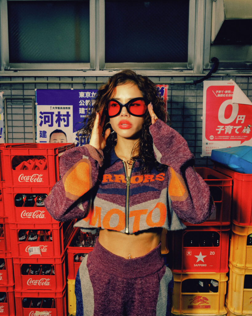
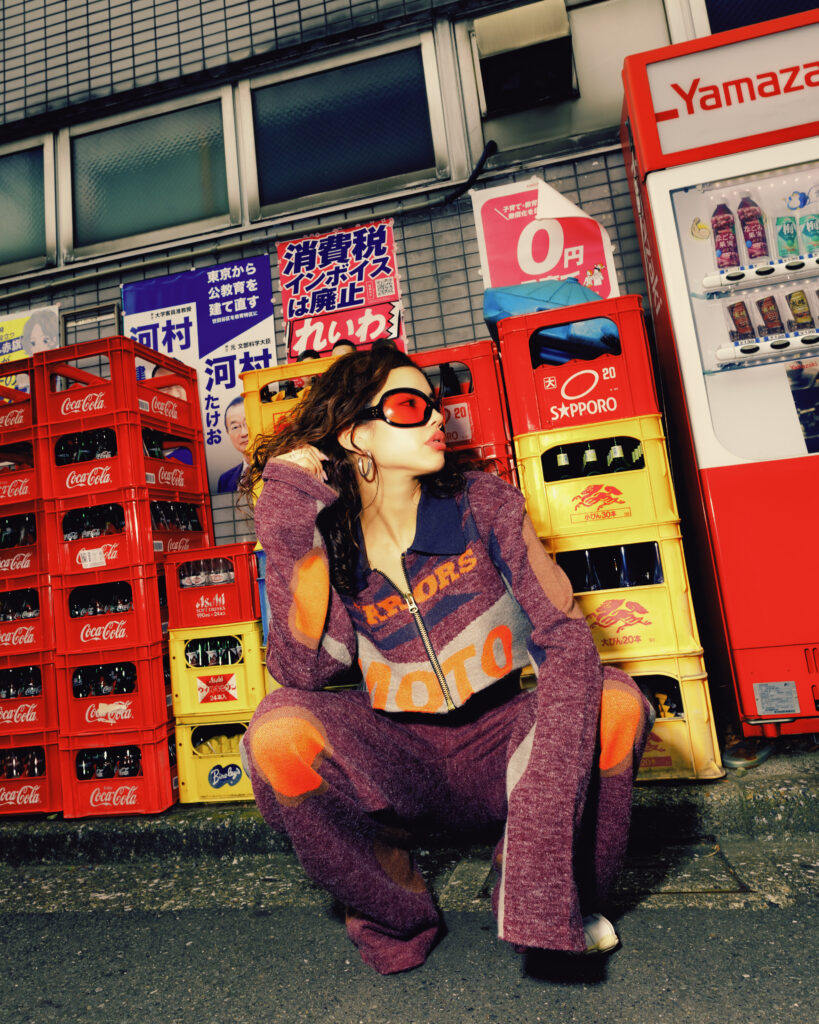
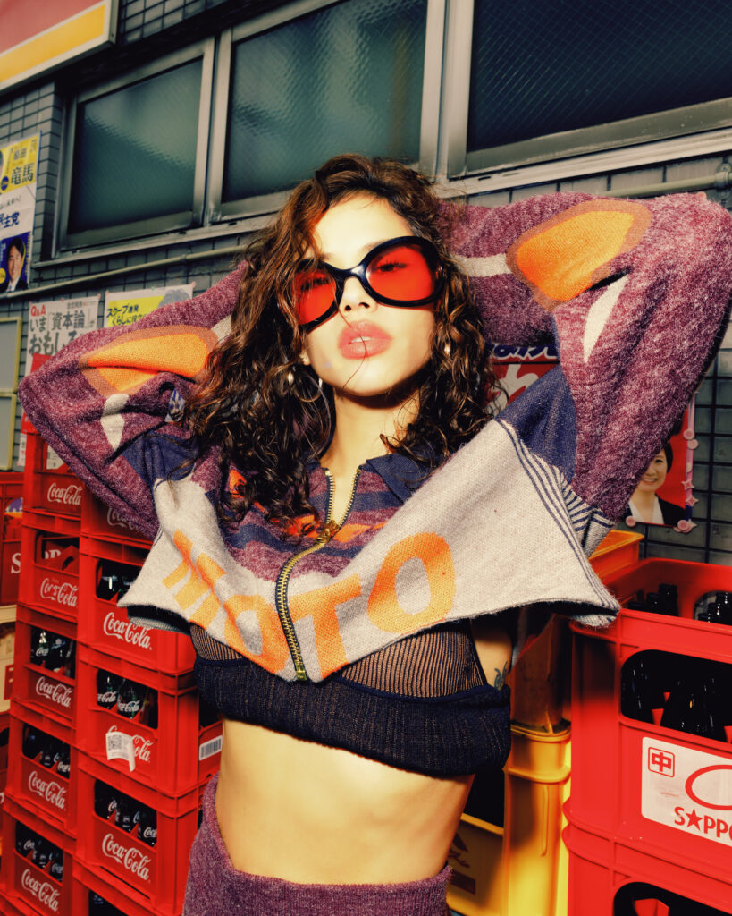
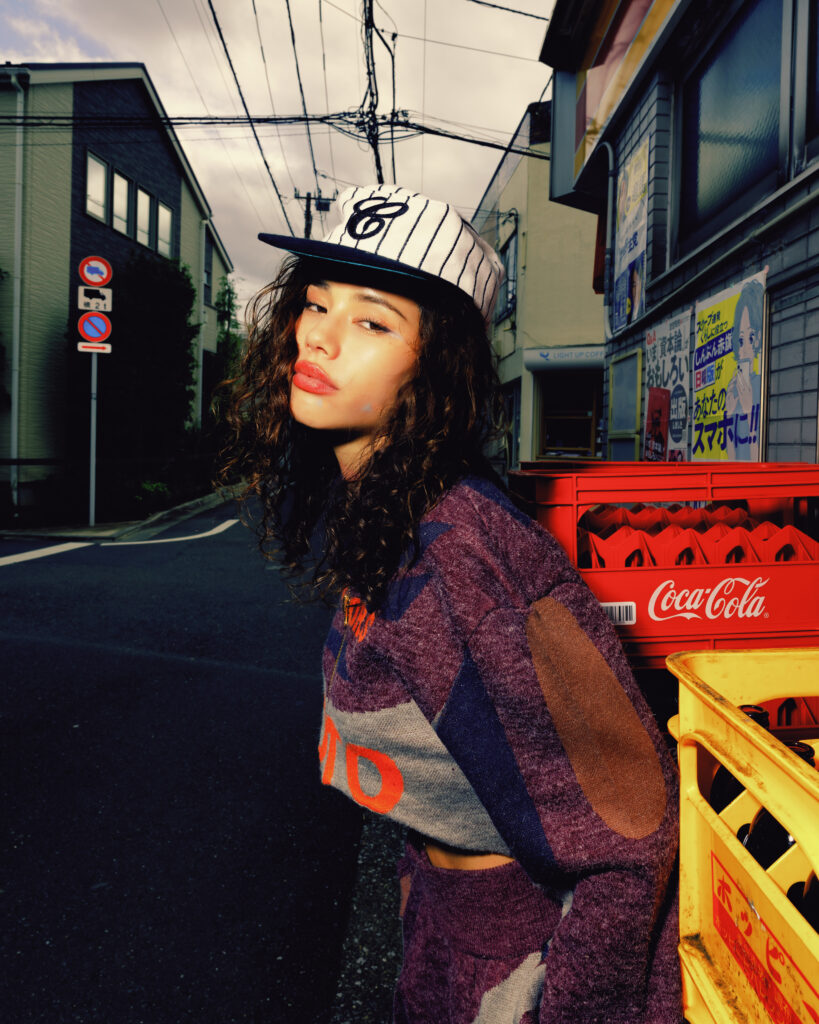
Tokyo doesn’t wait. The clothes have to move first.
Monica Sahara cuts through the city in silhouettes that feel engineered for speed AMISS pressed close to the body, sheer ribbed layers tracing the figure like a second outline. Then House of Errors pushes outward: cropped structure, expanded sleeves, fashion that occupies air as much as space. One look reads intimate. The other reads architectural. Together they create friction, and friction is where style lives.
Hard flash turns steel shutters and highway pillars into a live set. Nothing romantic. Nothing softened. Fabric against concrete, skin against light, silhouette against traffic. The city becomes a testing ground for proportion and posture. Every frame is a collision between polish and pressure.
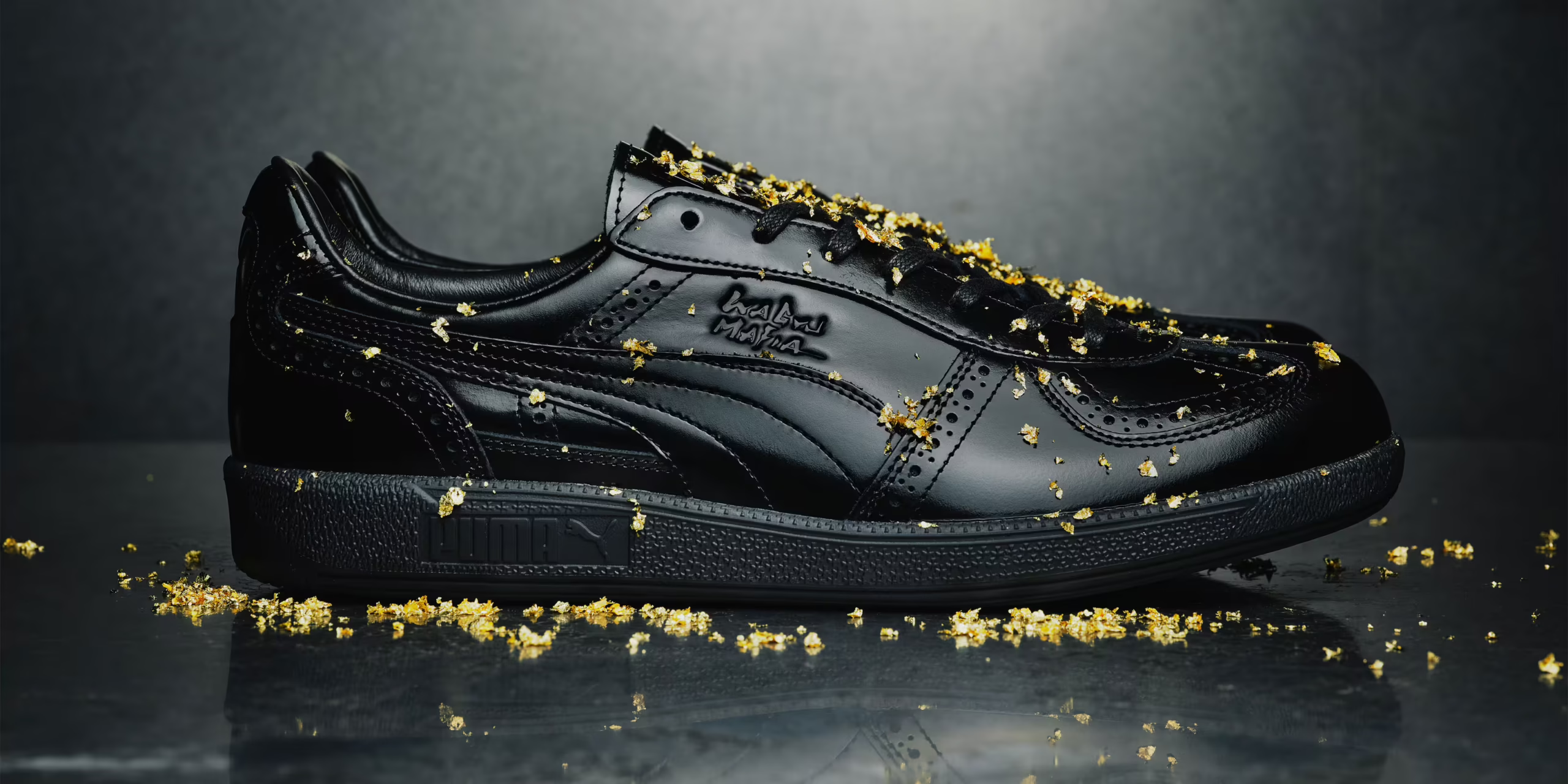
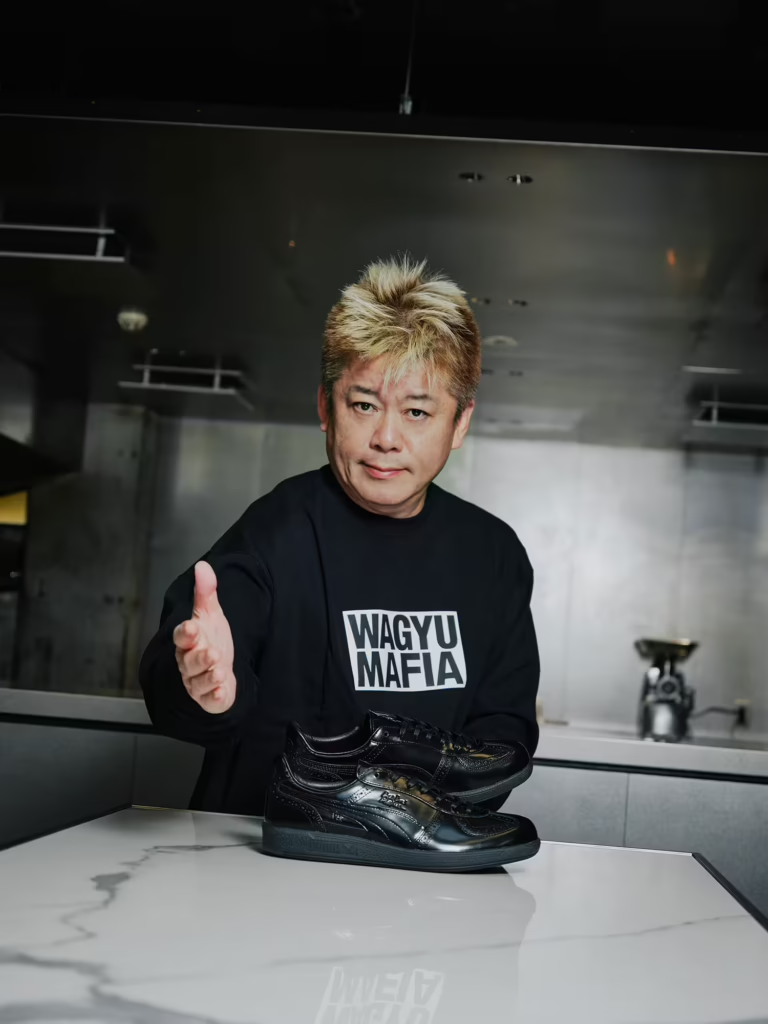
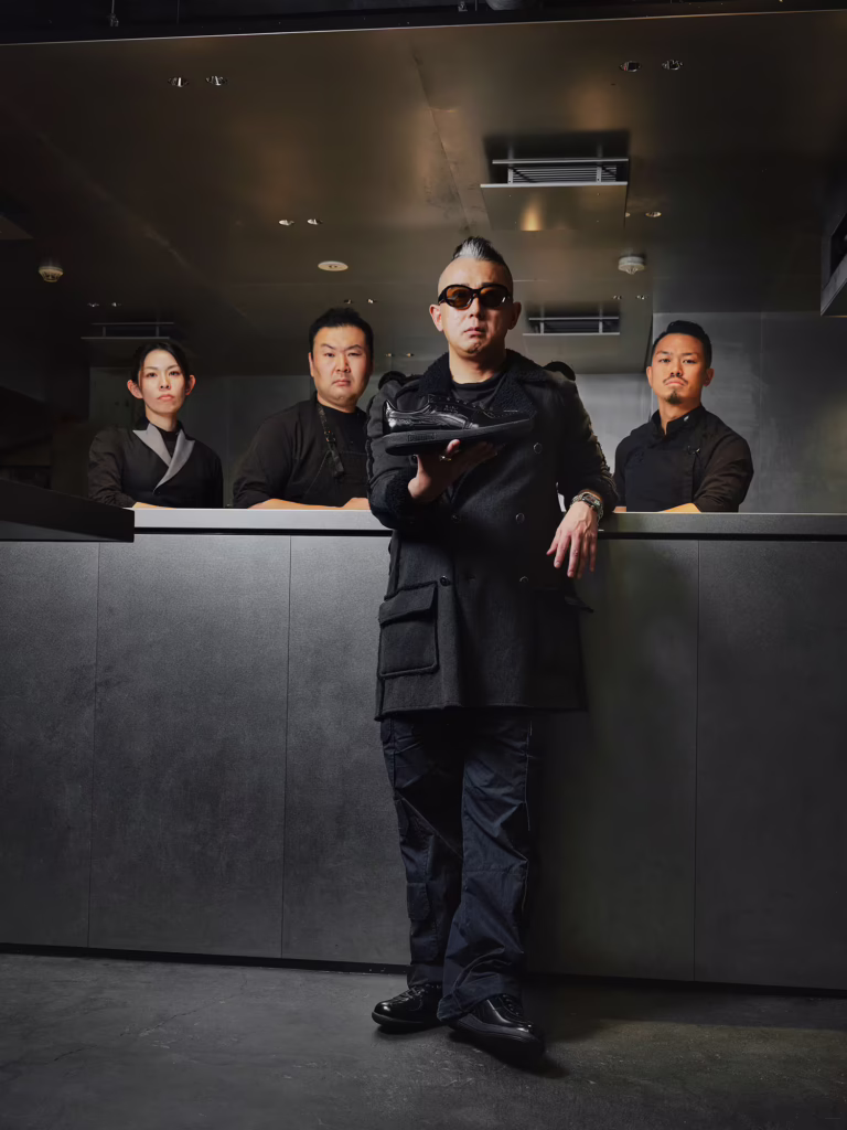
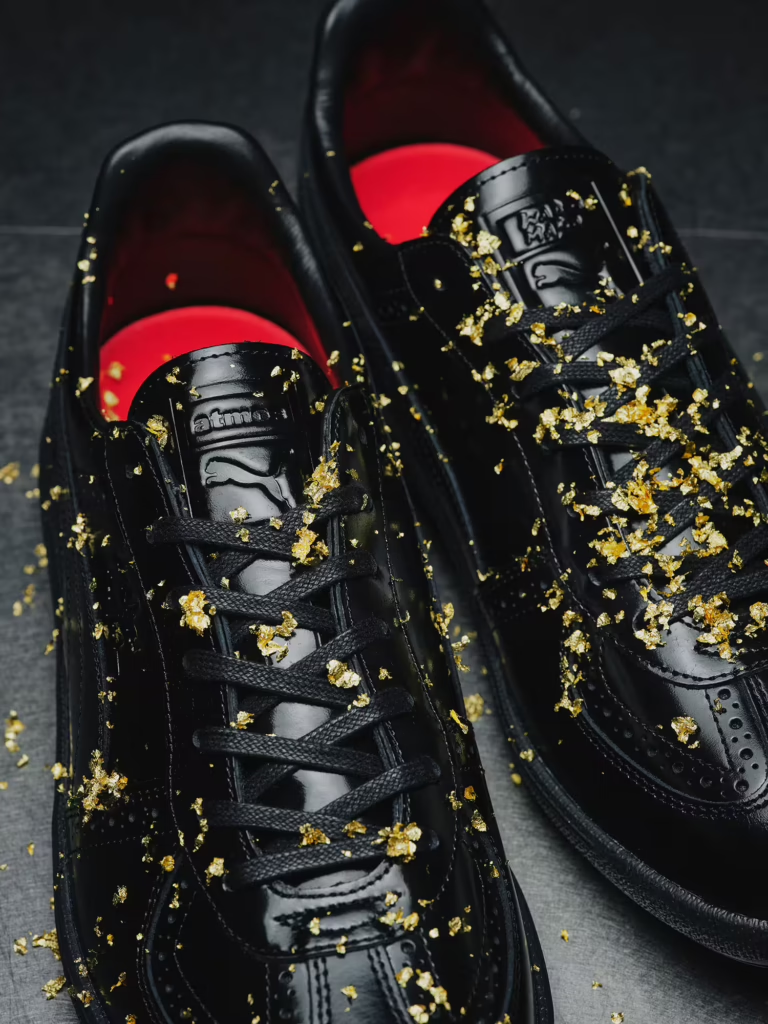
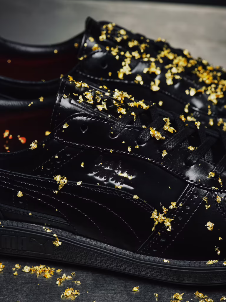
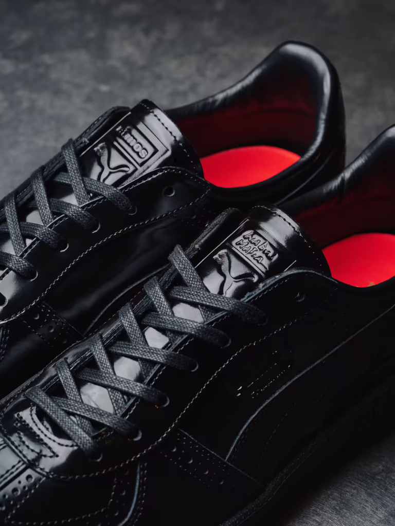
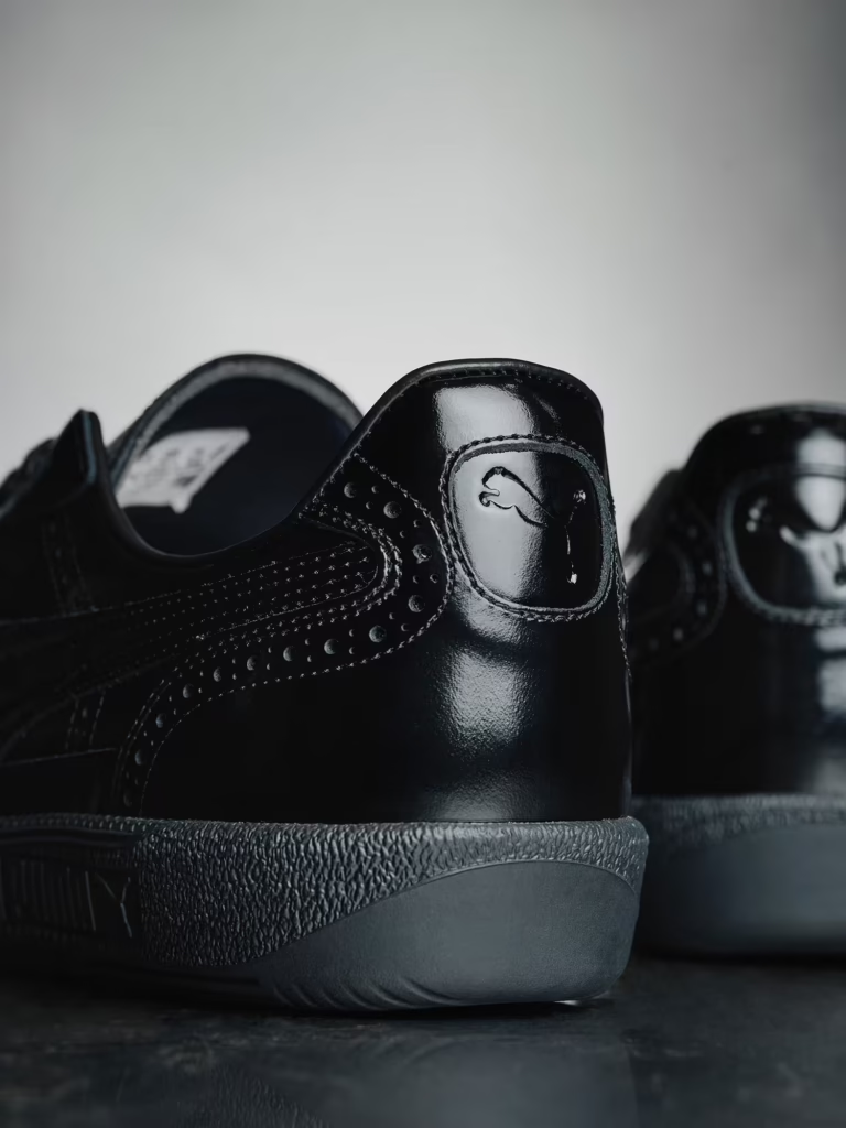
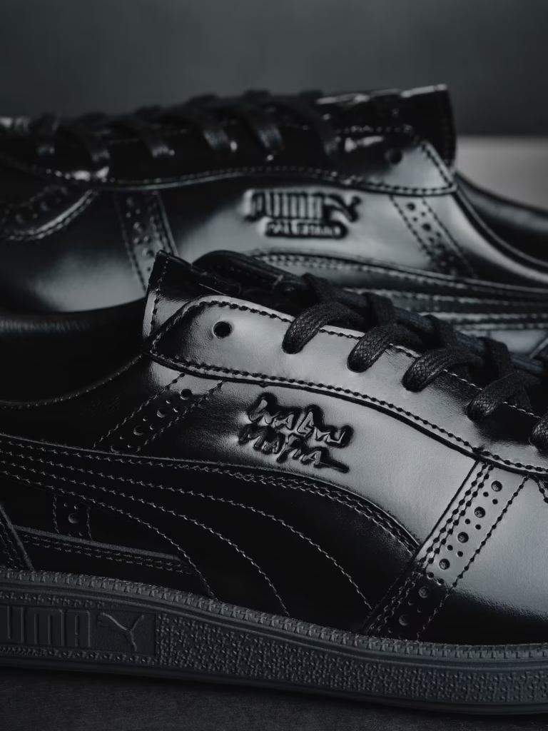
A few days after its release, the atmos × PUMA × WAGYUMAFIA sneaker already feels less like a product and more like a timestamp. Not just a drop, but a marker of where Japanese culture is moving fluid, hybrid, refusing categories.
WAGYUMAFIA has never framed itself as only food. From the beginning, it functioned as a cultural export project disguised as dining. Wagyu became the language, but the message was always broader: Japanese craftsmanship deserves global presence in every form it touches. The sneaker simply extends that philosophy into another medium.
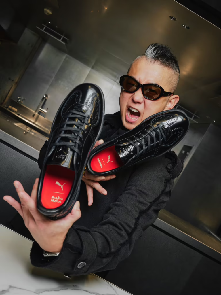
What makes the pair resonate now that it’s out in the world is the tension it carries. Formal leather discipline wrapped around the relaxed body of a sneaker. It walks like streetwear but stands with the posture of something ceremonial. That duality mirrors WAGYUMAFIA’s culinary identity high end product translated into everyday ritual. Luxury without distance. Craft without stiffness.
Seeing the shoe circulate in real time confirms something bigger. The future of culture isn’t split between elite and casual anymore. The most interesting work lives in the crossing point. Japan has long mastered that balance: elevating the ordinary without stripping it of warmth, refining objects without removing their soul.
The release didn’t just celebrate a sneaker. It celebrated a mindset that craftsmanship can move, breathe, and exist in daily life. A reminder that the strongest cultural statements aren’t always loud. Sometimes they’re worn quietly, step by step, across city streets.
Some collaborations don’t live in seasons. They live in culture.
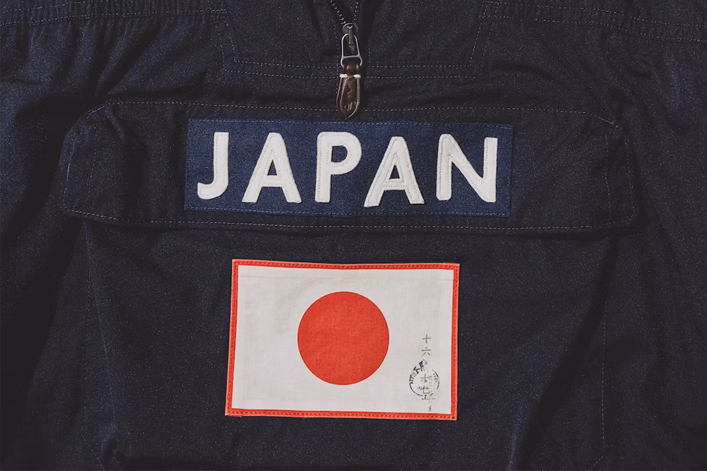
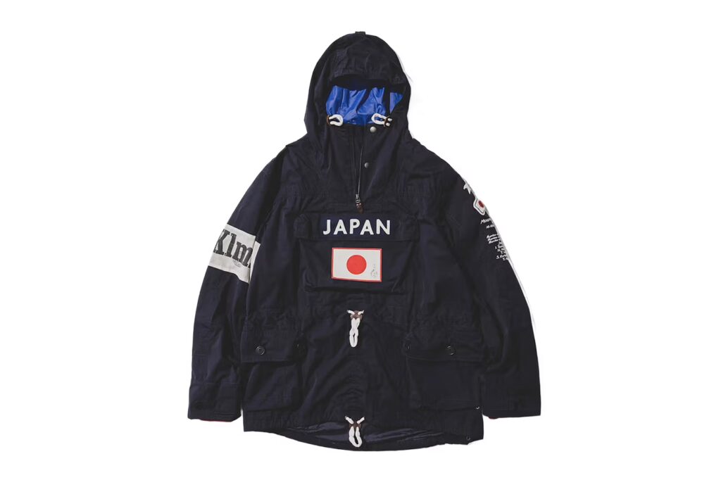
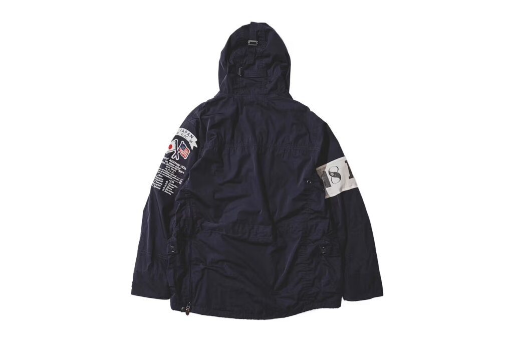
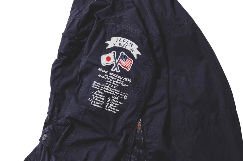
The return of the BEAMS x Polo Ralph Lauren JAPANORAK isn’t about revival it’s about recognition. Recognition of a design that quietly shaped how Tokyo learned to speak luxury through utility, and how American heritage learned to move with street rhythm.
This piece was never loud. It was precise. It existed for those who understood that real influence doesn’t beg for attention it earns it over time. That’s why it became legend in resale circles, whispered between collectors, worn like a secret handshake.
Now it comes back sharper, darker, and more intentional.
The matte black exterior feels architectural, almost monolithic. It carries weight without being heavy, authority without arrogance. Leather accents introduce warmth against the technical structure, a contrast that feels distinctly Ralph Lauren while remaining unmistakably BEAMS. Inside, the electric royal blue lining cuts through the darkness like a flash of rebellion Tokyo’s signature hidden beneath American formality.
The “JAPAN” mark across the front pocket isn’t decorative. It’s declarative.
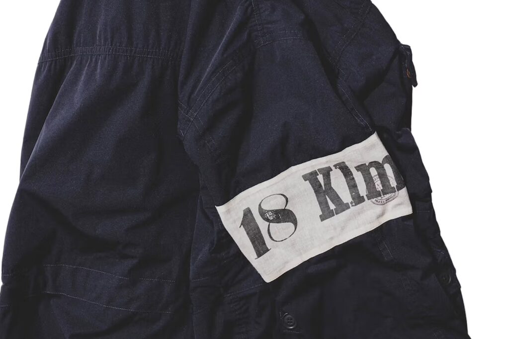
This isn’t a borrowed aesthetic. It’s a conversation between identities.
Street meets tradition. Precision meets poetry.
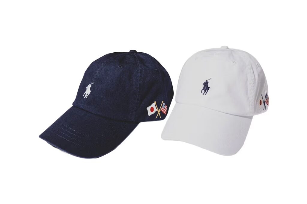
The accompanying cotton chino cap follows the same philosophy. Subtle, symbolic, and intentional. The embroidery doesn’t scream collaboration it whispers allegiance. Navy and white, two colors that feel eternal, designed to live quietly in rotation rather than trend loudly for a season.
This is what Pines Studio believes in:
Pieces that age with dignity.
Design that carries cultural gravity.
Fashion that doesn’t rush to be seen, but is remembered once it is.
The JAPANORAK doesn’t represent a comeback.
It represents permanence.
A reminder that the most powerful collaborations don’t need to be reintroduced.
They simply reappear, exactly when the culture is ready to listen again.
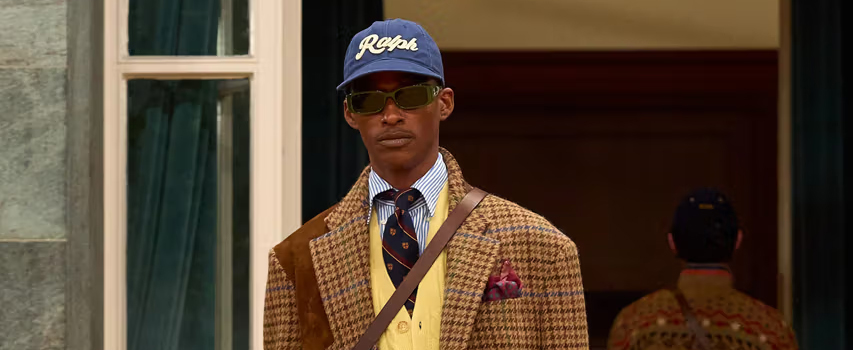
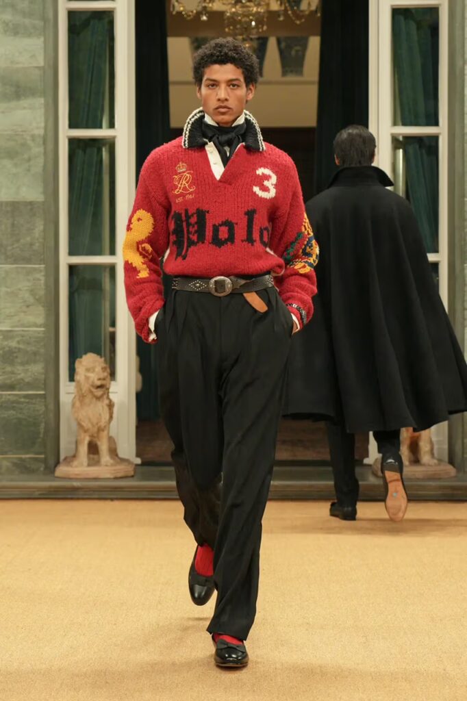
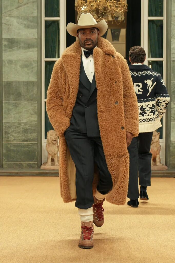
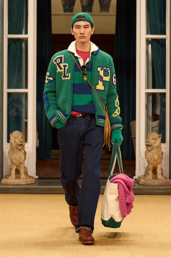
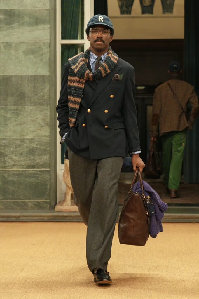
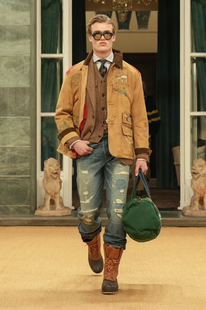
There are designers who follow trends, and then there are designers who define a way of living. Ralph Lauren has always belonged to the latter. For Fall 2026, he returned to Milan with a statement that felt less like a fashion show and more like a reaffirmation of identity. Hosted at Palazzo Ralph Lauren, the collection marked his first menswear presentation in over a decade, and it carried the weight of history with the clarity of someone who has never stopped evolving.
Fall 2026 unfolded as a dialogue between nostalgia and permanence. The silhouettes echoed the era when Polo and Purple Label were born, drawing deeply from the ’90s while grounding themselves in what Lauren calls “timeless tradition.” Ivy League tailoring, vintage Americana, and Indigenous craftsmanship coexisted effortlessly, forming a collection that celebrated multiplicity rather than uniformity.
Ralph Lauren once said he started with a tie, but that it was never really about a tie. It was about a way of living. That philosophy ran through every look. This wasn’t a runway built on spectacle; it was a narrative of character, culture, and personal history. From Purple Label’s refined elegance to Polo’s reimagined preppy spirit, each piece reflected the worlds he has lived in and the ideals he still believes in.
What made this collection powerful was its emotional range. Prep met dandy codes. Traditional sportswear crossed paths with vintage Americana. Indigenous artistry added soul and authenticity. Rather than isolating these influences, Lauren wove them together, presenting masculinity not as a fixed concept but as something layered, expressive, and deeply individual.
The show closed with Tyson Beckford, an icon synonymous with Ralph Lauren’s golden era. His walk wasn’t just a nostalgic callback; it was a reminder of the cultural impact Ralph Lauren has had across generations. It symbolized continuity, proving that the energy of the ’90s still lives, not as a memory, but as a foundation.
There is a quiet confidence in a designer who doesn’t need to chase relevance. Ralph Lauren doesn’t reinvent himself; he refines his truth. Fall 2026 stood as proof that authentic style is built over decades, not seasons. It grows through experience, conviction, and a deep understanding of how men live, move, and express who they are.
At Studio by Pines, we see this collection as a masterclass in restraint and power. It reminds us that fashion is strongest when it tells a story that feels lived in. Ralph Lauren didn’t just present clothing in Milan. He presented a legacy that continues to breathe, adapt, and inspire.
And then there are brands that are born inside it.
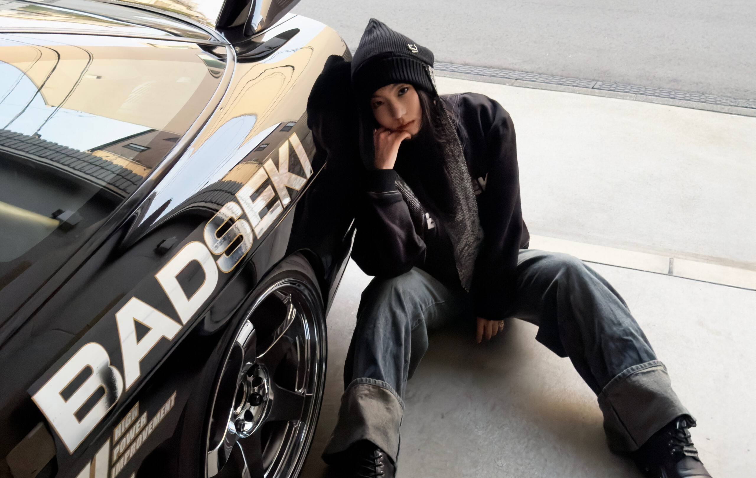
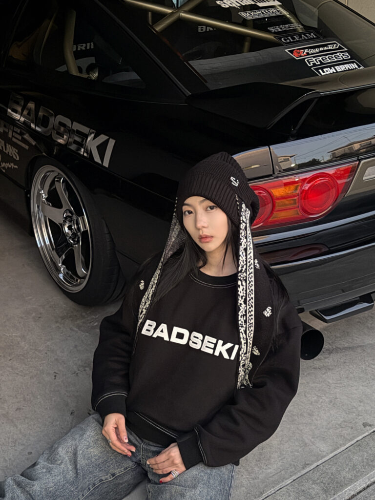
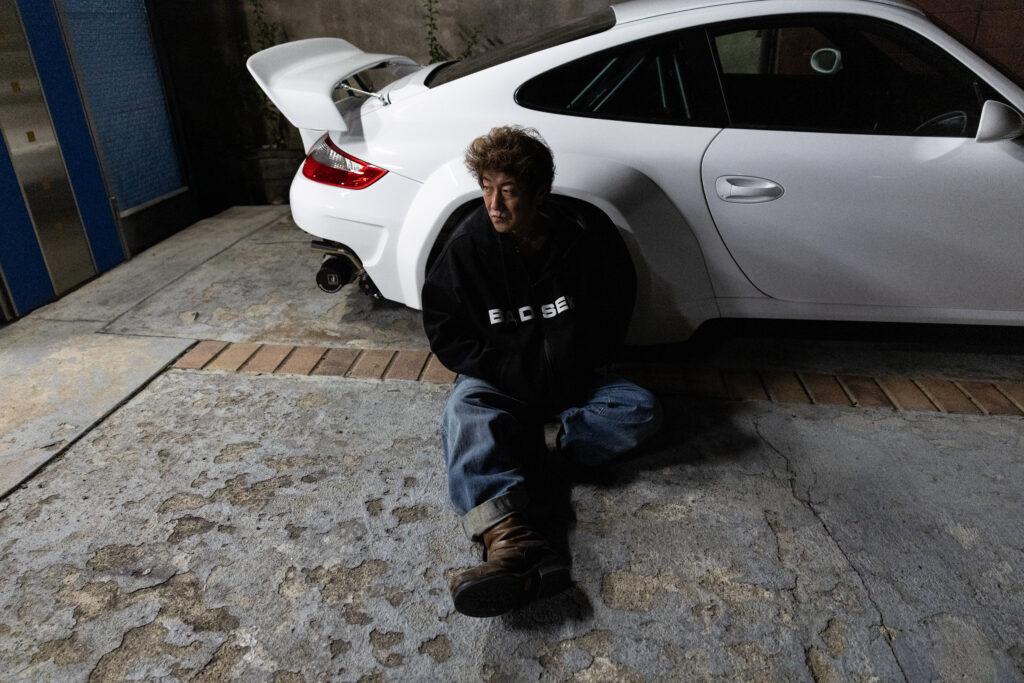
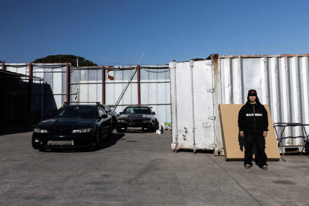
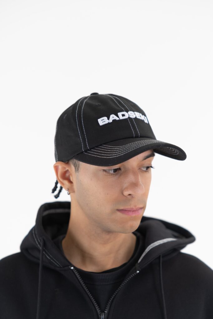
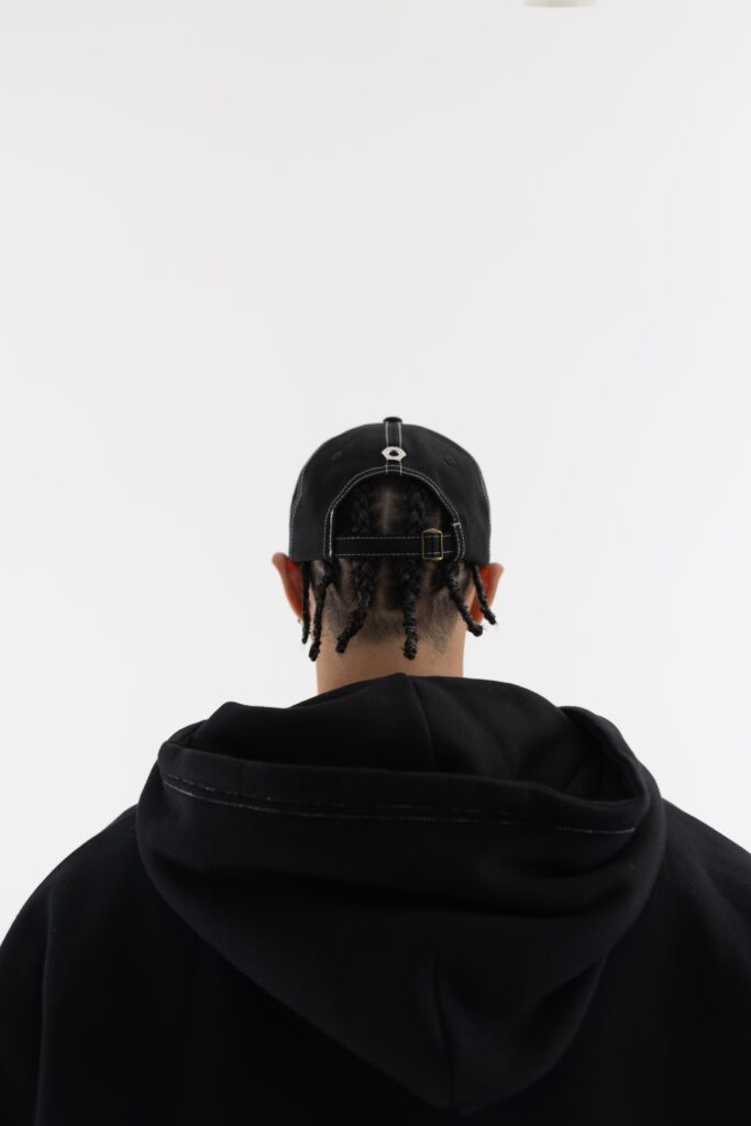
BADSEKI is the latter.
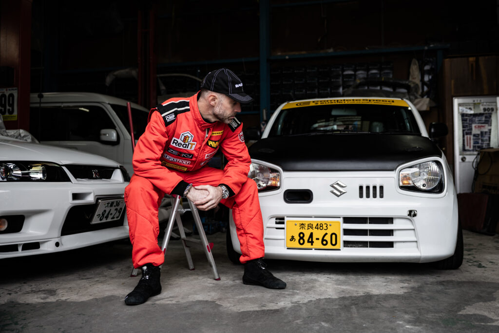
Founded by professional drift racer Sara Choi, BADSEKI isn’t a fashion interpretation of motorsports it’s a translation of lived experience. Of grease stained garages, midnight tuning sessions, tire smoke, repetition, discipline, and obsession. It is clothing shaped by motion and purpose, not trend cycles.
Unveiled in Tokyo during Auto Salon 2026, BADSEKI made its first physical appearance through an intimate pop-up in Shibuya. Surrounded by Porsche builds curated by Rocket Bunny Racing’s Kei Miura and Japan’s legendary SUNRISE BLVD, the space blurred the line between streetwear and speed. Cars weren’t backdrops. They were part of the story.
This wasn’t a launch designed for spectacle.
It was a statement of belonging.
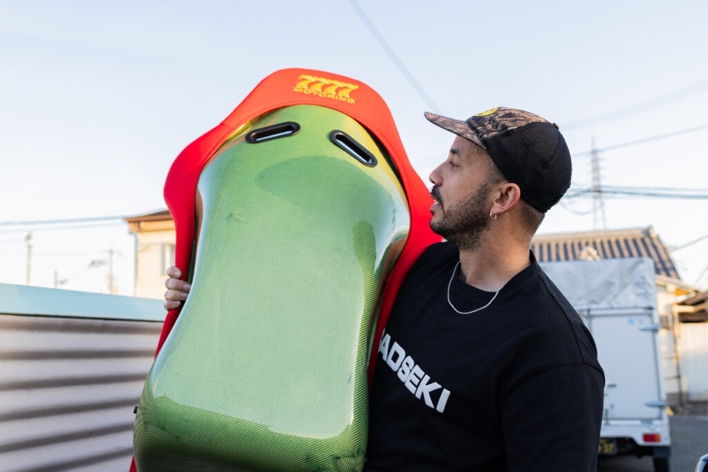
Fashion Shaped by Function
Sara Choi approaches design the same way she approaches drifting: with precision, intention, and respect for the craft. BADSEKI garments are born from movement and repetition the realities of motorsport environments where durability matters as much as expression.
Instead of pulling references from “car aesthetics,” BADSEKI pulls from the physical rhythm of the culture:
The way mechanics move
The tools they touch daily
The environments that wear into clothing over time
The brand’s pre-collection centers on elevated essentials crafted from high grain cotton, offered in deep black and burnished mahogany tones. At its core is the 10mm hex nut a universal symbol in any garage. Small, overlooked, but essential. BADSEKI transforms it into a recurring emblem that bridges utility and identity.
T-shirts, sweaters, pants, and caps feel understated but intentional. These are garments designed to live in real spaces: tracks, workshops, city streets, and late night drives.
Beyond the Garment: A Living Archive
What separates BADSEKI from typical streetwear is its commitment to people before product.
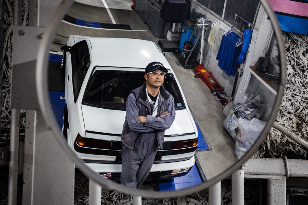
For its launch campaign and accompanying docuseries, the brand spent two years documenting figures who helped shape drift culture from the inside. Not influencers. Not surface level icons. But builders, racers, and visionaries who preserved the soul of the movement.
Featured collaborators include:
Kei Miura (Rocket Bunny Racing)
Naoki Nakamura (Five-time D1 champion)
Kota Takahashi
Ryota Hirakawa
Jean Christophe Pepino
Yusef Wallance
Yasu Shimomukai
Hyuma Kato
Satoshi Awaji
Hiro Sato
Shot across Tokyo, Kanagawa, Kyoto, Osaka, and beyond, the series functions as a cultural archive. It documents devotion. Precision. Lifelong passion. It shows motorsport not as fashion imagery, but as a way of life sustained by individuals who rarely receive mainstream recognition.
As Sara Choi puts it:
“BADSEKI is about people before product. History before hype. And culture understood beyond the surface.”
That philosophy lives in every frame.
Tokyo Auto Salon: A Cultural Intersection
The BADSEKI pop-up during Auto Salon wasn’t about merchandise alone. It was about context. Visitors walked through a space where streetwear met machinery. Where clothing shared oxygen with tuned Porsches. Where fashion and motorsports existed without hierarchy.
Exclusive pieces were available only at the event, reinforcing BADSEKI’s commitment to physical community moments not just digital drops.
What’s Next
The pre collection launches globally for pre-order on February 12, 2026, ranging from $50–$110 USD.
But the vision stretches further.
The full BADSEKI collection arrives in April 2026, promising a more experimental, high fashion approach. Expect bolder silhouettes, more technical design language, and deeper exploration into the space between performance and expression.
Future pop-ups, collaborations, and community driven events are already in motion.
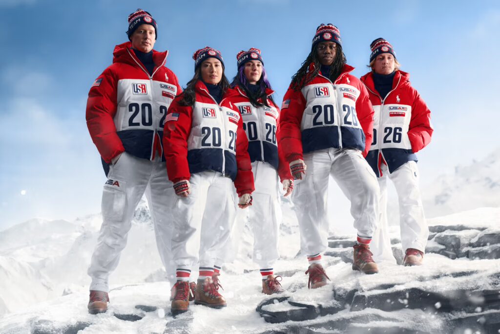
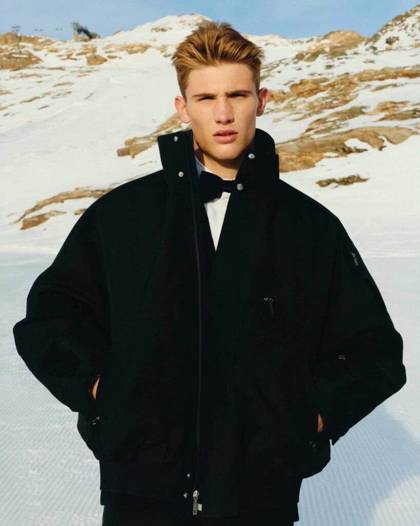
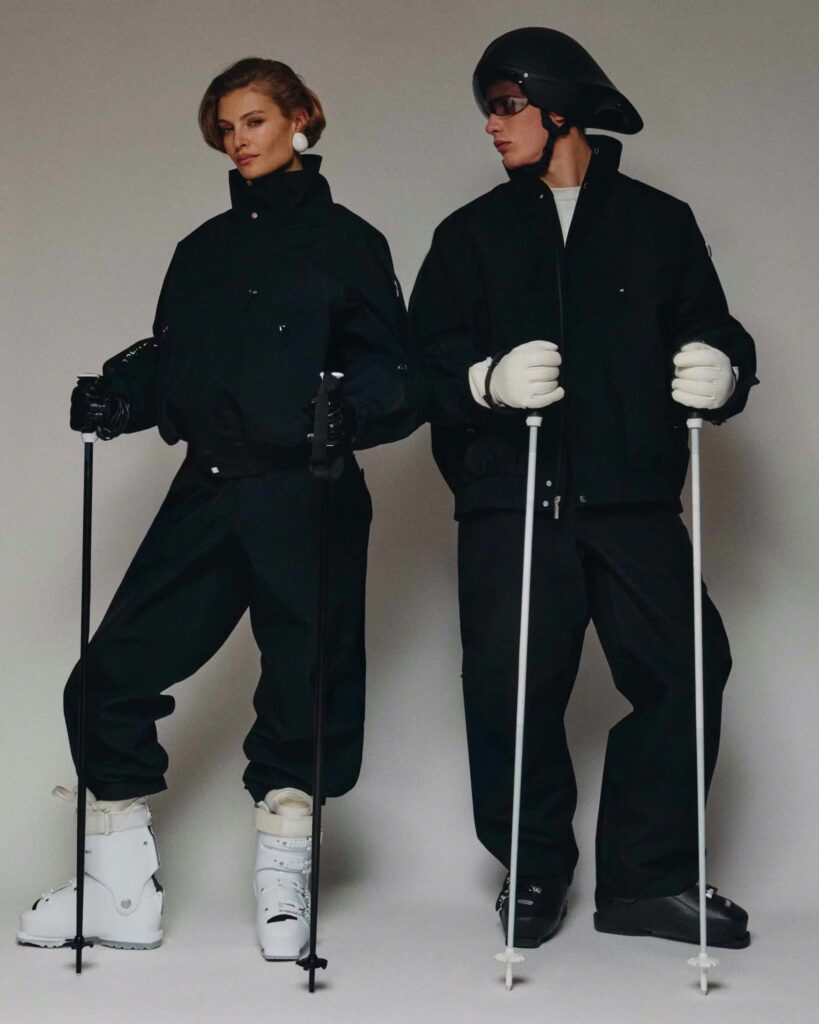
For nearly two decades, Ralph Lauren has been quietly shaping the visual language of American athletic ceremony. For the Milano Cortina Winter Olympics, that legacy continues with two sharply defined uniforms for Team USA each one speaking a different dialect of the same story. One rooted in heritage and craft, the other in motion and modern performance. Together, they form a conversation between past and future, tradition and velocity.
The Opening Ceremony look leans into Ralph Lauren’s Americana DNA. An ivory wool duffle coat anchors the silhouette, finished with wooden toggles that feel archival rather than nostalgic. Beneath it, an American flag intarsia turtleneck and tailored wool trousers sharpen the look into something ceremonial without becoming theatrical. It’s formal, but warm designed to stand still under stadium lights while carrying the weight of national symbolism with restraint.
For the Closing Ceremony, the tone shifts. The duffle gives way to a bold, color blocked puffer jacket that feels kinetic, almost aerodynamic. Team USA graphics take center stage, paired with a streamlined wool turtleneck and crisp white utility pants that nod to athletic function. It’s less about heritage and more about momentum what comes after the medals, the march forward, the quiet confidence of competition completed.
Accessories tie both looks together: intarsia knit hats and mittens in red, white, and blue, brown suede alpine boots, leather belts details that matter because they’re considered. Every piece is made in the USA, reinforcing the collection’s ethos not as costume, but as craft. As David Lauren notes, these uniforms aren’t just garments they’re stories, designed to reflect optimism, excellence, and the enduring American spirit against the backdrop of Milan, one of fashion’s grat capitals.
Beyond the ceremonies, the Ralph Lauren Team USA Collection extends that narrative to the public. Military inspired outerwear, leather flight jackets, olive bombers, and Olympic marked essentials bring the same palette and intention into everyday wear for men, women, and children alike. It’s not merch. It’s continuity. A reminder that style, when done right, can carry meaning long after the final torch is extinguished.
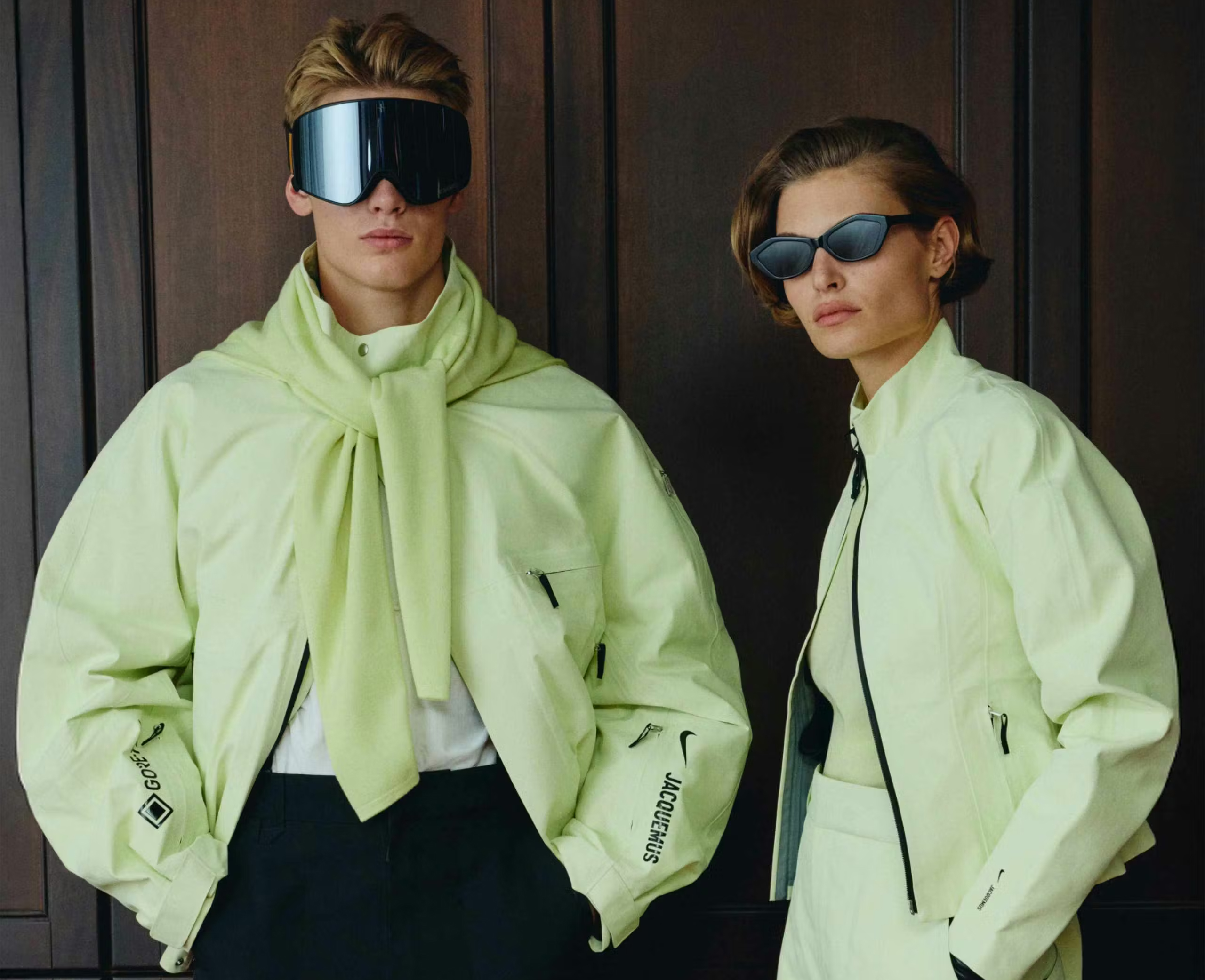
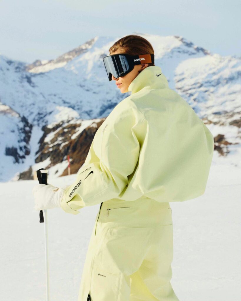
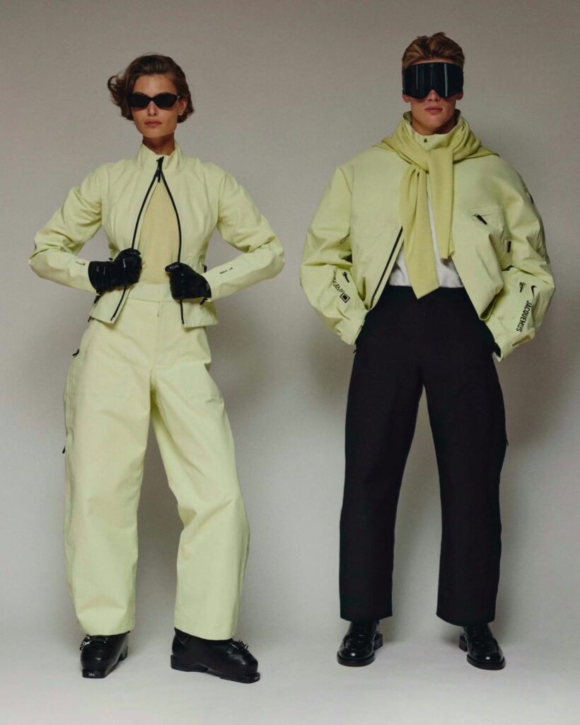
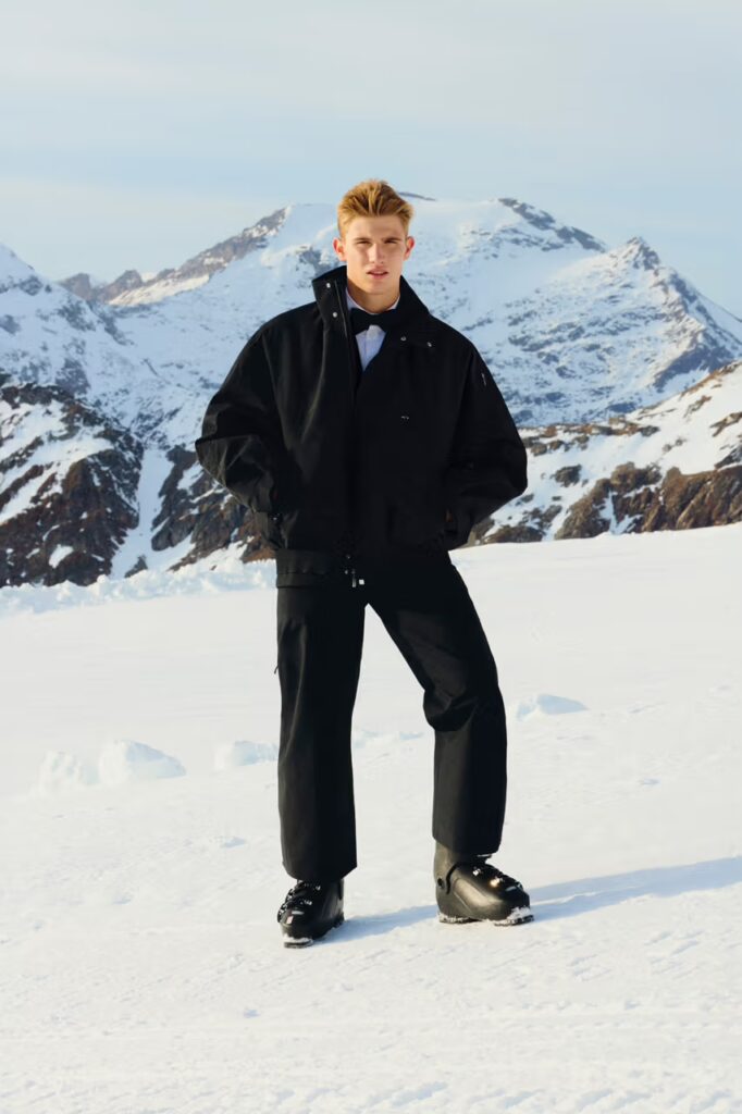
The new Nike x Jacquemus Après Ski collection arrives as a quiet yet powerful statement on what modern winter performance can look like when precision meets poetry. Built as an 18 piece capsule, the range moves effortlessly between alpine utility and sculptural minimalism. Technical outerwear constructed with advanced weather resistant fabrics is softened by Jacquemus’s refined eye for proportion, color, and silhouette proving that function no longer has to compete with form.
Designed to live both on the mountain and beyond it, the collection offers a tightly edited wardrobe of winter essentials: streamlined outer shells, tailored snow pants, and lightweight insulating layers that echo the nostalgic codes of vintage ski culture while feeling distinctly current. There’s a subtle nod to the glamour of 1980s alpine style, but reinterpreted through a modern, restrained lens each piece engineered for movement, protection, and visual clarity.
For Simon Porte Jacquemus, the collaboration represents more than just a seasonal drop it’s a personal dialogue with a sport and lifestyle that shaped his upbringing. His lifelong connection to skiing and his fascination with archival winter gear are woven into the DNA of the collection, translating personal memory into contemporary design. Partnering with Nike’s technical expertise allowed Jacquemus to push into new territory, merging high-performance craftsmanship with his signature minimal sophistication. The result is a collection that feels equally at home cutting through fresh powder or standing quietly at the edge of an alpine horizon a new chapter in the language of modern après ski.
There’s something disarmingly honest about Sweetest Me. It doesn’t announce itself as a concept album it simply breathes. Mahiru didn’t start with a grand message or storyline; she started with truth.
Each song became a timestamp a snapshot of her emotions, her friendships, her quiet introspections. The result feels like pages torn from a private diary, where love and solitude co-exist without explanation. It’s not confessional for attention it’s confessional because it’s real.
“I just wanted to make music that felt honest like whatever I was actually feeling in that moment.”
If Mahiru’s past work lived in the fog of dreamy melancholy, Sweetest Me is sunlight after rain still tender, but warmer. Working with close friends shifted her creative chemistry; the sessions felt more like late-night conversations than studio marathons. That intimacy radiates through the record’s palette playful synths, candid laughter, and pauses that sound like she’s smiling between lines.
“I worked with people around my age friends I hang out with on a regular basis and that chill, fun energy definitely came through in the songs.”
The emotional spectrum widens from the gravity of heartbreak to the weightlessness of new beginnings. Mahiru doesn’t discard her melancholy; she redefines it.
The world of Sweetest Me extends beyond sound into the lens. Shot by Badboi, the cover captures Mahiru in her purest form: stripped down, luminous, framed by her signature Chordal Mark. The stark white studio and her minimal styling create a stage for sincerity no theatrics, no filters.
Mahiru’s vision led the process; she designed the look, the pose, the mood. Together, the collaboration crystallized into an image that feels like silence after truth still, cinematic, alive.
“Since this project is all about self-expression, I wanted the visuals to feel raw just me, in a simple space.”
When the album ends, it doesn’t fade it lingers.
The echo remains, suspended in the room, a quiet reminder that vulnerability can be the loudest thing in art.
“I want listeners to feel overwhelmed like they need to go back and listen again just to process what happened.” – Mahiru