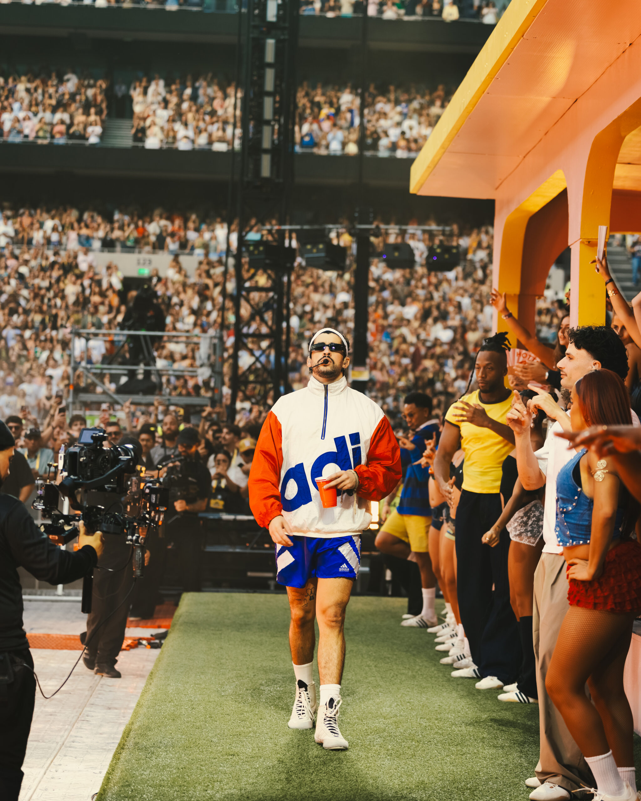
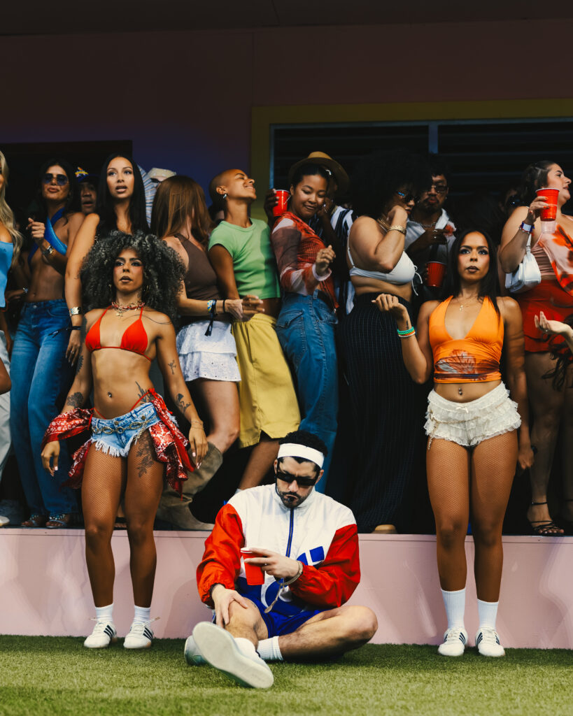
Two stadiums. Two nights. Tens of thousands of people gathering for the same reason.
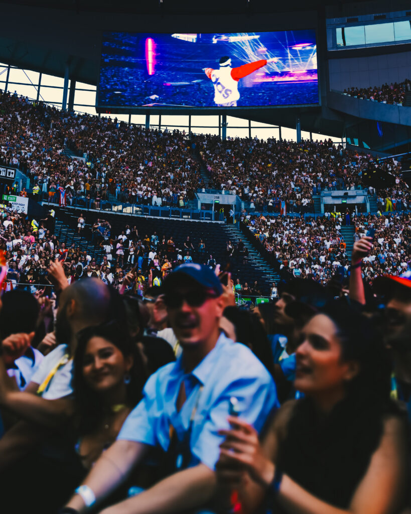
From the stage, the crowd felt endless.
What fascinated me most, however, wasn’t the scale. It was how the production constantly shifted between two completely different worlds.
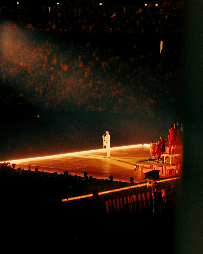
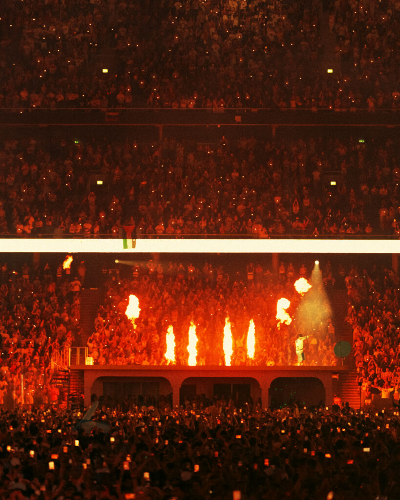
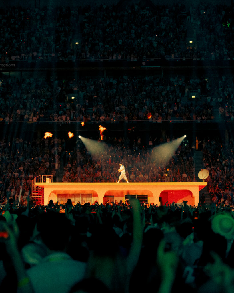
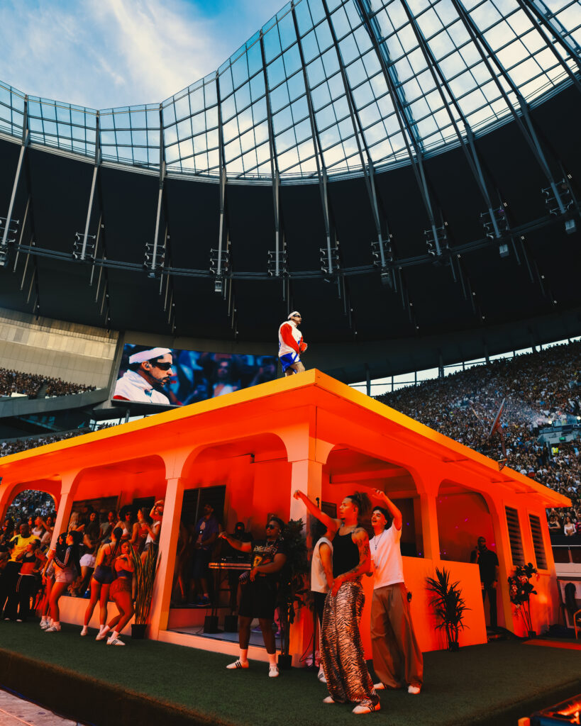
At one end of the stadium stood the main stage, built for momentum. Every song expanded into something massive, filling the venue with movement, light, and sound.
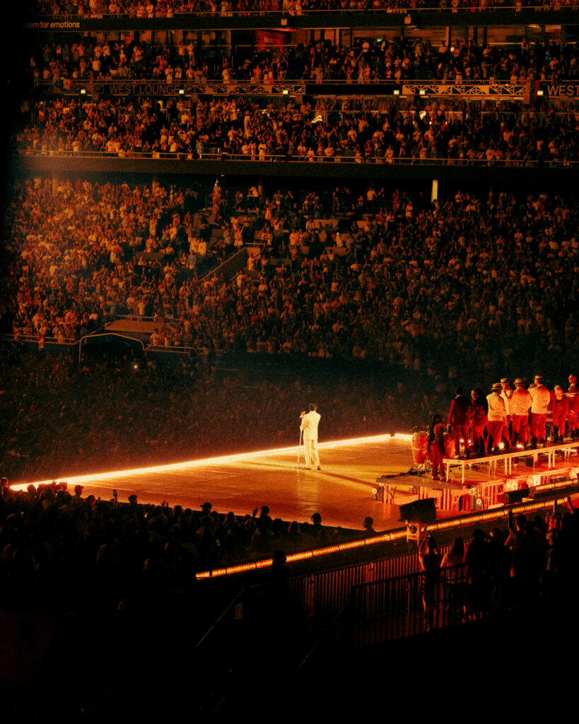
At the opposite end stood La Casita.
It wasn’t there to compete with the main stage. It changed the pace of the evening. The performance moved toward it, asking an entire stadium to follow. For a moment, the scale dissolved, and the atmosphere became noticeably more intimate.
That contrast stayed with me.
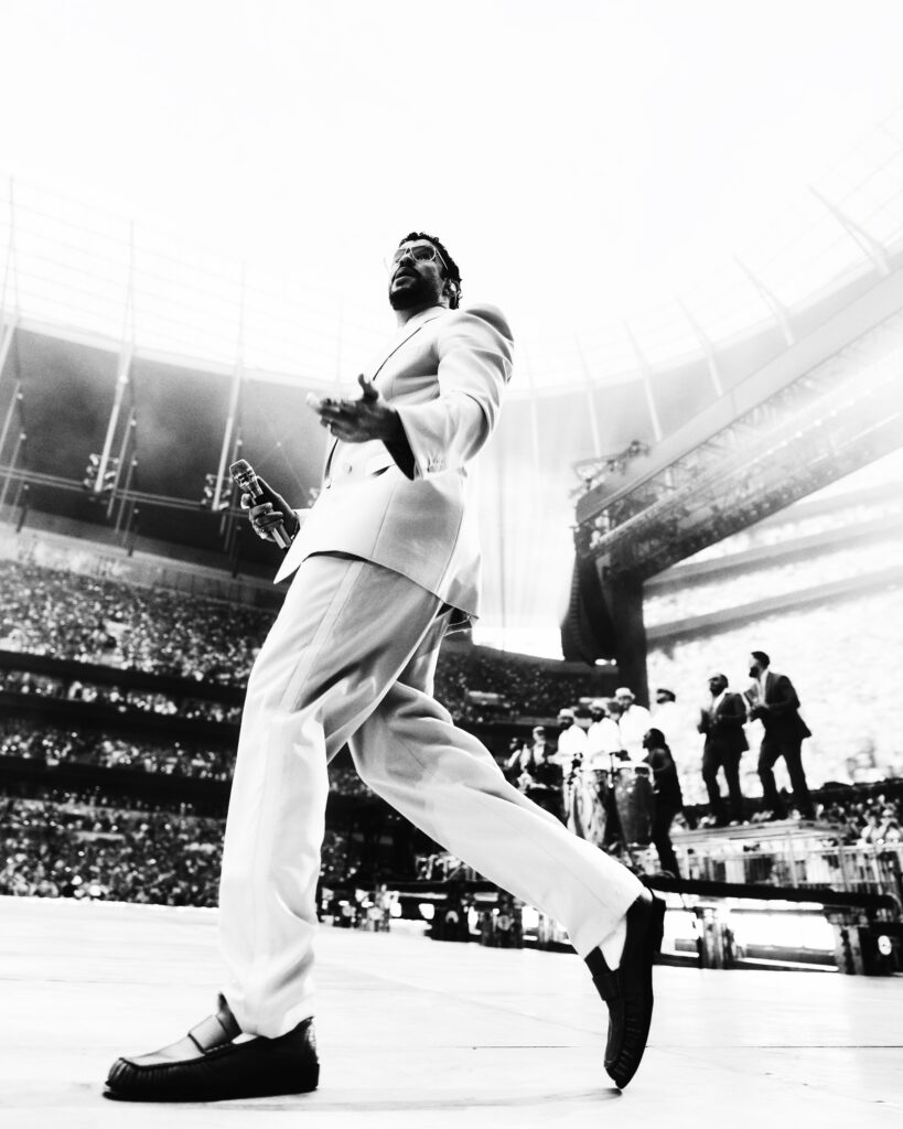
The production never relied on size alone.
It understood rhythm.
Knowing when to fill a stadium.
Knowing when to slow everything down.
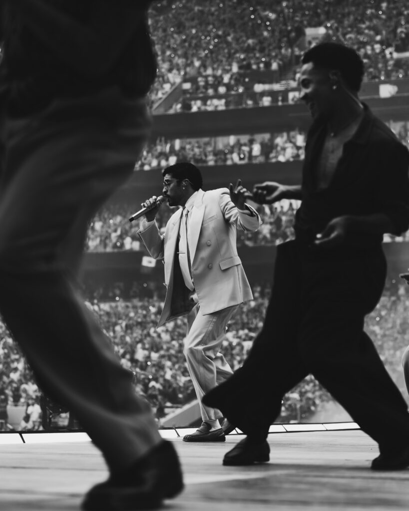
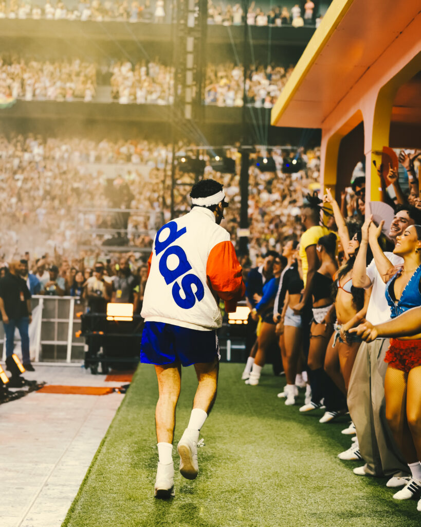
From behind the camera, I found myself paying just as much attention to the moments between songs as the songs themselves. The walk from one stage to the other. The anticipation before the lights shifted. The seconds where thousands of people waited together without saying a word.
Those moments rarely become the photographs everyone expects.
They’re usually the ones I return to.
The best productions aren’t remembered only because they’re bigger.
They’re remembered because they know when to be quieter.
Somewhere between those two stages, I stopped photographing a concert.
And sometimes once in a while they cross the invisible line between the two.
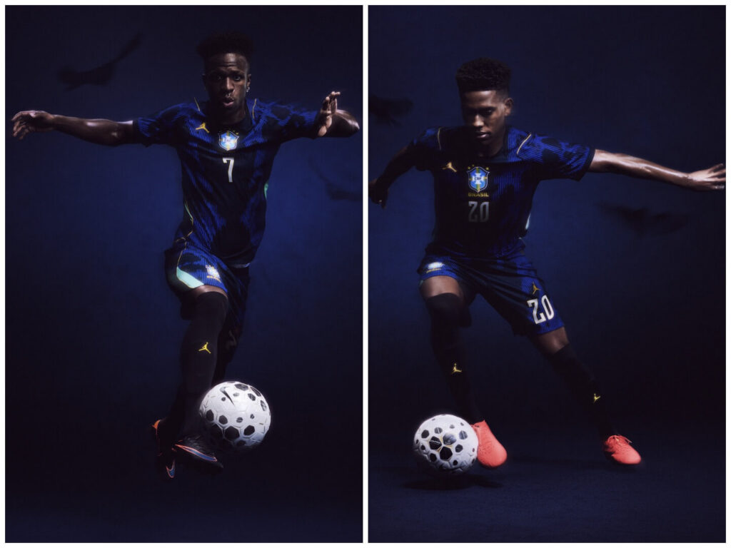
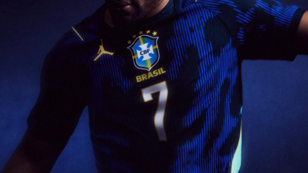
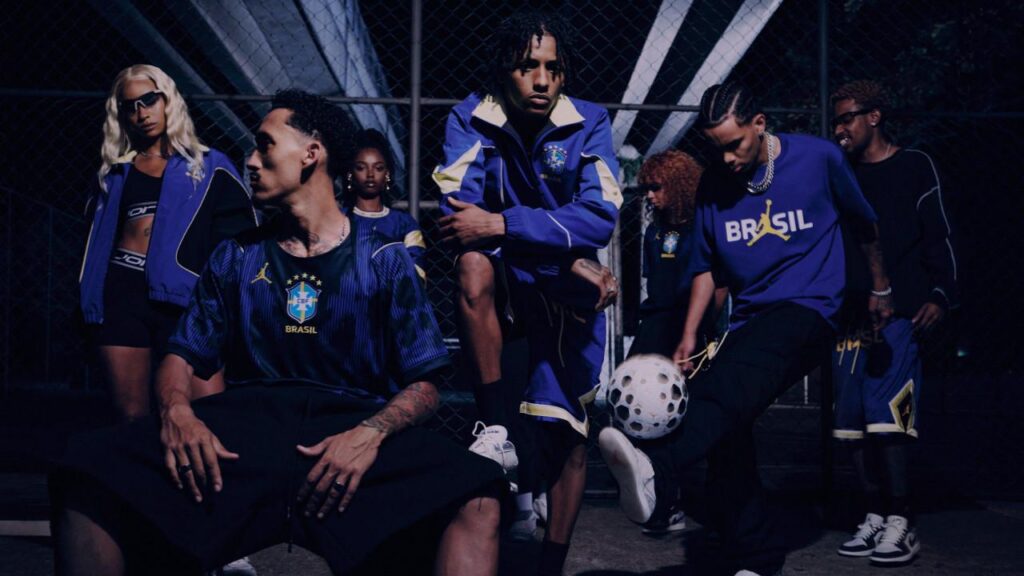
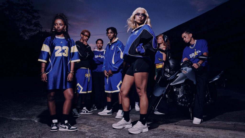
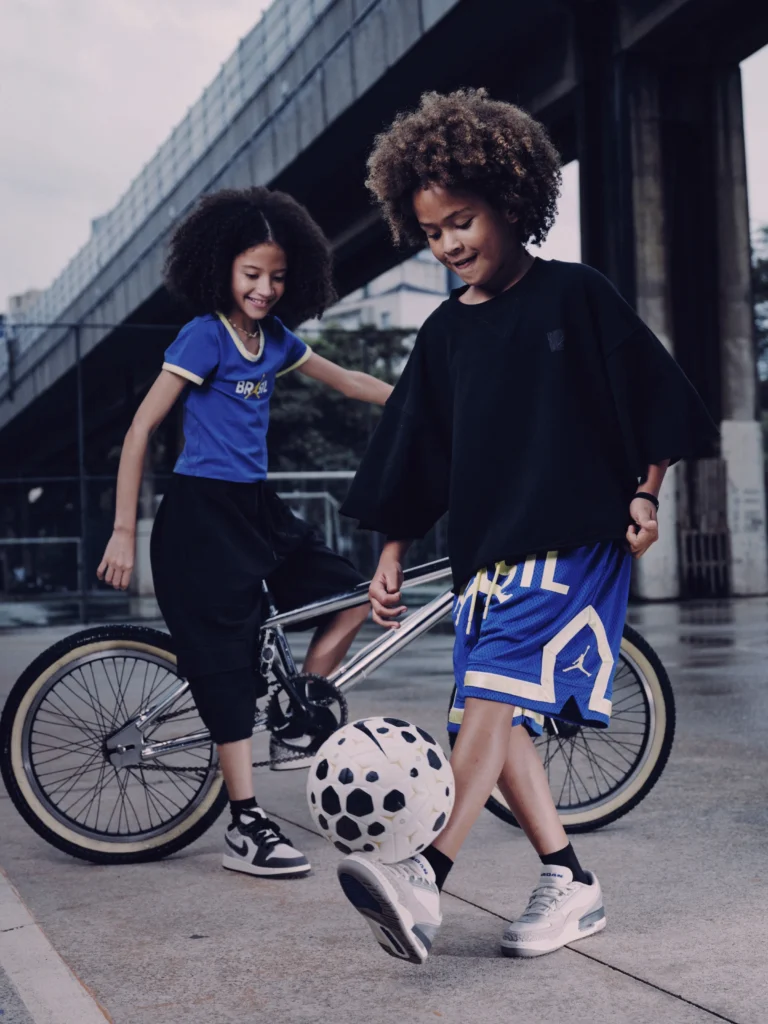
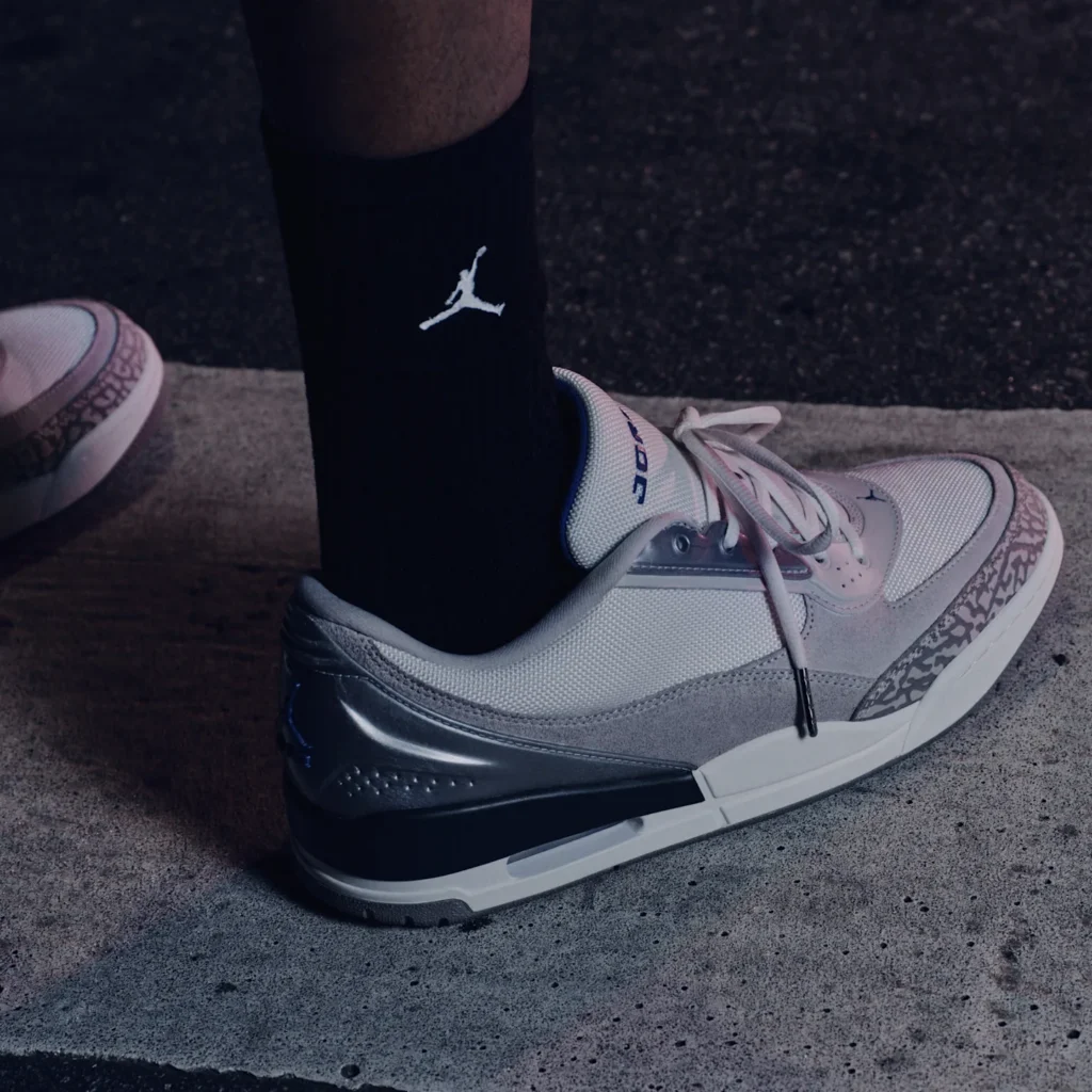
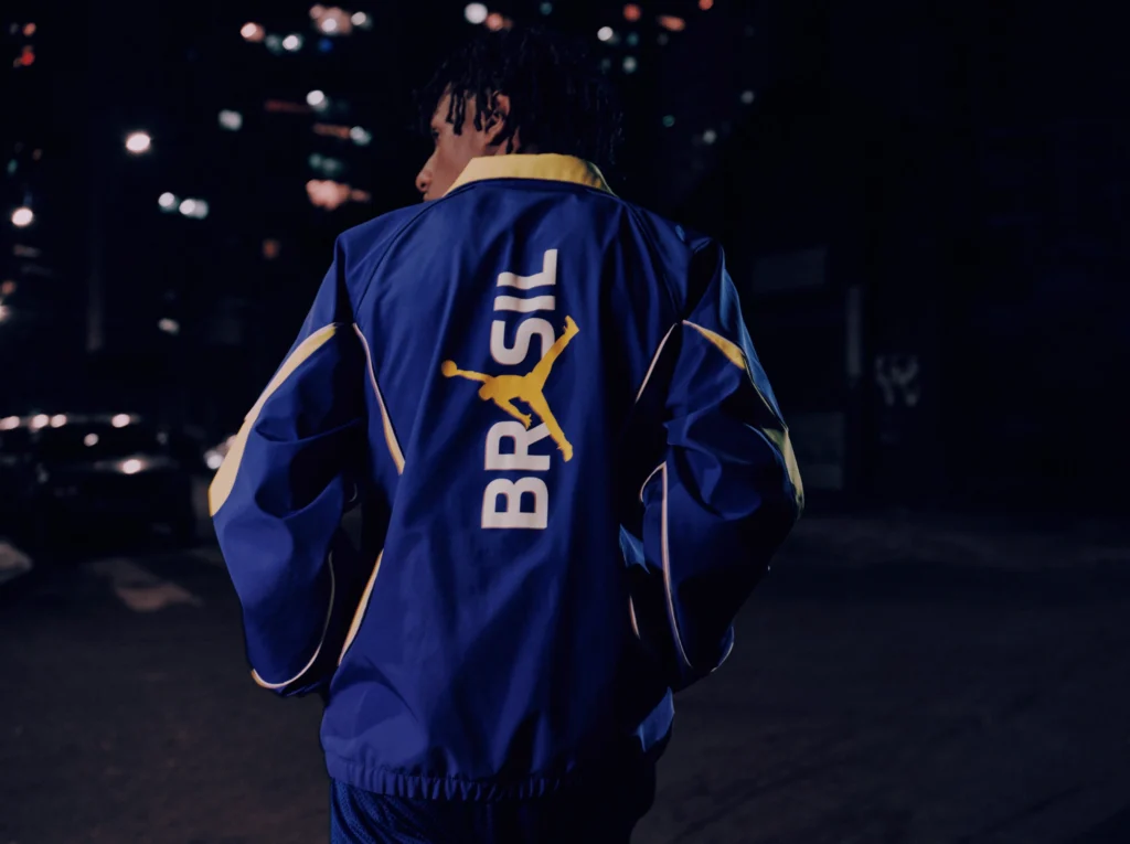
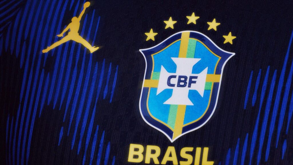
The latest collaboration between Jordan Brand and the Brazilian Football Confederation does exactly that. Not just another kit. Not just another sponsor logo stitched to fabric. This one arrives with gravity.
For the first time, Brazil’s World Cup away shirt will carry the unmistakable silhouette of the Jumpman a symbol that long ago escaped the boundaries of basketball courts and turned into a cultural passport.
The yellow home shirt remains untouched, a sacred piece of football mythology. But the away kit opens the door for something different: a meeting point between football folklore and the mythology of streetwear.
And Brazil has plenty of folklore.
The design quietly nods to the early 2000s era that last moment Brazil lifted the World Cup, when players like Ronaldo Nazário, Ronaldinho, Rivaldo, Cafú, and Roberto Carlos turned football into something closer to poetry.
Back then, Brazil didn’t just win.
They danced.
The new pieces from the away shirt to the anthem jacket borrow from that memory without trying to recreate it. Sharp cut lines wrap the collar and fall through the body like motion frozen mid stride. The shapes feel almost archival, like something discovered in a locker room from another era, then reassembled with modern precision.
It’s nostalgia, but with better tailoring.
Which is exactly where the Jordan language fits.
For decades, the Jumpman has been less about basketball and more about attitude a symbol worn by musicians, skaters, designers, and anyone who understood that sport could bleed into style.
Brazil, of course, has always played football that way.
Loose. Expressive. Slightly rebellious.
So the pairing doesn’t feel forced. It feels inevitable.
Football heritage meets street mythology stitched together in deep blue.
A kit built not just for the pitch, but for the culture surrounding it.
Because in 2026, Brazil won’t just arrive at the World Cup.
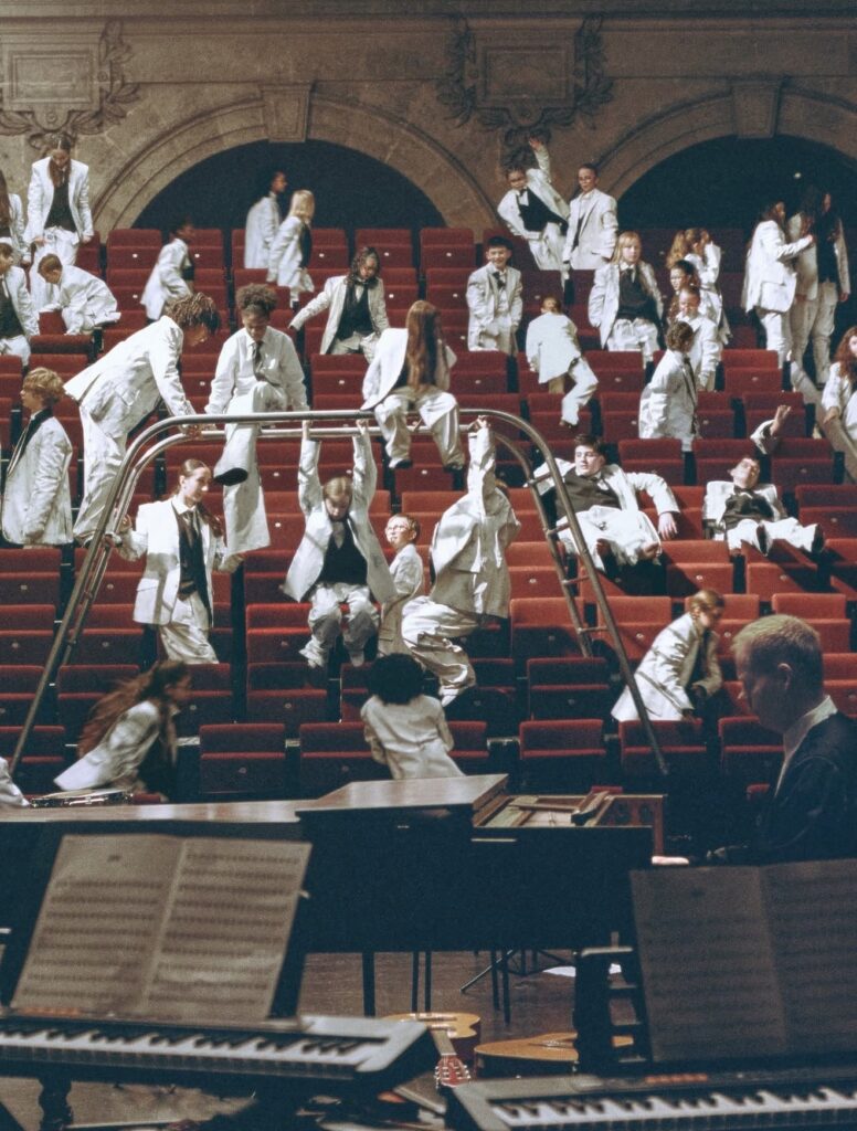
Maison Margiela transforms a Paris concert hall into a playground of white tailoring and beautiful disorder.
For SpringSummer 2026, Maison Margiela stages a concert that refuses to behave.
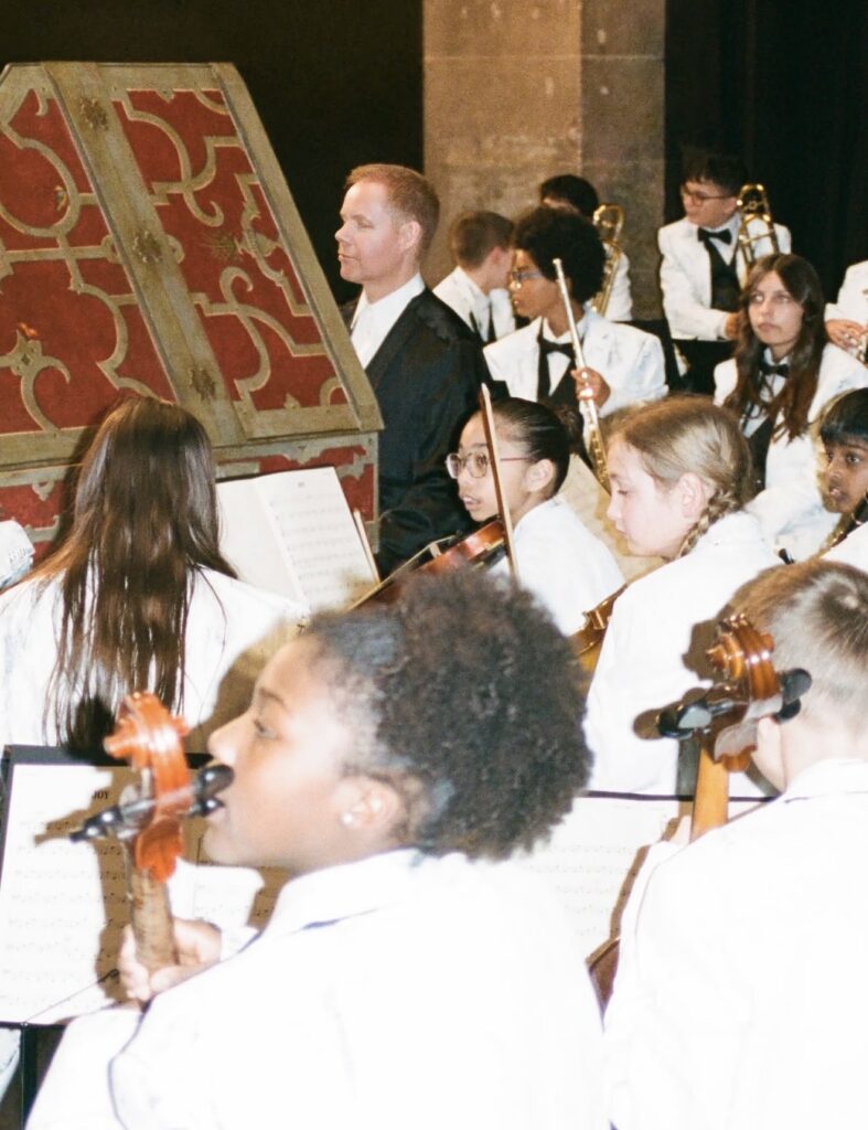
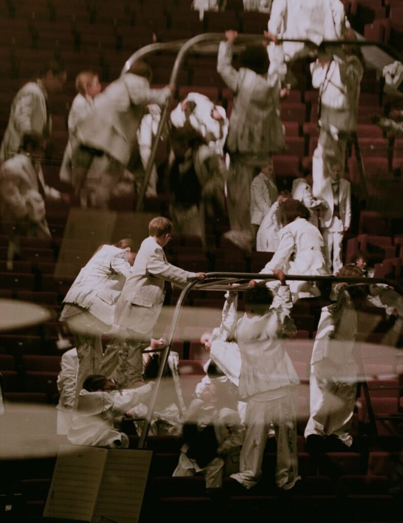
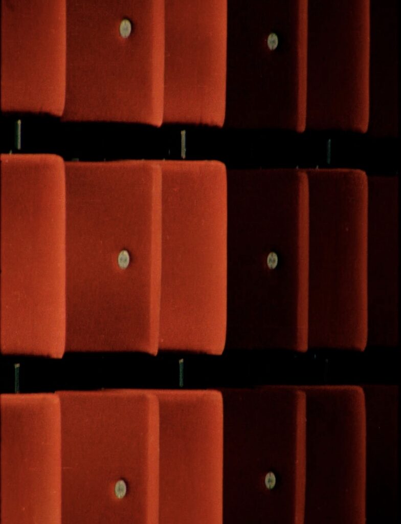
Inside a Paris concert hall, rows of velvet theater seats frame a classical orchestra setup. Sheet music sits perfectly arranged. Instruments wait for precision.
Then the room erupts.
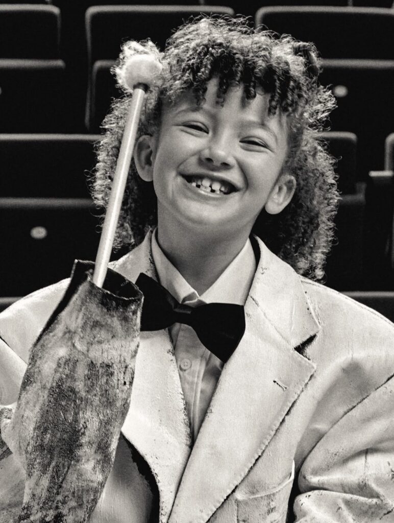
Dozens of children dressed in white tailoring scatter across the auditorium climbing rails, sliding down aisles, swinging between rows of seats. What should be a disciplined orchestra rehearsal becomes something closer to controlled chaos.
The campaign, titled Joy, moves like a short film rather than a fashion advertisement.
At the center sits composer Max Richter, performing a score while the young ensemble surrounding him dissolves the formality of the space. The musicians shift between structure and spontaneity, mirroring the tension Margiela has always explored between construction and deconstruction.
The uniforms tell the other half of the story.
White tailoring dominates the frame jackets, trousers, waistcoats treated with Margiela’s signature Bianchettofinish, a technique where garments are painted white so the original layers reveal themselves through wear and movement. The effect feels unfinished, almost ghostlike, as if the clothing itself is mid transformation.
Accessories quietly introduce new pieces from the house as well, including the return of Margiela’s architectural heel less footwear and a structured leather bag built through thermo molded construction.
But the campaign isn’t about product.
It’s about disruption.
A concert hall represents order. Rules. Tradition.
Children represent instinct. Movement. Noise.
When the two collide, the result is something Margiela understands well beauty inside disorder.
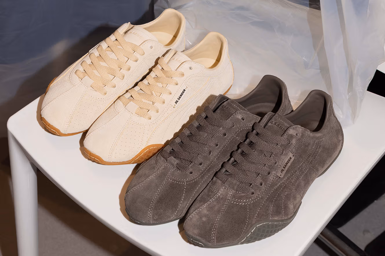
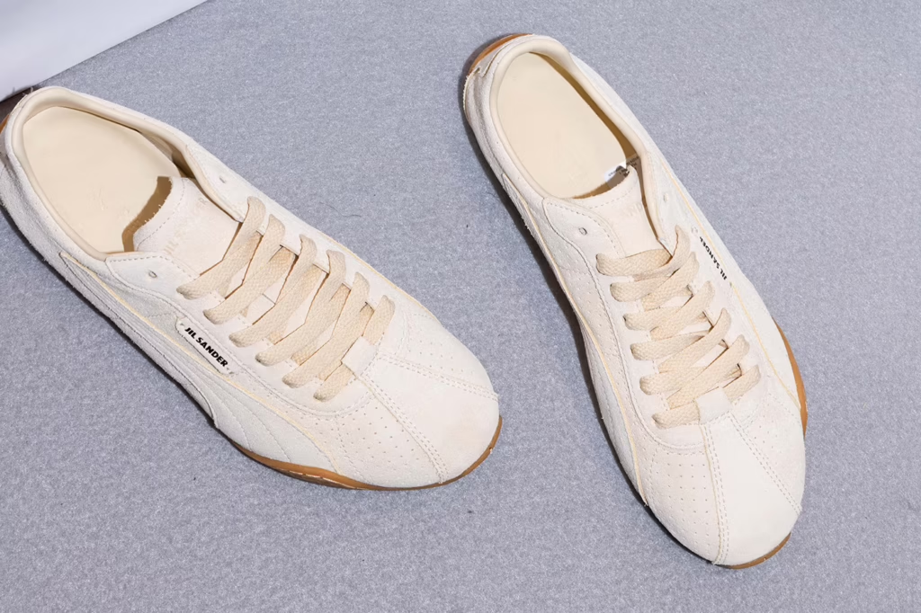
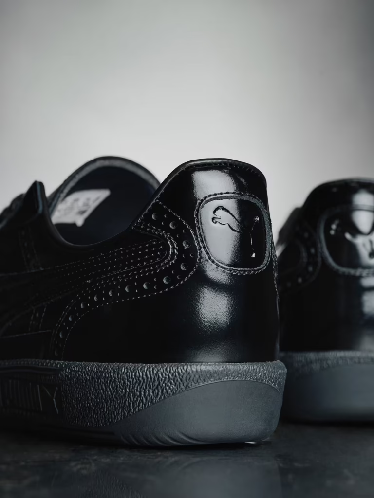
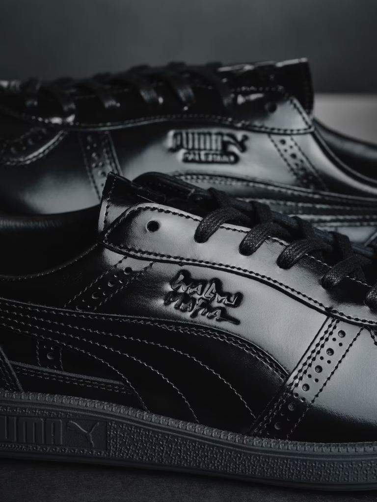
For Fall/Winter 2026, Jil Sander stepped into the velocity of PUMA, unveiling a collaboration that feels less like a sneaker drop and more like a recalibration of tempo. The chosen silhouette: the cult Y2K era H-Street a track born runner once obsessed over for its featherweight build and low profile aggression.
But this isn’t nostalgia. It’s refinement under pressure.
Where the original H Street was about speed and subculture utility, Jil Sander strips it down to architectural clarity. Stitching is restrained. Panels are smoothed into a near seamless upper. Leather replaces overt performance cues, shifting the conversation from track lane to gallery floor.
Two color studies define the release:
Light Ivory paired with a retro brown rubber sole that nods to vintage athletics without slipping into costume.
Chocolate Brown a tonal meditation, grounded by a deep brown sole that turns the shoe into an object rather than an accessory.
The branding whispers. A tonal Jil Sander mark is embossed on the tongue not printed, not shouted. It’s there if you’re looking. If you’re not, it doesn’t care.
This is where the collaboration becomes interesting.
PUMA’s heritage is rooted in performance, in split second margins and finish lines. Jil Sander operates in controlled restraint the discipline of subtraction. Together, they don’t clash. They compress.
The result is a sneaker that feels aerodynamic in spirit but monastic in execution. No unnecessary overlays. No exaggerated tech flex. Just proportion, material, and balance.
In a market addicted to visible innovation carbon plates, inflated midsoles, loud retro revivals this pair opts for composure. It doesn’t chase noise. It edits it.
And that restraint might be the most radical move of all.
Release details remain unannounced, but timing feels secondary. This isn’t about hype cycles. It’s about longevity a runner reborn as uniform.
Studio Take:
If most collaborations are about amplification, Jil Sander x PUMA is about compression. Sport reduced to its pure line. Luxury reduced to its pure form. Motion, distilled.
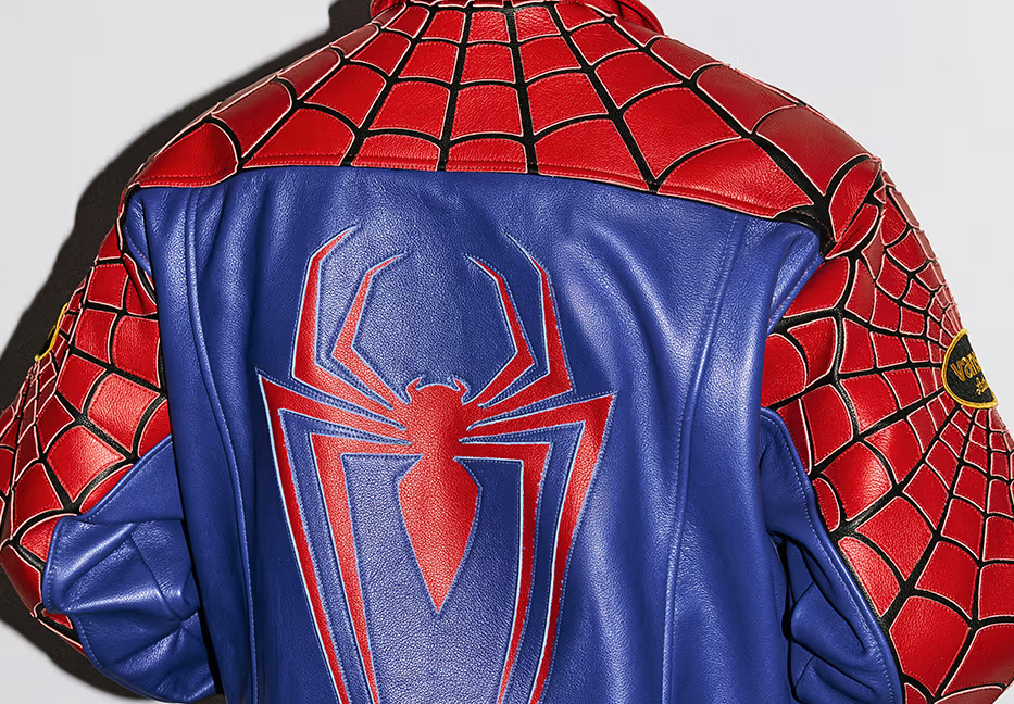
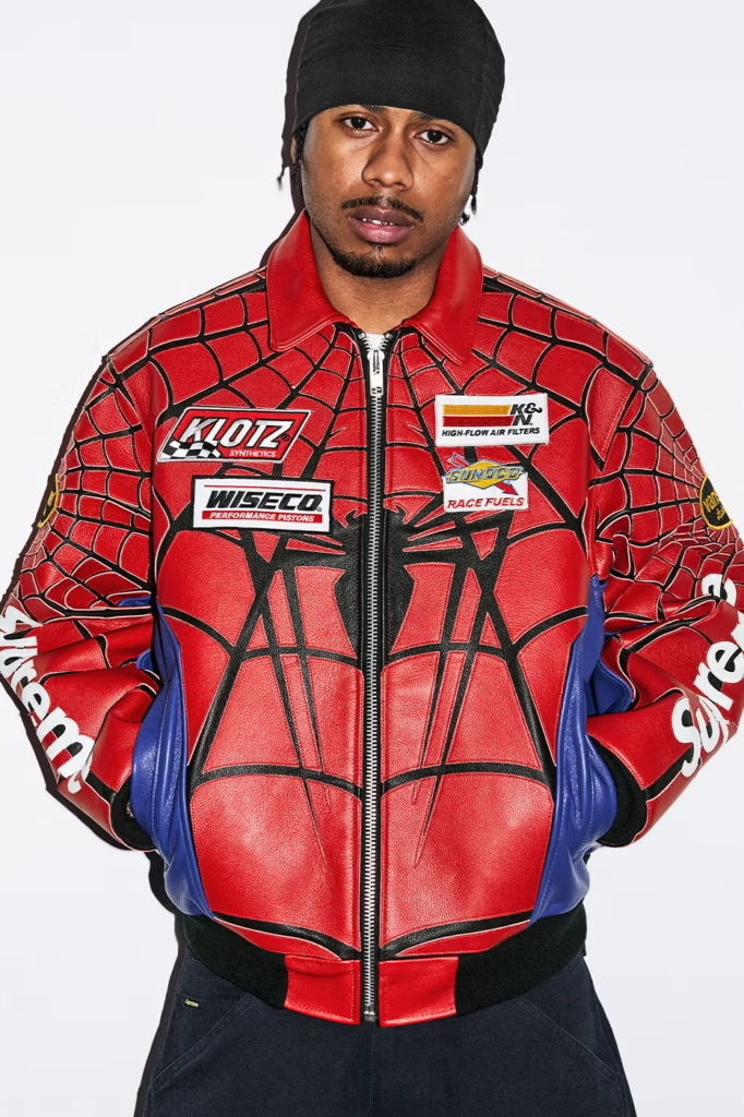
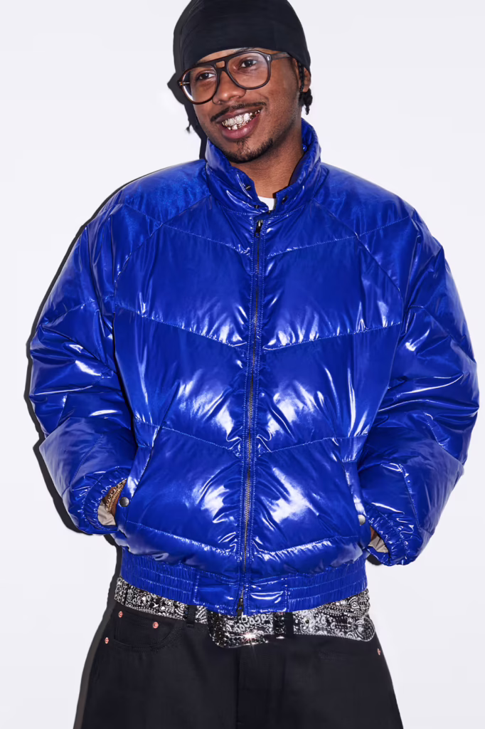
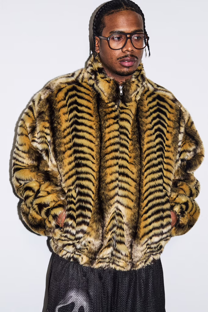
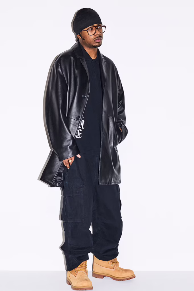
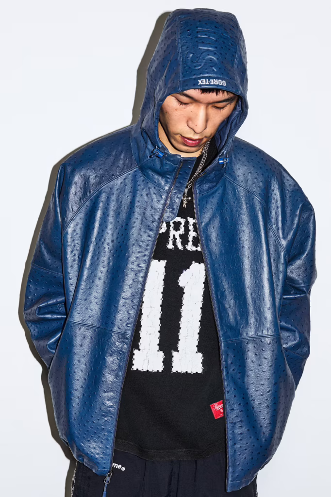
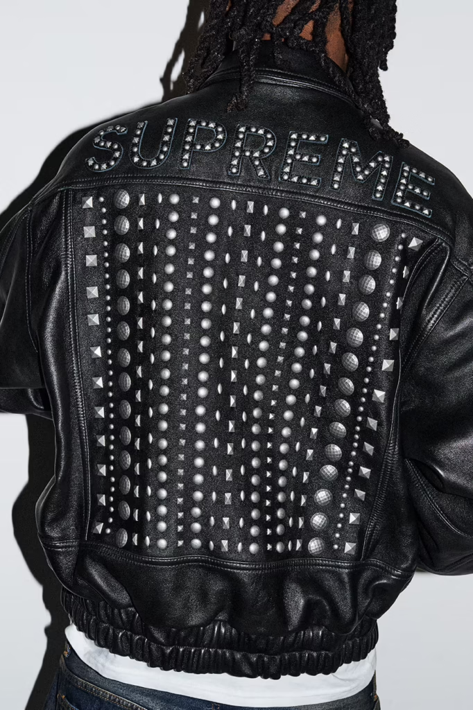
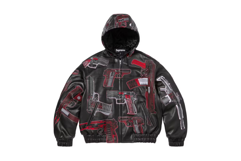
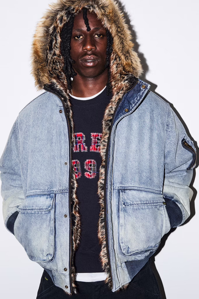
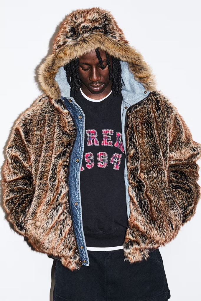
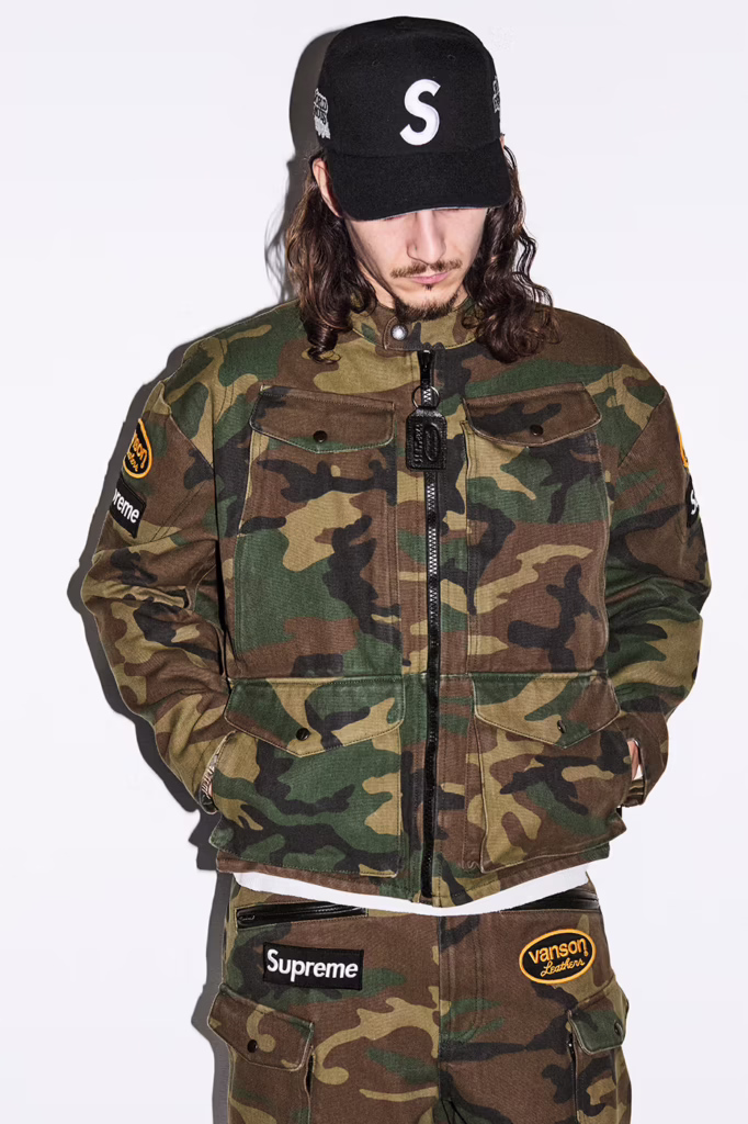
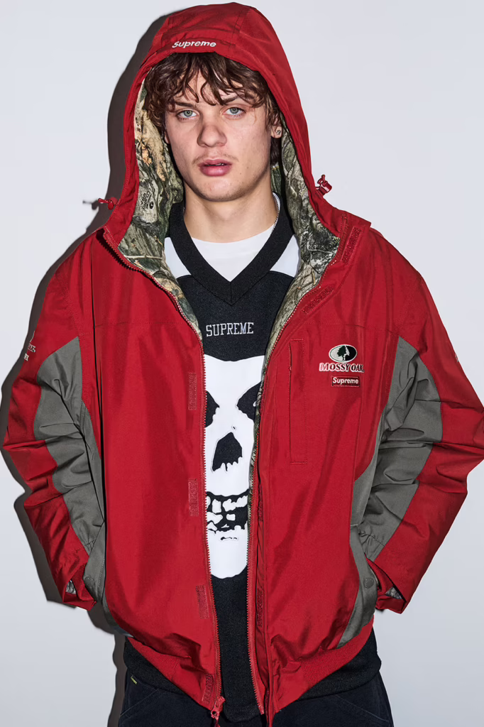
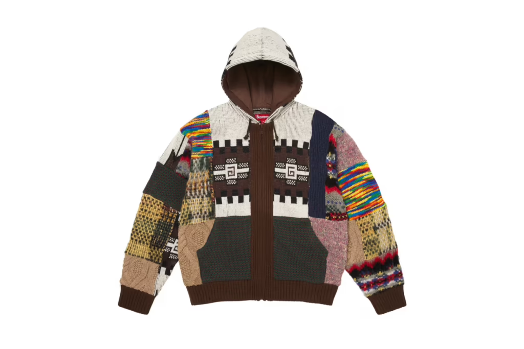
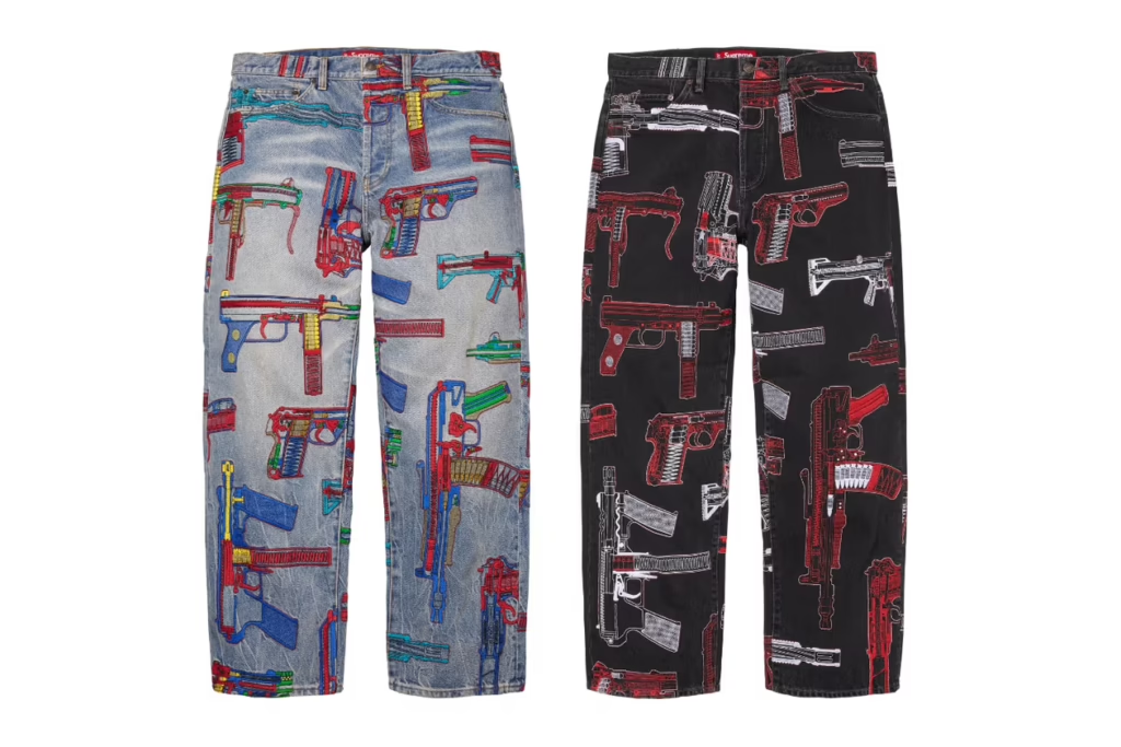
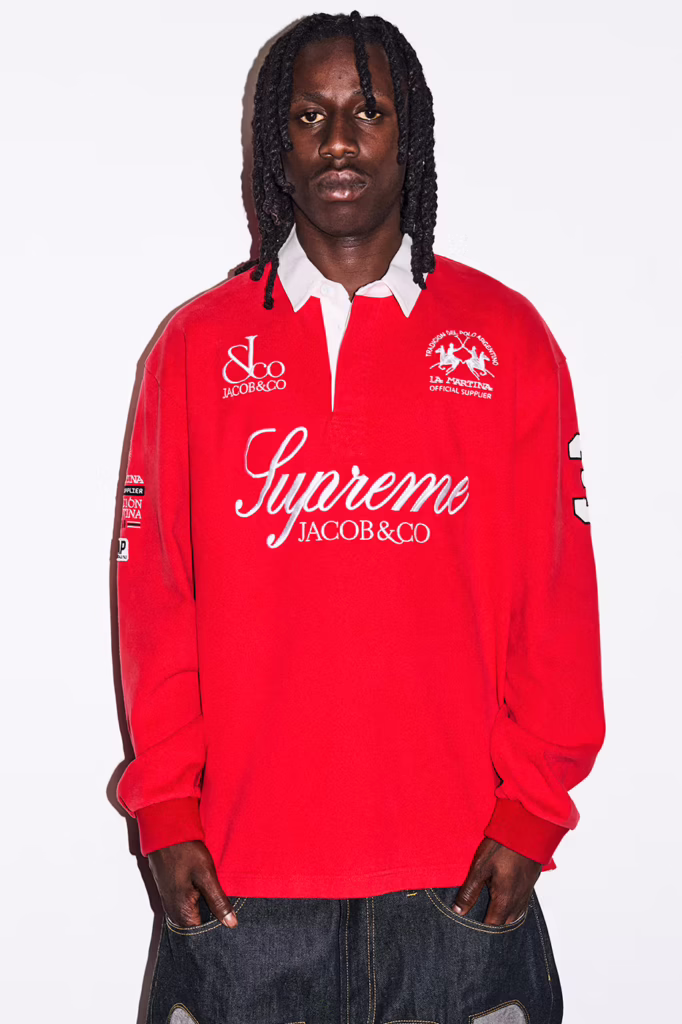
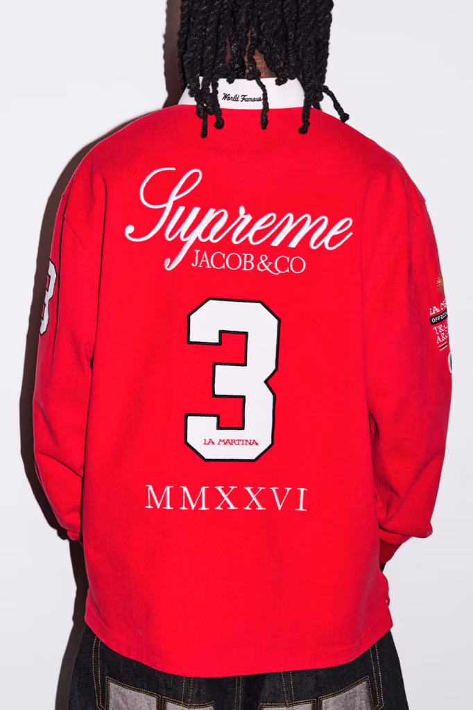
Spring/Summer 2026 is Supreme in its most maximal form less collection, more cultural detonation. It reads like a downtown manifesto stitched in ostrich leather, printed in gunmetal ink, and blasted across a boxing ring in the middle of nowhere.
The headline collaboration Spider Man colliding with Vanson feels inevitable. Comic book mythology wrapped in American road armor. Web graphics drip across heavyweight knits and leather outerwear like urban folklore rewritten for the pit lane. Alongside it, heritage American grit surfaces through partnerships with Schott NYC and The Great China Wall, reinforcing that Supreme still understands lineage before it disrupts it.
But what makes SS26 resonate isn’t just collaboration it’s texture and confrontation.
Sea Island cotton meets camo cable knits. Mohair stripes arrive loud, unapologetic, almost theatrical. Patchwork hoodies feel intentionally chaotic. Across leather, denim, and bags, the raw gun sketches of Alfredo Martinez slash through the season like a recurring motif defiant, political, unfiltered. Art Dealer injects his own graphic tension, pushing the collection deeper into art world territory rather than simple streetwear repetition.
Pop culture doesn’t cameo it dominates. Ghostface returns in graphic form. MISFITS iconography bleeds into the lineup. The Arabic Box Logo re-emerges, resurrecting the hysteria of seasons past with calculated precision. A Spider Man graphic swinging across a Supreme billboard feels less like merch and more like New York myth making.
Athletic codes surge throughout basketball mesh, hockey silhouettes, racing jerseys all drenched in branding that refuses subtlety. Denim is stamped with oversized block letter logos down the leg. Leather trousers arrive ostrich-embossed, equal parts luxury and threat. Cargo pants lean tactical. Star spangled prints oscillate between patriotic theater and dystopian satire.
Even the softer moments feel ironic. Tapestry florals reminiscent of a grandmother’s couch land on sweats, recontextualized as high fashion street armor. Varsity typography clashes against Monster Jam adrenaline graphics. It’s nostalgia weaponized.
And then, as always, Supreme shifts from clothing into spectacle.
A fully branded boxing ring. A leopard lined coffin. A custom Fender bass. Gold bars and iced out Ghostface pendants courtesy of Jacob & Co.. Retro camcorders. Podcast microphones. A Fort Knox toolbox. Objects that blur the line between retail, performance art, and provocation.
This was never built for utility.
It was built to dominate.
The skate decks aren’t accessories they’re statements. Arabic insignias scorched into maple. Martinez’s gun sketches bleeding from leather to lacquer like raw evidence sealed in gloss. Meant to slam against pavement or hang inside a white cube gallery. Either way, they leave a mark.
Supreme SS26 doesn’t ride trends it runs straight through them. Biker steel collides with comic book mythology. Punk iconography refuses to fade. Downtown art grit gets amplified to stadium scale. It’s aggressive, deliberate, and unapologetically excessive
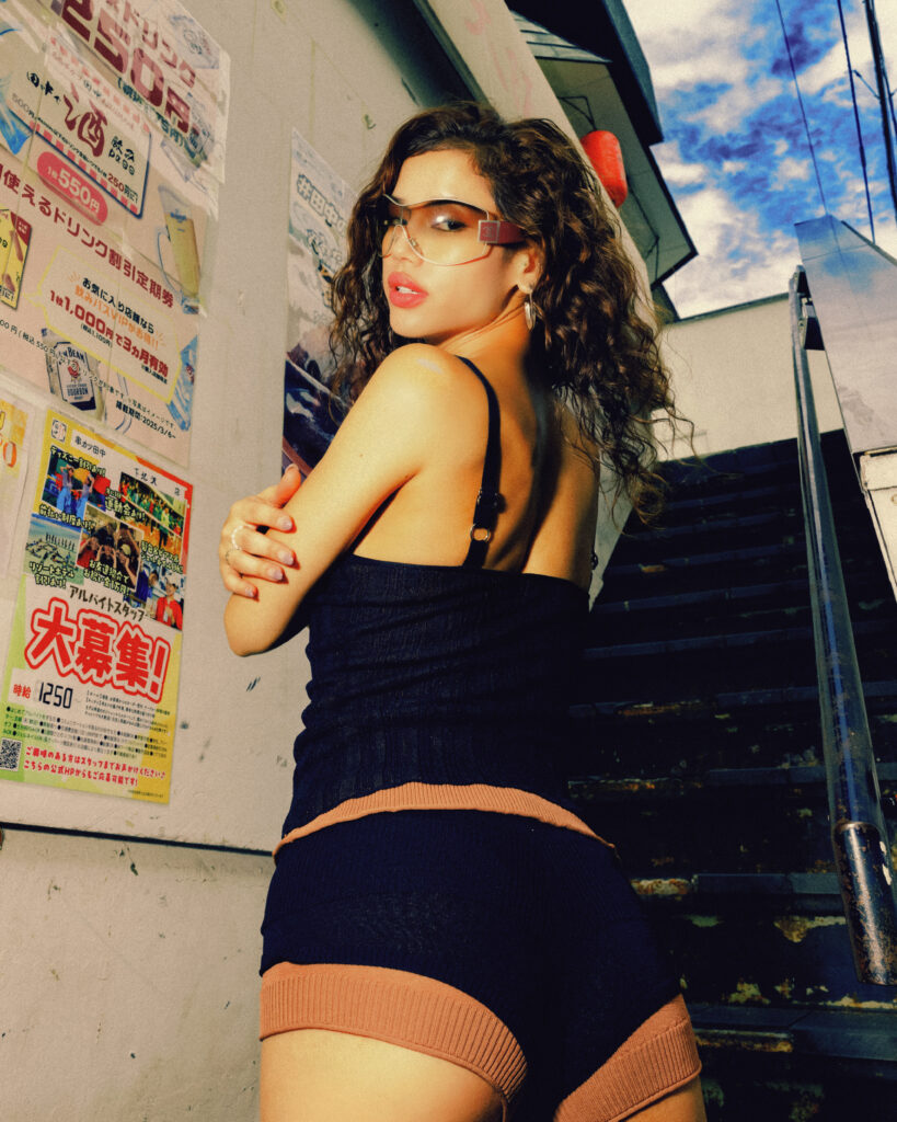
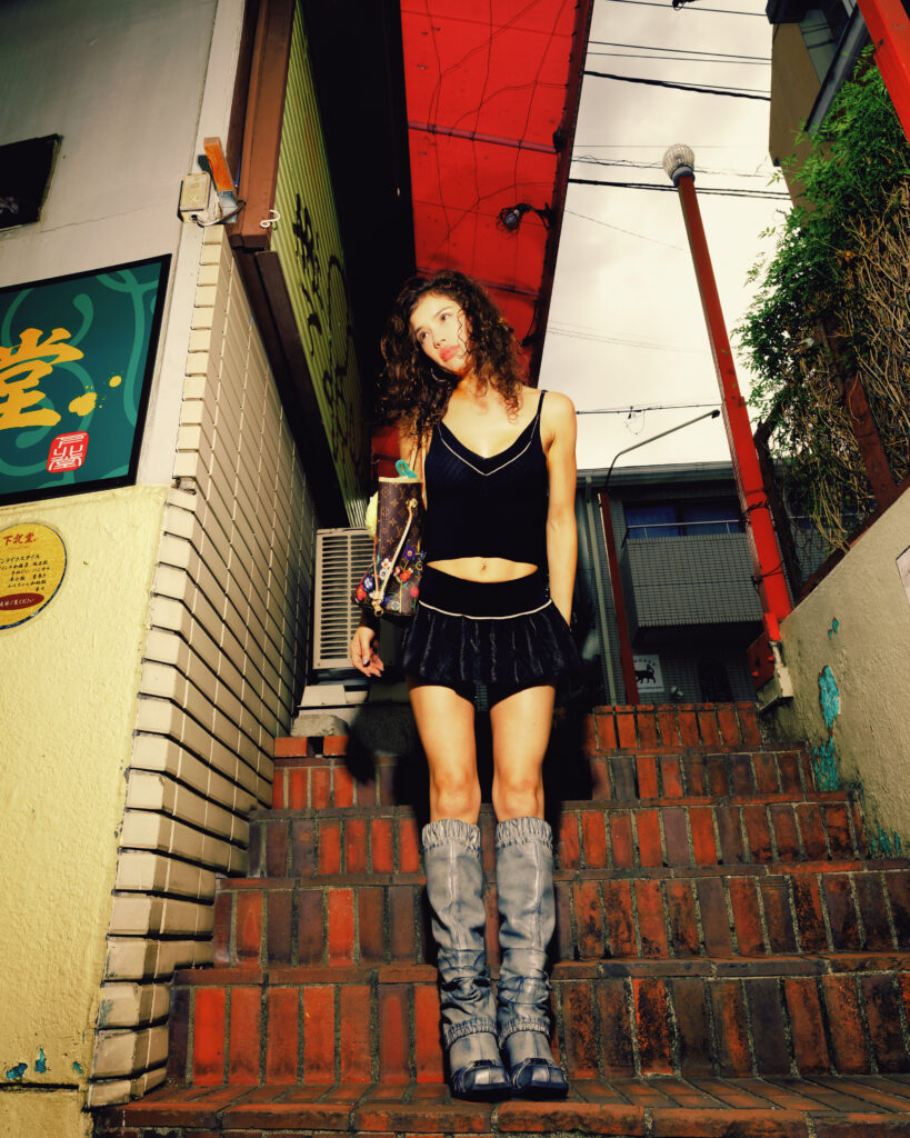
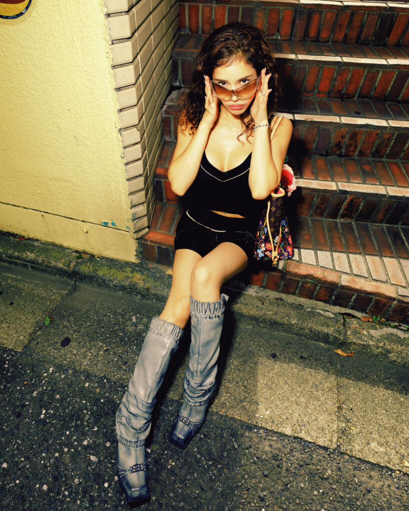
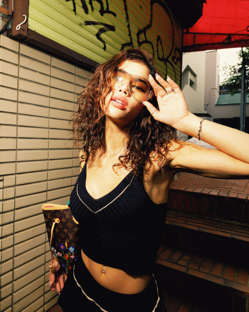
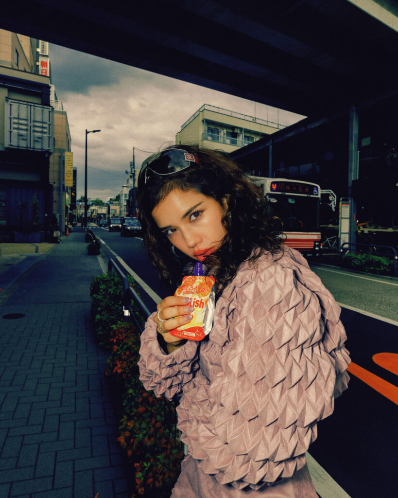
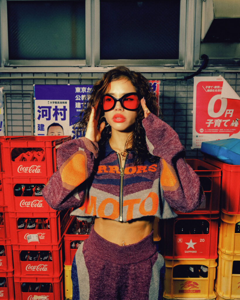
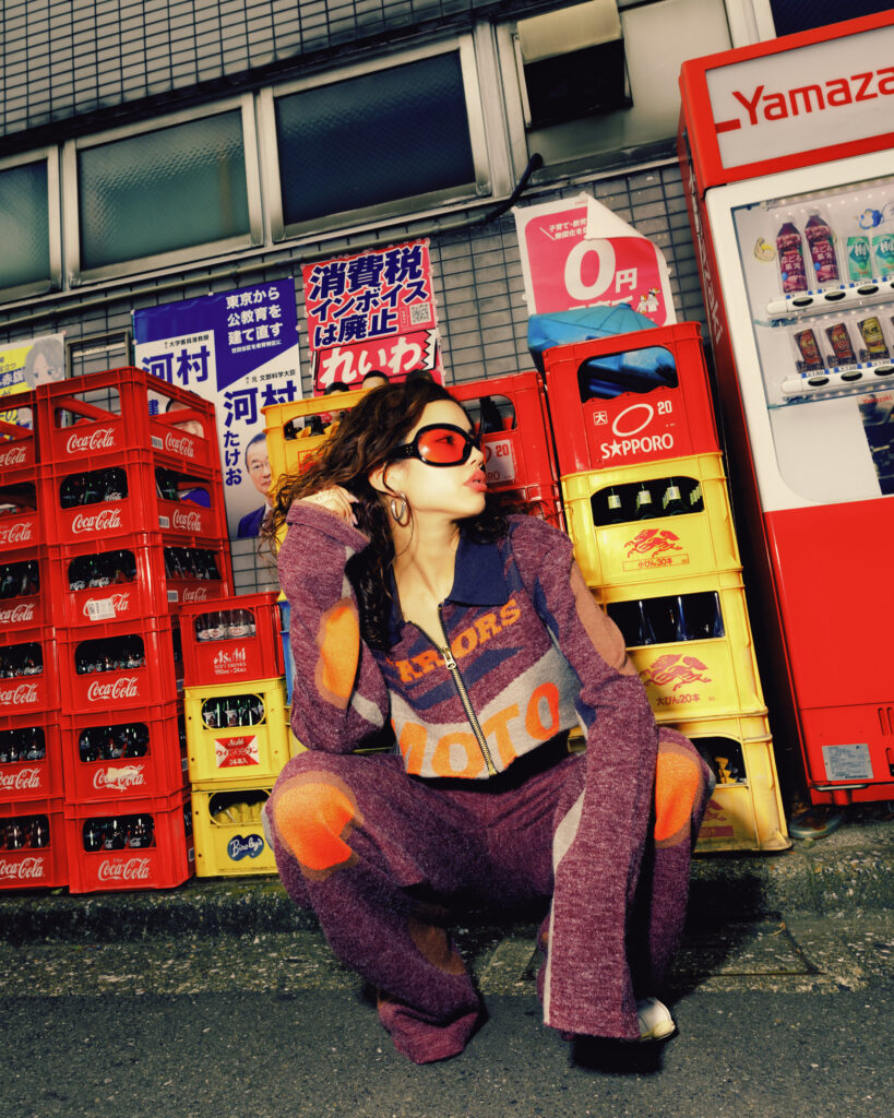
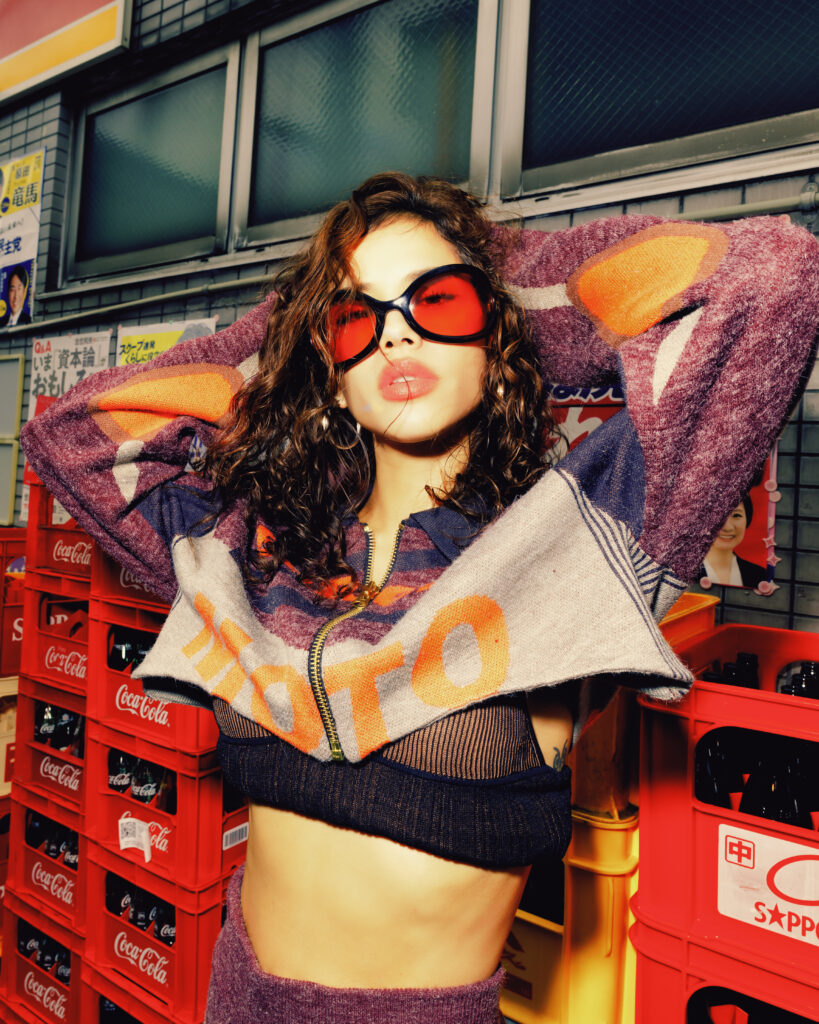
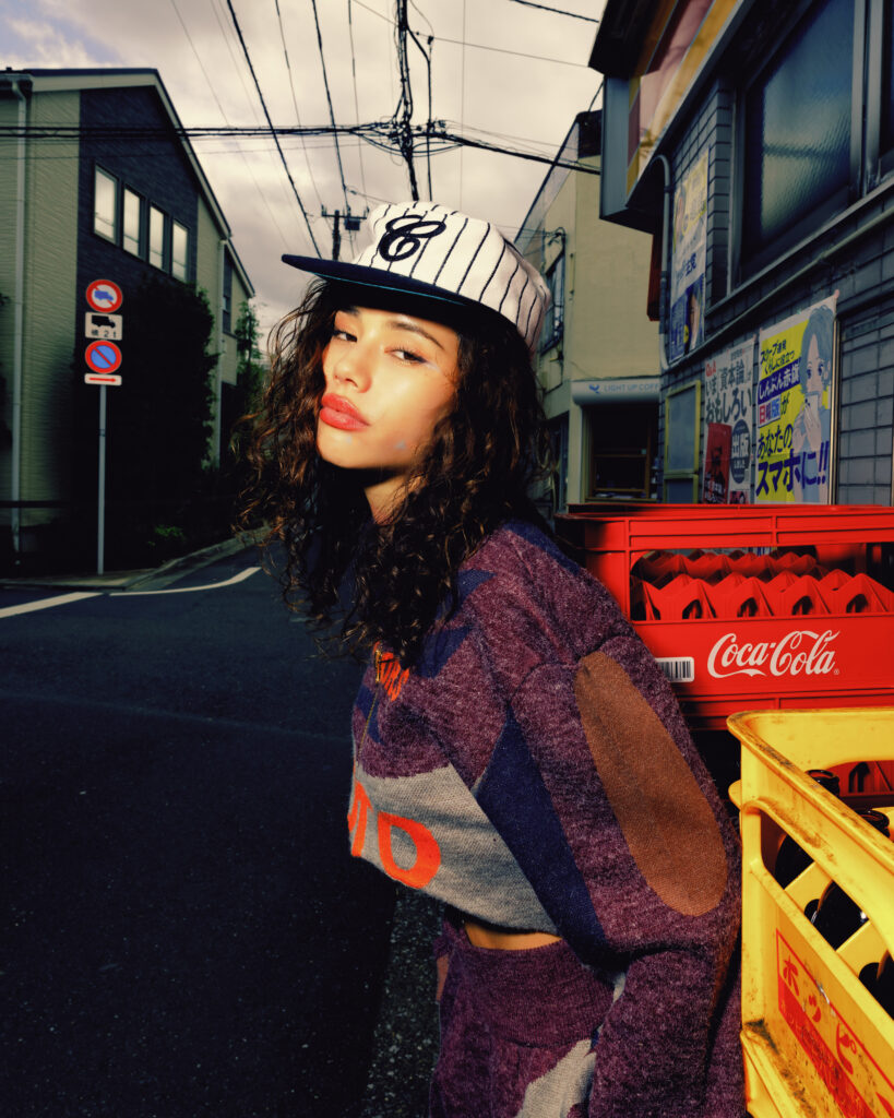
Tokyo doesn’t wait. The clothes have to move first.
Monica Sahara cuts through the city in silhouettes that feel engineered for speed AMISS pressed close to the body, sheer ribbed layers tracing the figure like a second outline. Then House of Errors pushes outward: cropped structure, expanded sleeves, fashion that occupies air as much as space. One look reads intimate. The other reads architectural. Together they create friction, and friction is where style lives.
Hard flash turns steel shutters and highway pillars into a live set. Nothing romantic. Nothing softened. Fabric against concrete, skin against light, silhouette against traffic. The city becomes a testing ground for proportion and posture. Every frame is a collision between polish and pressure.
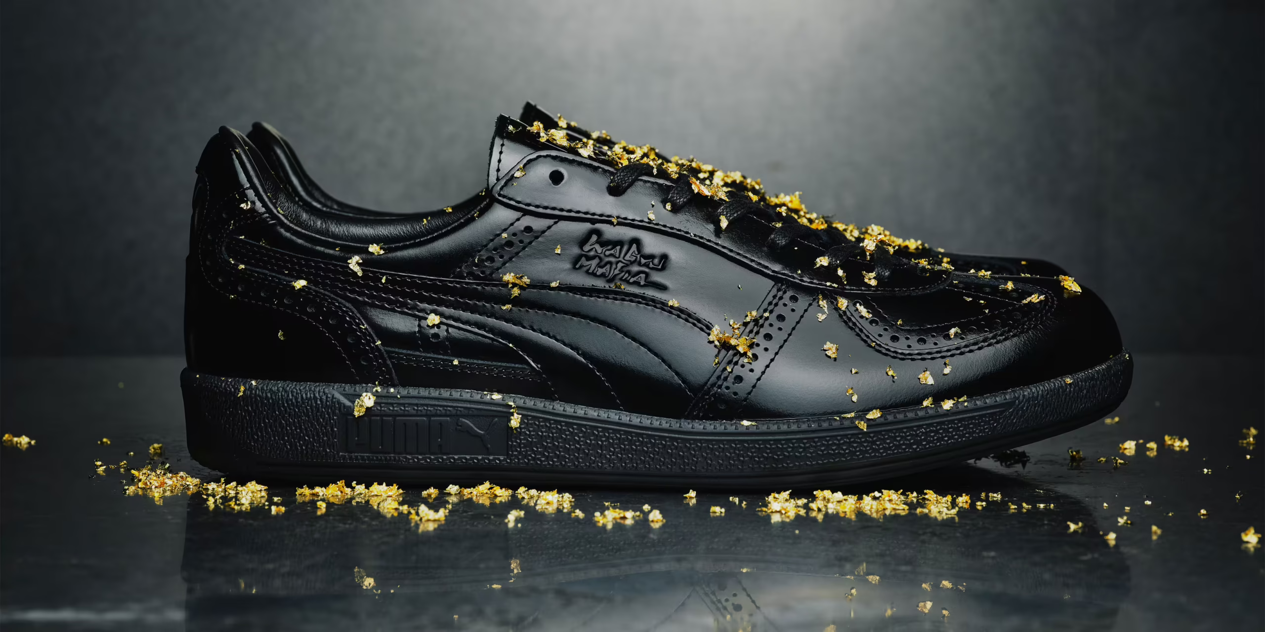
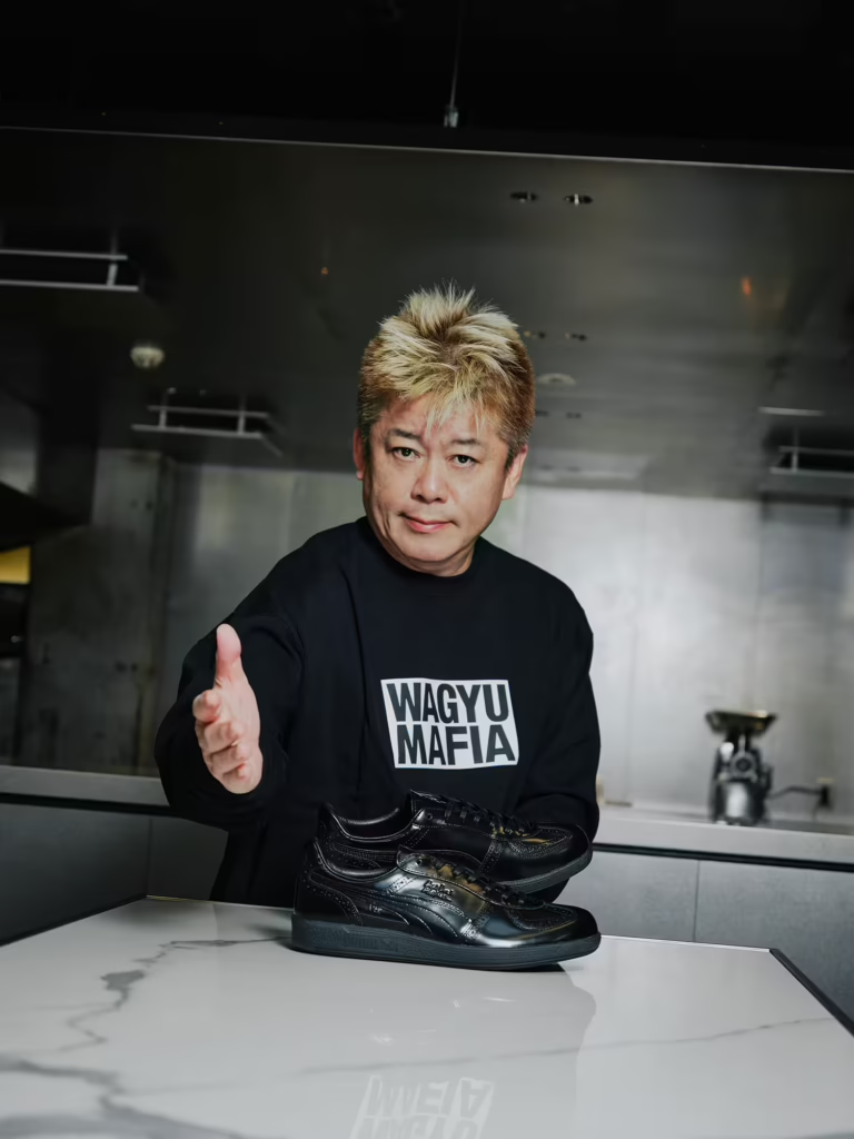
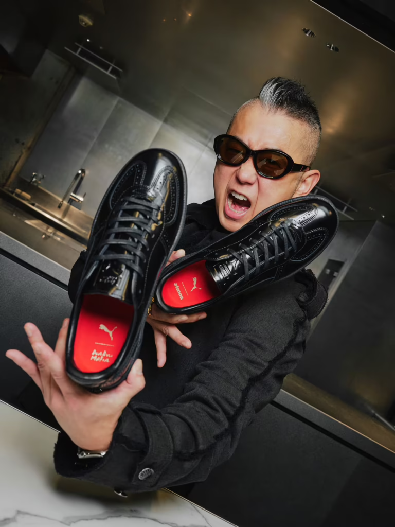
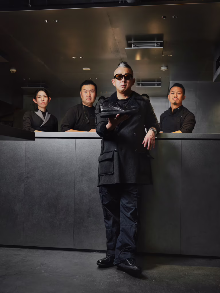
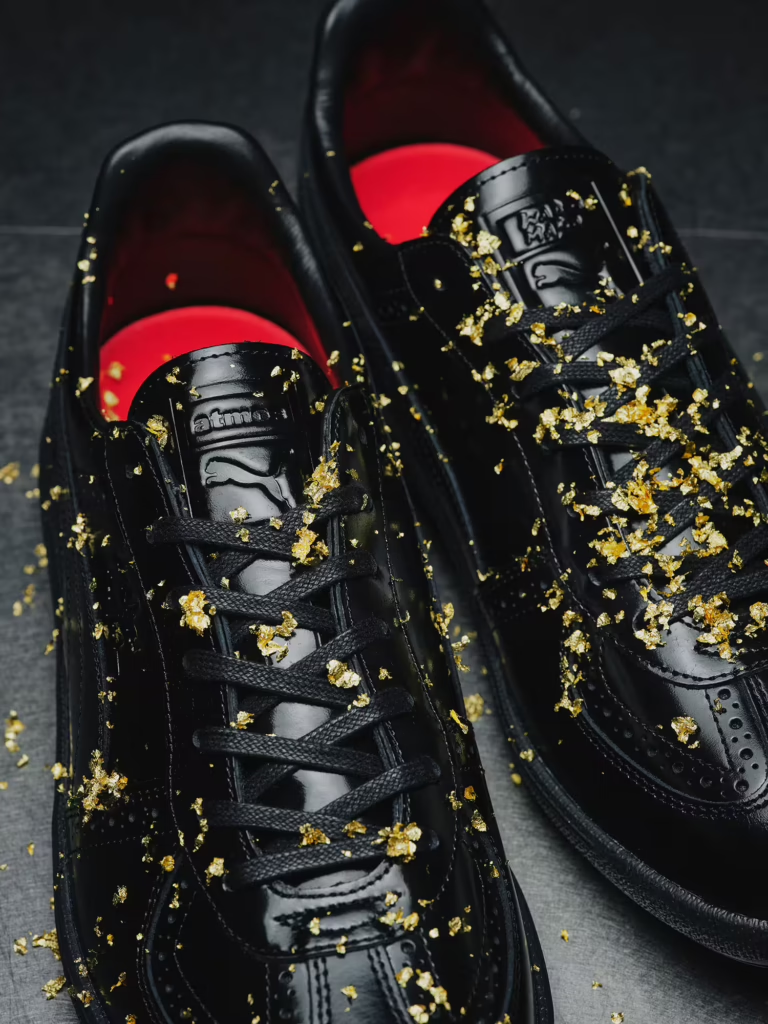
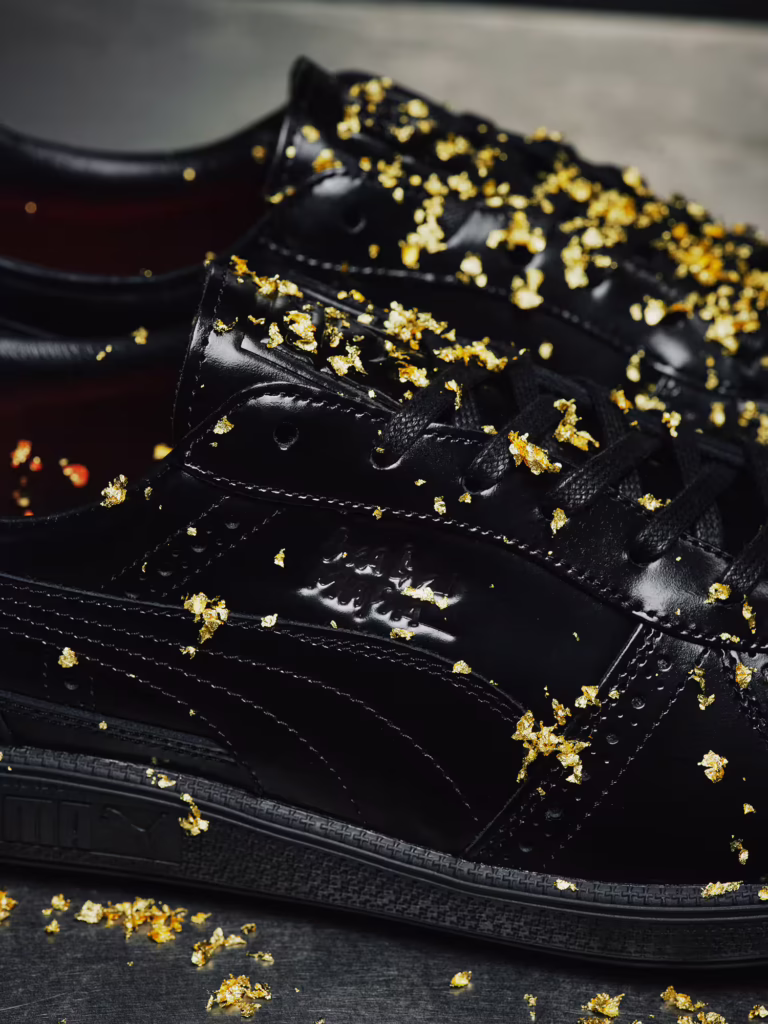
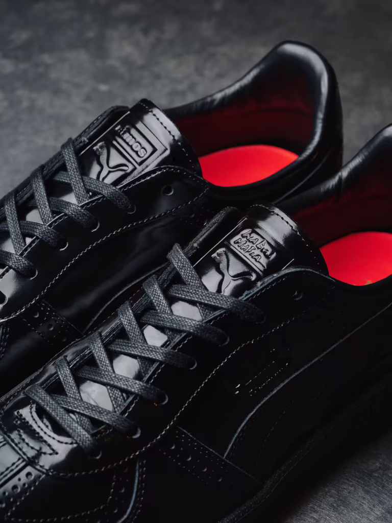
A few days after its release, the atmos × PUMA × WAGYUMAFIA sneaker already feels less like a product and more like a timestamp. Not just a drop, but a marker of where Japanese culture is moving fluid, hybrid, refusing categories.
WAGYUMAFIA has never framed itself as only food. From the beginning, it functioned as a cultural export project disguised as dining. Wagyu became the language, but the message was always broader: Japanese craftsmanship deserves global presence in every form it touches. The sneaker simply extends that philosophy into another medium.
What makes the pair resonate now that it’s out in the world is the tension it carries. Formal leather discipline wrapped around the relaxed body of a sneaker. It walks like streetwear but stands with the posture of something ceremonial. That duality mirrors WAGYUMAFIA’s culinary identity high end product translated into everyday ritual. Luxury without distance. Craft without stiffness.
Seeing the shoe circulate in real time confirms something bigger. The future of culture isn’t split between elite and casual anymore. The most interesting work lives in the crossing point. Japan has long mastered that balance: elevating the ordinary without stripping it of warmth, refining objects without removing their soul.
The release didn’t just celebrate a sneaker. It celebrated a mindset that craftsmanship can move, breathe, and exist in daily life. A reminder that the strongest cultural statements aren’t always loud. Sometimes they’re worn quietly, step by step, across city streets.
When Bad Bunny won the Grammy, it felt less like a spotlight and more like sunrise over a place that had been working all night. The shine came after the sweat. Songs built from crowded rooms, long drives, voices layered like paint that never fully dries. Then the Warhol gloss repetition, icon, gold turned into surface trying to pin him still. But he won’t stay still. Inside the frame there’s movement, a pulse that belongs to streets, kitchens, radios left on too late. The trophy is only evidence. Proof that something grown from heat and pressure can step into marble halls and still sound like home
Sony’s four film The Beatles project reads less like a biopic and more like a cultural palimpsest history written, erased, and written over again. Four films, four lives, each orbiting the same flash of electricity that changed sound, youth, and longing forever. Under Sam Mendes’ direction, the band fractures into parallel myths: Harris Dickinson’s Lennon as sharp static, Paul Mescal’s McCartney as melodic gravity, Joseph Quinn’s Harrison drifting inward, Barry Keoghan’s Starr keeping time while the world spins. It’s Warhol repetition meeting Basquiat scrawl—fame as surface, humanity bleeding through the cracks. Captured through the lens of John Russo, the imagery feels immediate and unresolved, treating the band not as monuments, but as moments alive, unstable, and still echoing forward into April 2028.
Some collaborations don’t live in seasons. They live in culture.
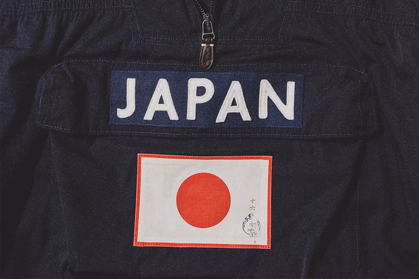
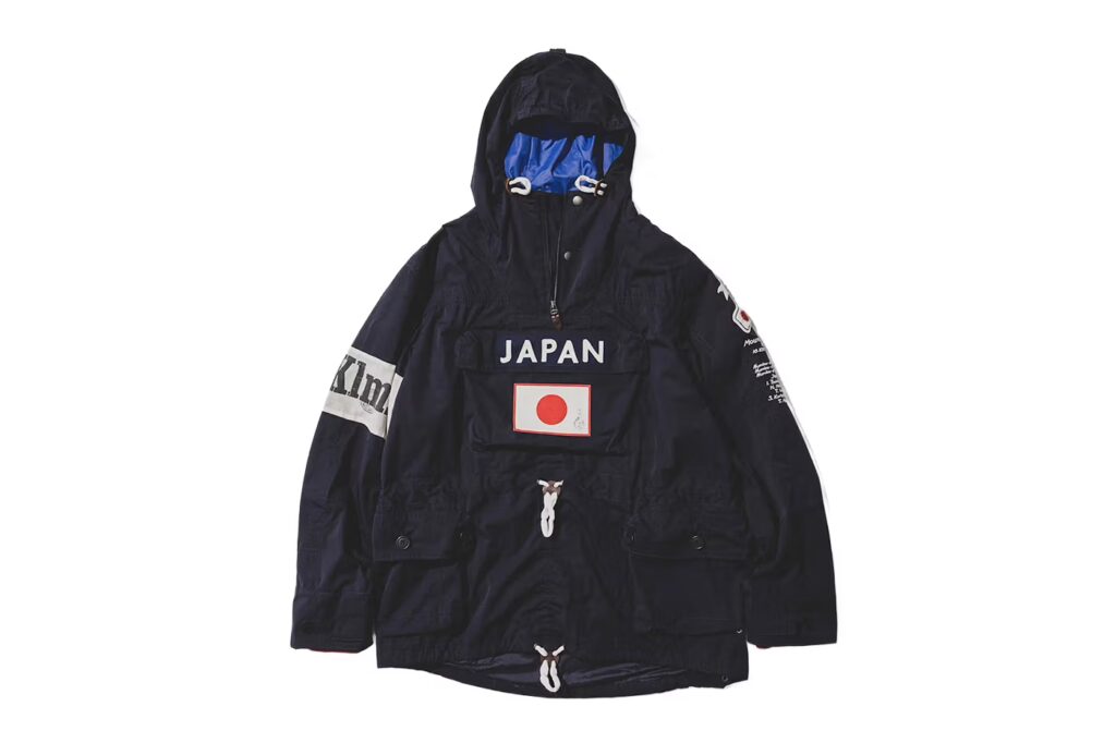
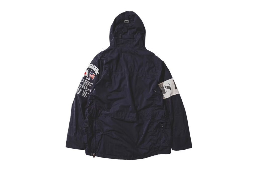
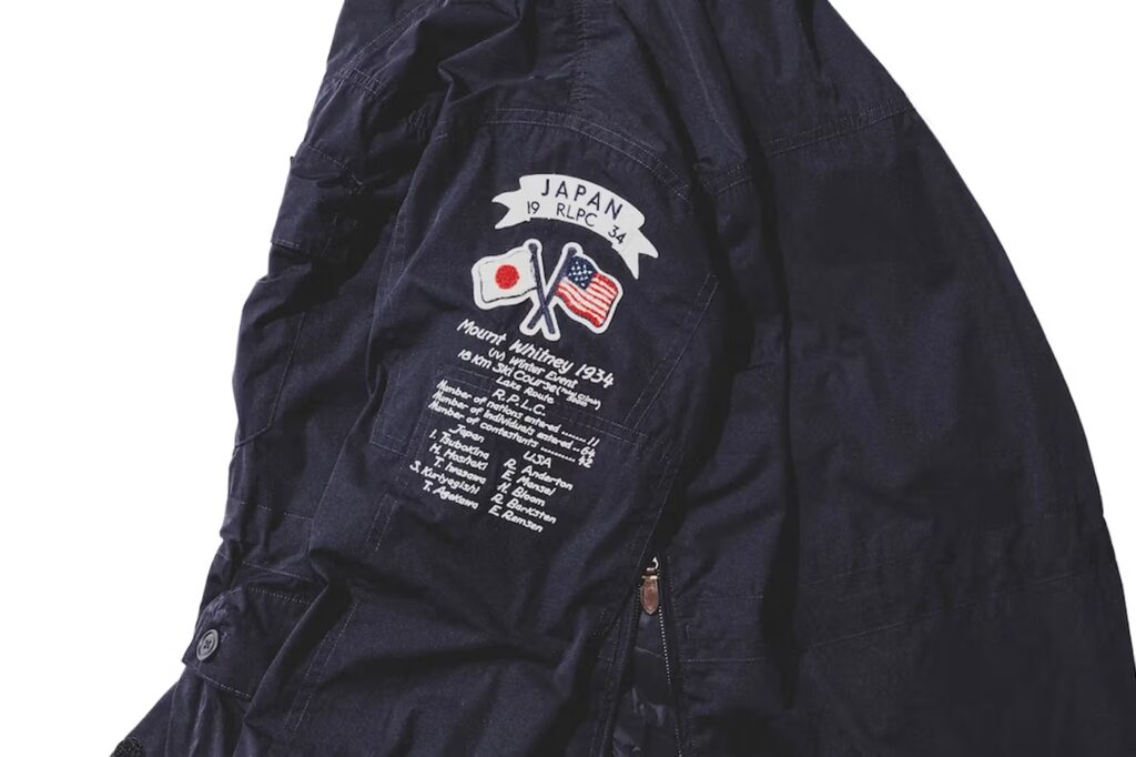
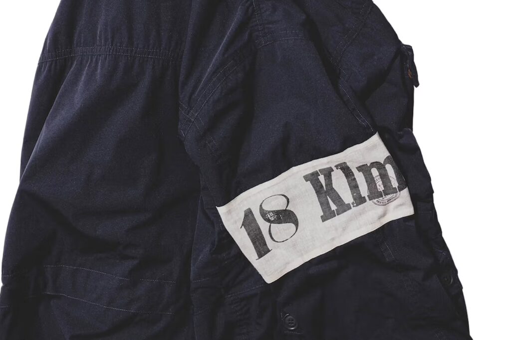
The return of the BEAMS x Polo Ralph Lauren JAPANORAK isn’t about revival it’s about recognition. Recognition of a design that quietly shaped how Tokyo learned to speak luxury through utility, and how American heritage learned to move with street rhythm.
This piece was never loud. It was precise. It existed for those who understood that real influence doesn’t beg for attention it earns it over time. That’s why it became legend in resale circles, whispered between collectors, worn like a secret handshake.
Now it comes back sharper, darker, and more intentional.
The matte black exterior feels architectural, almost monolithic. It carries weight without being heavy, authority without arrogance. Leather accents introduce warmth against the technical structure, a contrast that feels distinctly Ralph Lauren while remaining unmistakably BEAMS. Inside, the electric royal blue lining cuts through the darkness like a flash of rebellion Tokyo’s signature hidden beneath American formality.
The “JAPAN” mark across the front pocket isn’t decorative. It’s declarative.
This isn’t a borrowed aesthetic. It’s a conversation between identities.
Street meets tradition. Precision meets poetry.
The accompanying cotton chino cap follows the same philosophy. Subtle, symbolic, and intentional. The embroidery doesn’t scream collaboration it whispers allegiance. Navy and white, two colors that feel eternal, designed to live quietly in rotation rather than trend loudly for a season.
This is what Pines Studio believes in:
Pieces that age with dignity.
Design that carries cultural gravity.
Fashion that doesn’t rush to be seen, but is remembered once it is.
The JAPANORAK doesn’t represent a comeback.
It represents permanence.
A reminder that the most powerful collaborations don’t need to be reintroduced.
They simply reappear, exactly when the culture is ready to listen again.