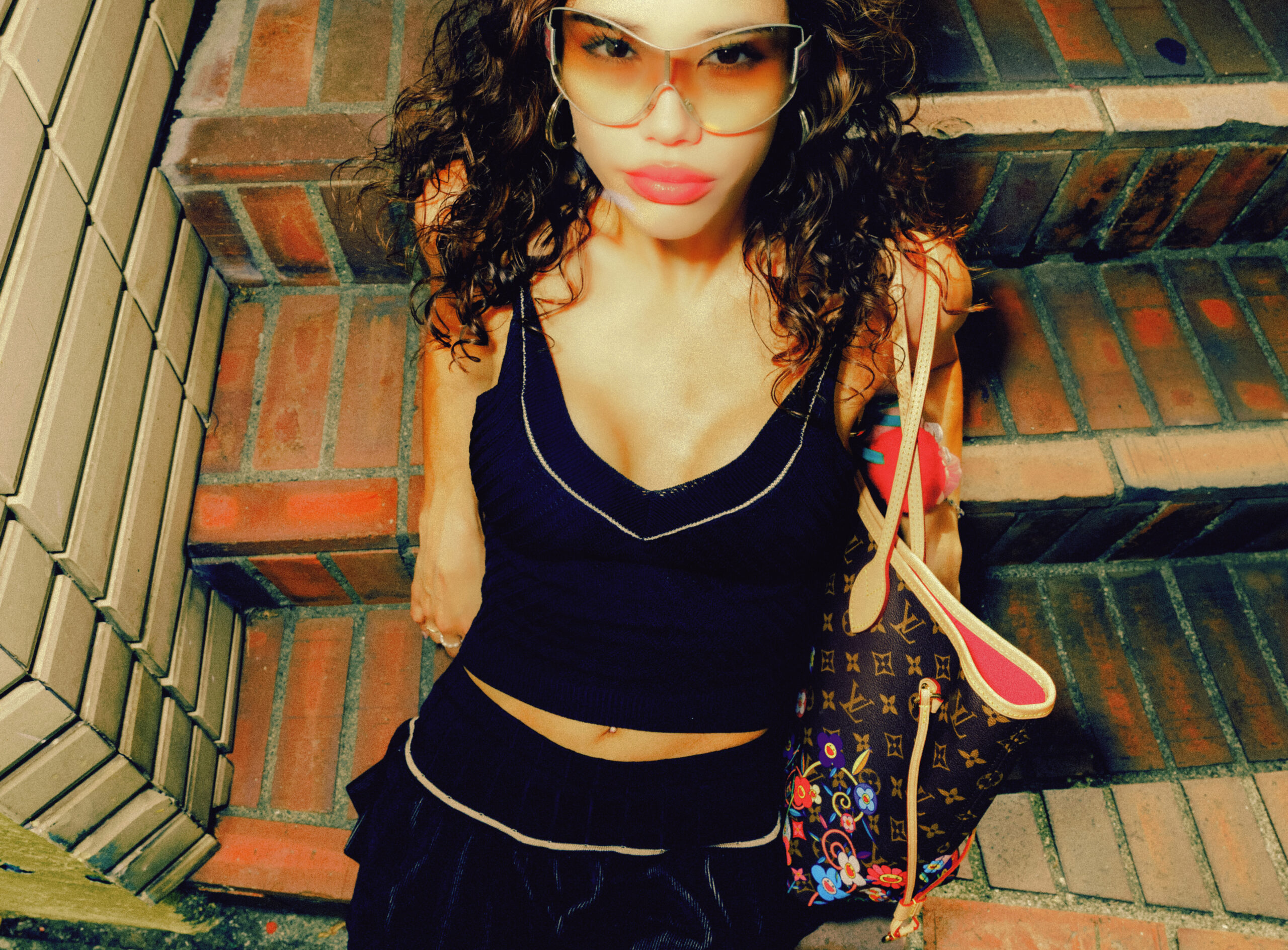
Author: studiobypines

  • Supreme

    Supreme

     Spring/Summer 2026

    There are seasons.

    And then there are statements.

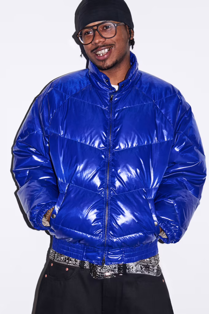
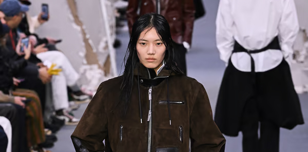
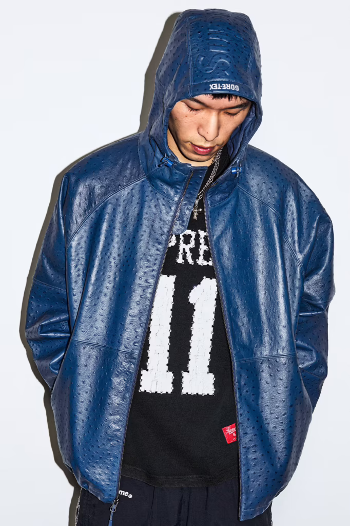
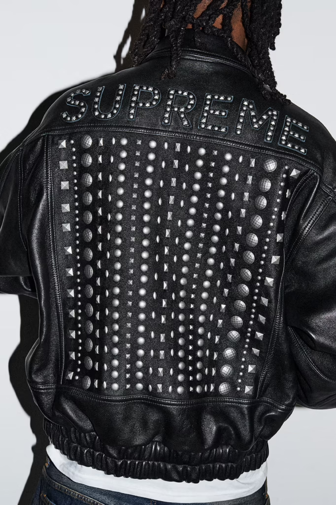
    Spring/Summer 2026 is Supreme in its most maximal form less collection, more cultural detonation. It reads like a downtown manifesto stitched in ostrich leather, printed in gunmetal ink, and blasted across a boxing ring in the middle of nowhere.

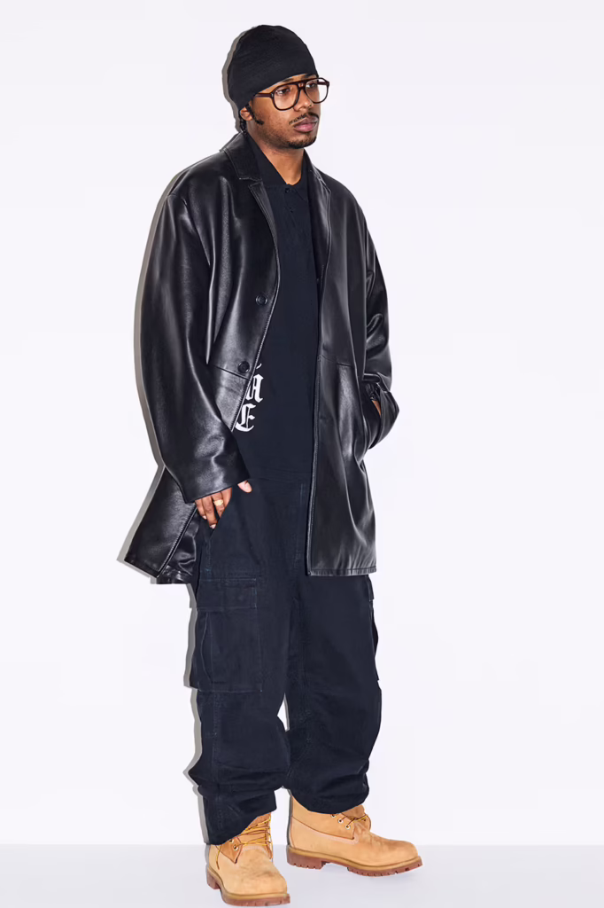
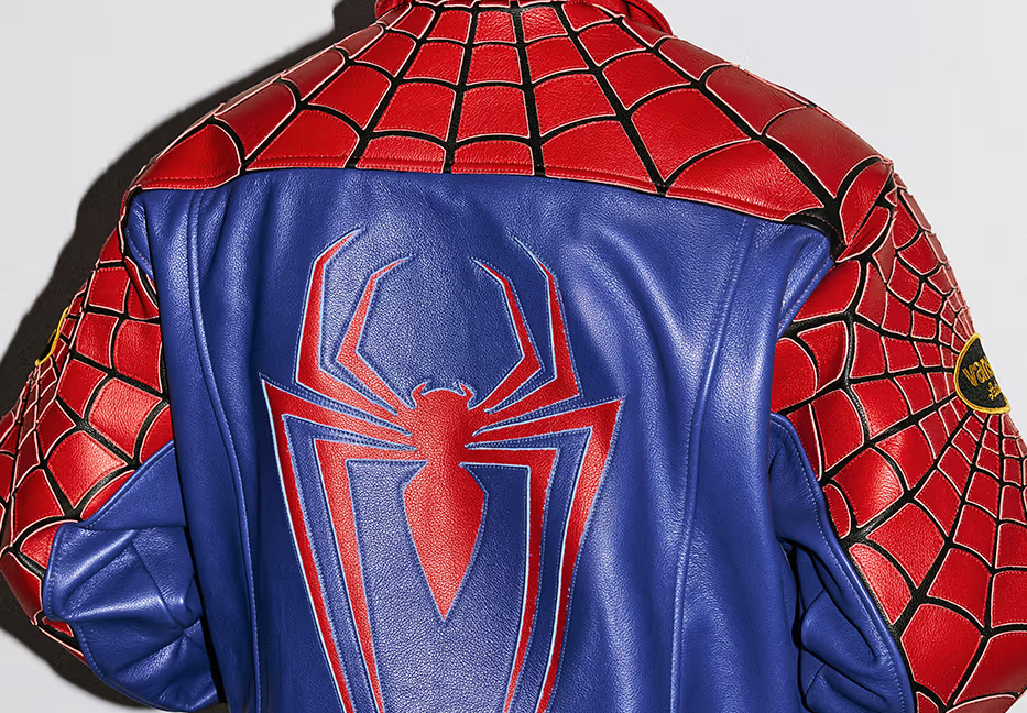
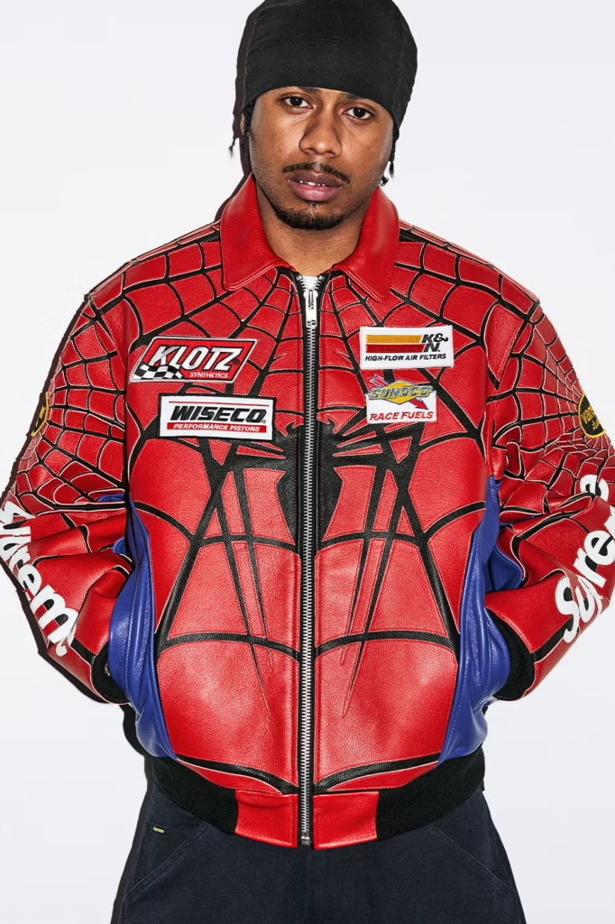
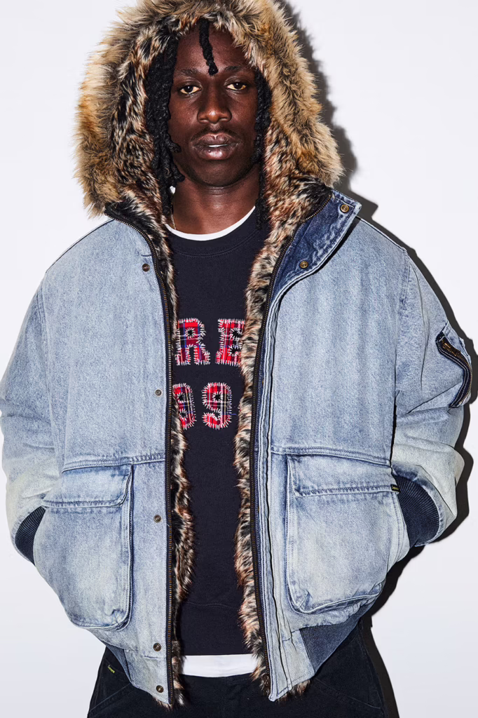
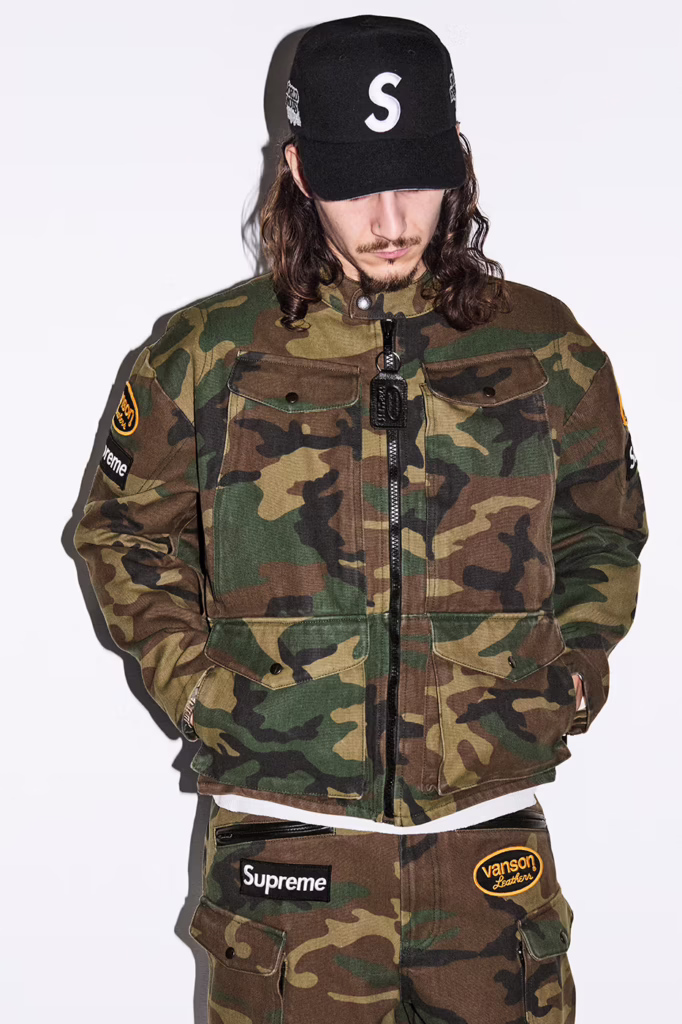
    The headline collaboration Spider Man colliding with Vanson feels inevitable. Comic book mythology wrapped in American road armor. Web graphics drip across heavyweight knits and leather outerwear like urban folklore rewritten for the pit lane. Alongside it, heritage American grit surfaces through partnerships with Schott NYC and The Great China Wall, reinforcing that Supreme still understands lineage before it disrupts it.

    But what makes SS26 resonate isn’t just collaboration it’s texture and confrontation.

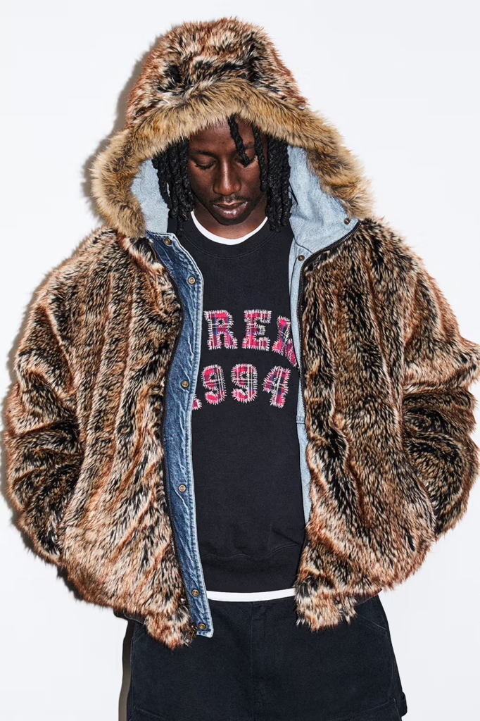
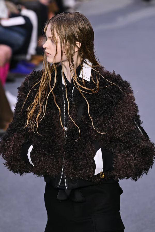
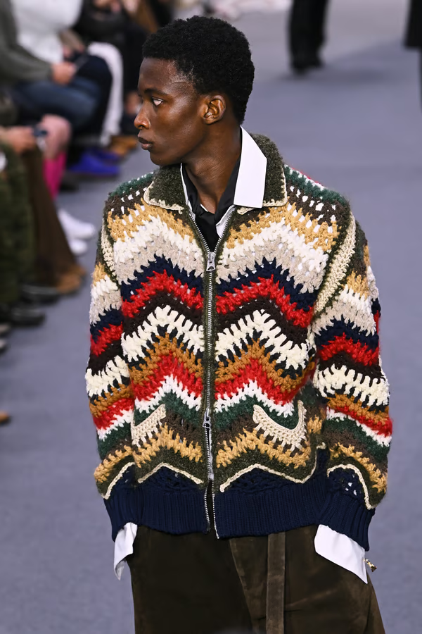
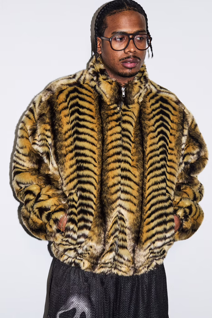
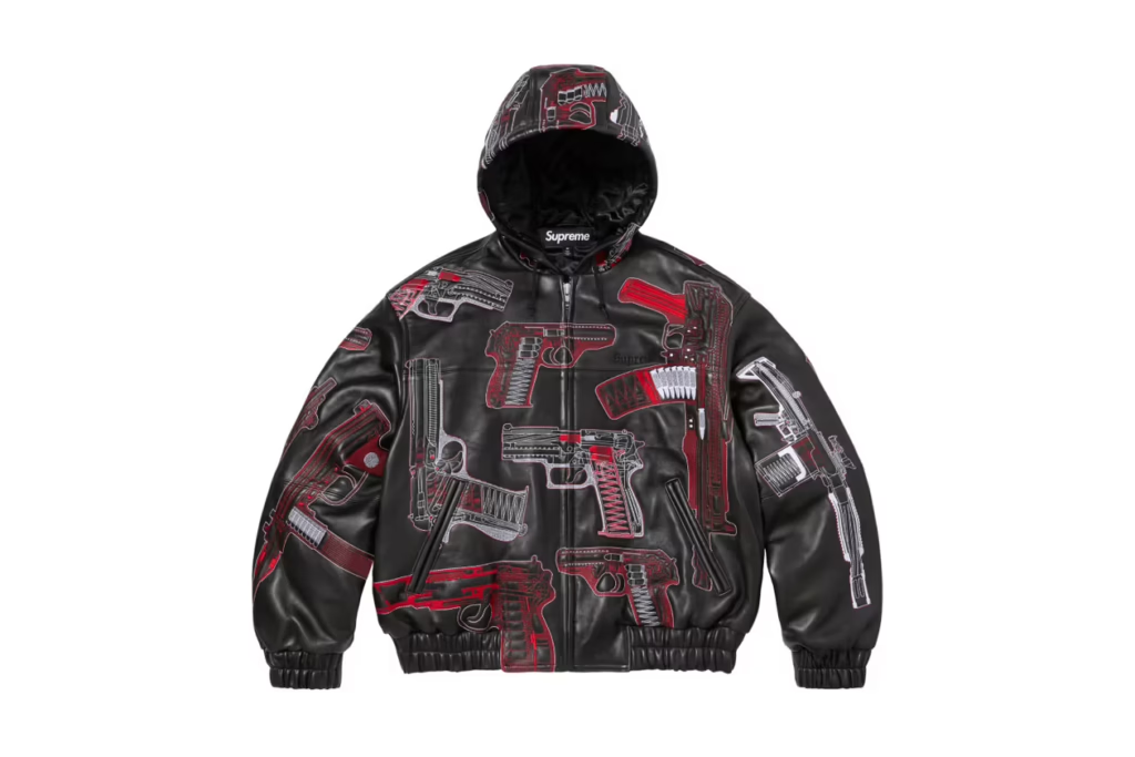
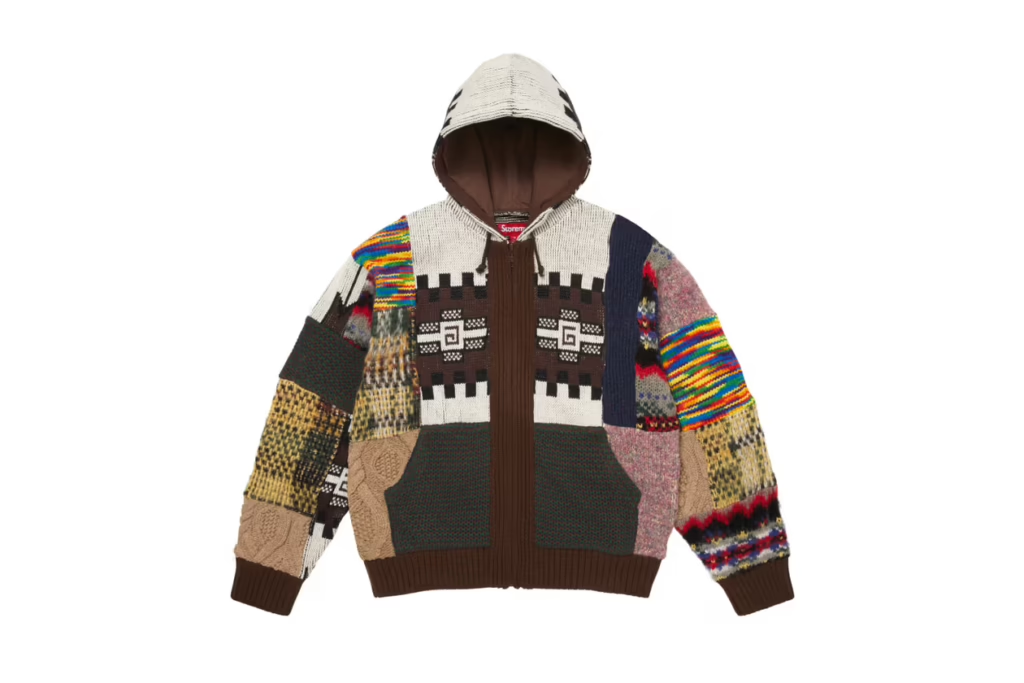
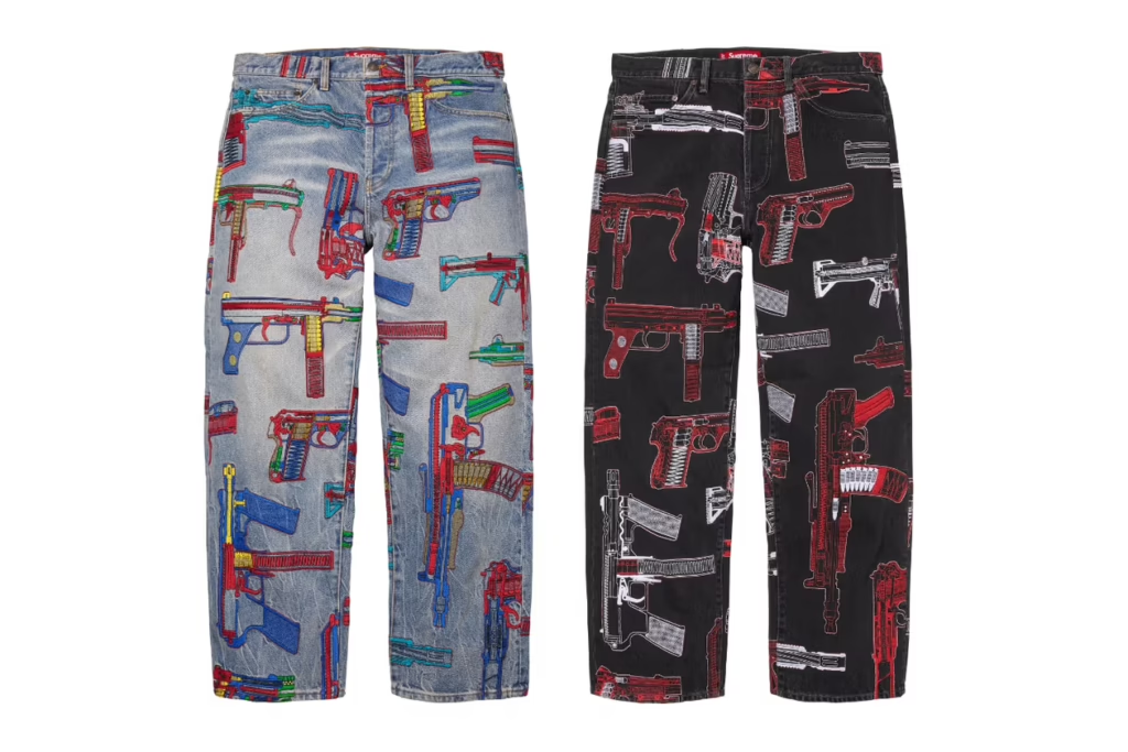
    Sea Island cotton meets camo cable knits. Mohair stripes arrive loud, unapologetic, almost theatrical. Patchwork hoodies feel intentionally chaotic. Across leather, denim, and bags, the raw gun sketches of Alfredo Martinez slash through the season like a recurring motif defiant, political, unfiltered. Art Dealer injects his own graphic tension, pushing the collection deeper into art world territory rather than simple streetwear repetition.

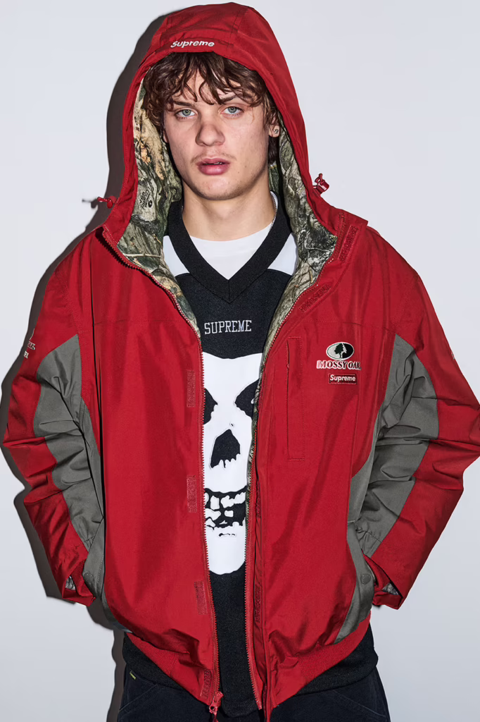
    Pop culture doesn’t cameo it dominates. Ghostface returns in graphic form. MISFITS iconography bleeds into the lineup. The Arabic Box Logo re-emerges, resurrecting the hysteria of seasons past with calculated precision. A Spider Man graphic swinging across a Supreme billboard feels less like merch and more like New York myth making.

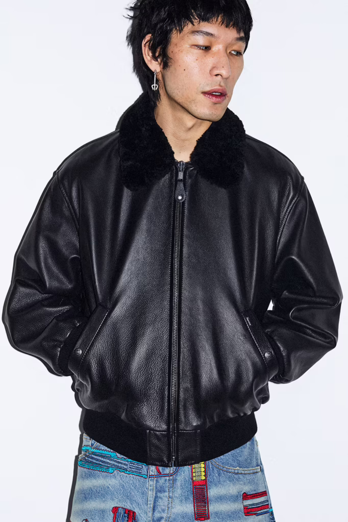
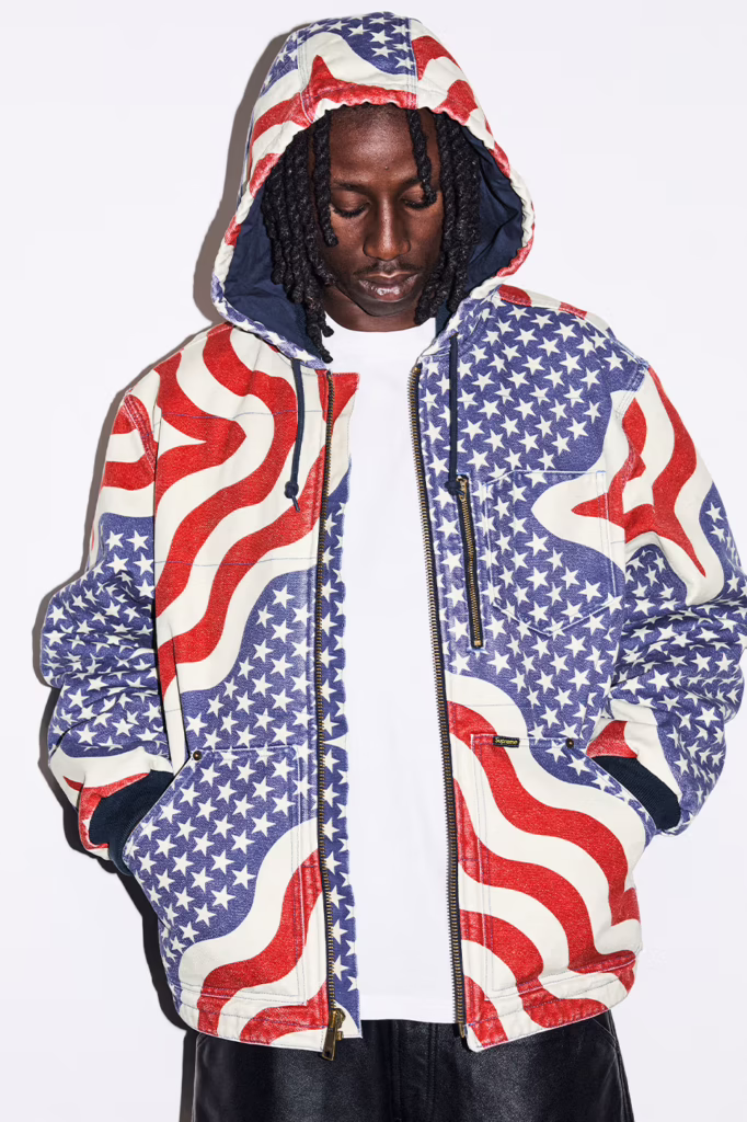
    Athletic codes surge throughout basketball mesh, hockey silhouettes, racing jerseys all drenched in branding that refuses subtlety. Denim is stamped with oversized block letter logos down the leg. Leather trousers arrive ostrich-embossed, equal parts luxury and threat. Cargo pants lean tactical. Star spangled prints oscillate between patriotic theater and dystopian satire.

    Even the softer moments feel ironic. Tapestry florals reminiscent of a grandmother’s couch land on sweats, recontextualized as high fashion street armor. Varsity typography clashes against Monster Jam adrenaline graphics. It’s nostalgia weaponized.

    And then, as always, Supreme shifts from clothing into spectacle.

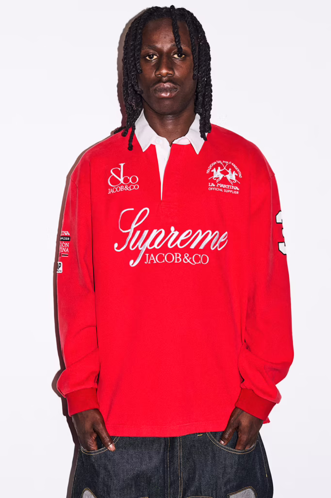
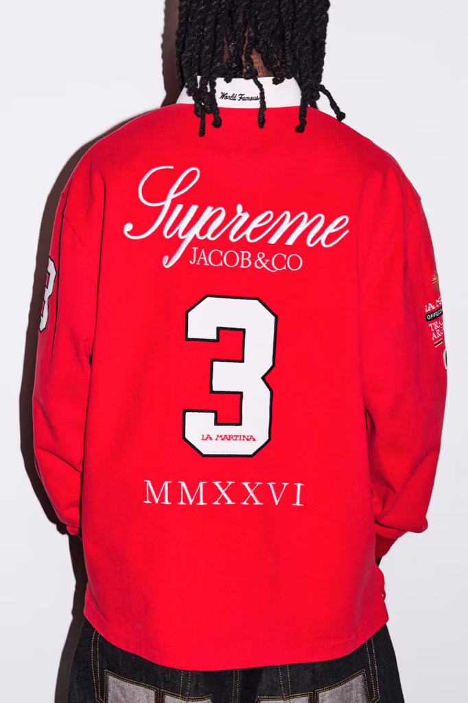
    A fully branded boxing ring. A leopard lined coffin. A custom Fender bass. Gold bars and iced out Ghostface pendants courtesy of Jacob & Co.. Retro camcorders. Podcast microphones. A Fort Knox toolbox. Objects that blur the line between retail, performance art, and provocation.

    This was never built for utility.

    It was built to dominate.

    The skate decks aren’t accessories they’re statements. Arabic insignias scorched into maple. Martinez’s gun sketches bleeding from leather to lacquer like raw evidence sealed in gloss. Meant to slam against pavement or hang inside a white cube gallery. Either way, they leave a mark.

    Supreme SS26 doesn’t ride trends it runs straight through them. Biker steel collides with comic book mythology. Punk iconography refuses to fade. Downtown art grit gets amplified to stadium scale. It’s aggressive, deliberate, and unapologetically excessive

    by Pines Studios

  • FRAME SERIES NO.01 MONICA SAHARA

    FRAME SERIES NO.01 MONICA SAHARA

    Styled in AMISS and House of Errors

    Photographed by Pines Studio

    Tokyo doesn’t wait. The clothes have to move first.

    Monica Sahara cuts through the city in silhouettes that feel engineered for speed AMISS pressed close to the body, sheer ribbed layers tracing the figure like a second outline. Then House of Errors pushes outward: cropped structure, expanded sleeves, fashion that occupies air as much as space. One look reads intimate. The other reads architectural. Together they create friction, and friction is where style lives.

    Hard flash turns steel shutters and highway pillars into a live set. Nothing romantic. Nothing softened. Fabric against concrete, skin against light, silhouette against traffic. The city becomes a testing ground for proportion and posture. Every frame is a collision between polish and pressure.

    This isn’t fashion staged for distance.

    It’s fashion caught mid impact.

  • WAGYUMAFIA Walked the Line Between Luxury and Street

    WAGYUMAFIA Walked the Line Between Luxury and Street

    A few days after its release, the atmos × PUMA × WAGYUMAFIA sneaker already feels less like a product and more like a timestamp. Not just a drop, but a marker of where Japanese culture is moving fluid, hybrid, refusing categories.

    WAGYUMAFIA has never framed itself as only food. From the beginning, it functioned as a cultural export project disguised as dining. Wagyu became the language, but the message was always broader: Japanese craftsmanship deserves global presence in every form it touches. The sneaker simply extends that philosophy into another medium.

    What makes the pair resonate now that it’s out in the world is the tension it carries. Formal leather discipline wrapped around the relaxed body of a sneaker. It walks like streetwear but stands with the posture of something ceremonial. That duality mirrors WAGYUMAFIA’s culinary identity high end product translated into everyday ritual. Luxury without distance. Craft without stiffness.

    Seeing the shoe circulate in real time confirms something bigger. The future of culture isn’t split between elite and casual anymore. The most interesting work lives in the crossing point. Japan has long mastered that balance: elevating the ordinary without stripping it of warmth, refining objects without removing their soul.

    The release didn’t just celebrate a sneaker. It celebrated a mindset that craftsmanship can move, breathe, and exist in daily life. A reminder that the strongest cultural statements aren’t always loud. Sometimes they’re worn quietly, step by step, across city streets.

    Photo credit Atmos

    Words by Pine Studios

  • Bad Bunny Takes the Grammy Stage

    Bad Bunny Takes the Grammy Stage

    When Bad Bunny won the Grammy, it felt less like a spotlight and more like sunrise over a place that had been working all night. The shine came after the sweat. Songs built from crowded rooms, long drives, voices layered like paint that never fully dries. Then the Warhol gloss repetition, icon, gold turned into surface trying to pin him still. But he won’t stay still. Inside the frame there’s movement, a pulse that belongs to streets, kitchens, radios left on too late. The trophy is only evidence. Proof that something grown from heat and pressure can step into marble halls and still sound like home

    by PINES STUDIOS

    photos by GETTY IMAGES/ The Recording Academy

  • A Beatles Film Is Coming

    A Beatles Film Is Coming

    Sony’s four film The Beatles project reads less like a biopic and more like a cultural palimpsest history written, erased, and written over again. Four films, four lives, each orbiting the same flash of electricity that changed sound, youth, and longing forever. Under Sam Mendes’ direction, the band fractures into parallel myths: Harris Dickinson’s Lennon as sharp static, Paul Mescal’s McCartney as melodic gravity, Joseph Quinn’s Harrison drifting inward, Barry Keoghan’s Starr keeping time while the world spins. It’s Warhol repetition meeting Basquiat scrawl—fame as surface, humanity bleeding through the cracks. Captured through the lens of John Russo, the imagery feels immediate and unresolved, treating the band not as monuments, but as moments alive, unstable, and still echoing forward into April 2028.

    by PINES STUDIOS

  • Ralph Lauren x BEAMS: Not a Comeback, a Constant

    Ralph Lauren x BEAMS: Not a Comeback, a Constant

    Some collaborations don’t live in seasons. They live in culture.

    The return of the BEAMS x Polo Ralph Lauren JAPANORAK isn’t about revival it’s about recognition. Recognition of a design that quietly shaped how Tokyo learned to speak luxury through utility, and how American heritage learned to move with street rhythm.

    This piece was never loud. It was precise. It existed for those who understood that real influence doesn’t beg for attention it earns it over time. That’s why it became legend in resale circles, whispered between collectors, worn like a secret handshake.

    Now it comes back sharper, darker, and more intentional.

    The matte black exterior feels architectural, almost monolithic. It carries weight without being heavy, authority without arrogance. Leather accents introduce warmth against the technical structure, a contrast that feels distinctly Ralph Lauren while remaining unmistakably BEAMS. Inside, the electric royal blue lining cuts through the darkness like a flash of rebellion Tokyo’s signature hidden beneath American formality.

    The “JAPAN” mark across the front pocket isn’t decorative. It’s declarative.

    This isn’t a borrowed aesthetic. It’s a conversation between identities.

    Street meets tradition. Precision meets poetry.

    The accompanying cotton chino cap follows the same philosophy. Subtle, symbolic, and intentional. The embroidery doesn’t scream collaboration it whispers allegiance. Navy and white, two colors that feel eternal, designed to live quietly in rotation rather than trend loudly for a season.

    This is what Pines Studio believes in:

    Pieces that age with dignity.

    Design that carries cultural gravity.

    Fashion that doesn’t rush to be seen, but is remembered once it is.

    The JAPANORAK doesn’t represent a comeback.

    It represents permanence.

    A reminder that the most powerful collaborations don’t need to be reintroduced.

    They simply reappear, exactly when the culture is ready to listen again.

  • Sacai FW26 Is a Manifesto in Motion: Chitose Abe Breaks the Rules to Build Something New

    Sacai FW26 Is a Manifesto in Motion: Chitose Abe Breaks the Rules to Build Something New

    Chitose Abe isn’t playing nice anymore. And that’s exactly the point.

    For Sacai’s Fall/Winter 2026 show, Abe traded her signature sense of playful hybridization for something sharper, more confrontational. This season wasn’t about remixing expectations it was about breaking them. Literally. The walls of Le Carreau du Temple were marked with dramatic punch dents, as if the space itself had been challenged to withstand her ideas. Fashion as impact. Fashion as force.

    Inspired by Muhammad Ali, Abe framed the collection as an act of liberation. Not just from aesthetic rules, but from mental constraints. “Breaking through the wall” became both metaphor and mission. It was a reminder that creativity isn’t born from comfort it’s born from resistance.

    The atmosphere set the tone. A soundtrack shifting from Queen’s  Want to Break Free  into a high energy Charli XCX remix transformed the show into a manifesto. This wasn’t nostalgia or rebellion for rebellion’s sake. It was clarity. A declaration that Sacai is evolving beyond hybridity as novelty, into hybridity as philosophy.

    Where past collections fused garments through visible layering, FW26 was about deception and precision. Construction became sleight of hand. Skirt-pant hybrids appeared effortless but were engineered from wide-leg trousers. Jackets were sliced horizontally, reattached through internal linings to create silhouettes that looked singular but were structurally complex. Nothing was what it first appeared to be.

    Even tailoring loosened its grip. The classic shirt and tie were stripped of formality, replaced by scarf like ties wrapped gently around the collar, freeing the neck from rigidity. Power dressing without the armor. Authority without constraint.

    The collaborations deepened this narrative. Sacai’s ongoing partnership with Levi’s evolved into a new language of denim rebellion: Type I and Type II jackets fused with leather biker elements and bomber structures, while flared jeans merged seamlessly into tailored trousers. Workwear met elegance through destruction and reinvention.

    A third collaboration with A.P.C. introduced a textile inspired by Jessica Ogden’s patchwork quilts fabric that carried memory, craft, and human imperfection. It was folded into Sacai’s silhouettes like a quiet reminder that freedom is built from fragments of history.

    Footwear anchored the collection with J.M. Weston Golf Derbies shifting into a deep bordeaux tone, grounding the chaos with richness and control. Destruction, but refined.

    What made this show truly resonate was intimacy. Much like the legendary early 2000s Paris shows, the smaller space pulled the audience closer to the garments. You didn’t just see the clothes you confronted them. Every seam, splice, and illusion was impossible to ignore.

    This wasn’t fashion asking for attention. It was fashion demanding reflection.

    Sacai FW26 isn’t about disruption for spectacle. It’s about the beauty that exists inside rupture. The elegance of letting go. The courage to dismantle what you’ve mastered to build something more honest.

    Chitose Abe didn’t just design a collection.

    She staged a breakthrough.

    by PINES STUDIOS

  • Ralph Lauren Returns to Milan With a Vision Rooted in Legacy, Freedom, and the Spirit of the ’90s

    Ralph Lauren Returns to Milan With a Vision Rooted in Legacy, Freedom, and the Spirit of the ’90s

    There are designers who follow trends, and then there are designers who define a way of living. Ralph Lauren has always belonged to the latter. For Fall 2026, he returned to Milan with a statement that felt less like a fashion show and more like a reaffirmation of identity. Hosted at Palazzo Ralph Lauren, the collection marked his first menswear presentation in over a decade, and it carried the weight of history with the clarity of someone who has never stopped evolving.

    Fall 2026 unfolded as a dialogue between nostalgia and permanence. The silhouettes echoed the era when Polo and Purple Label were born, drawing deeply from the ’90s while grounding themselves in what Lauren calls “timeless tradition.” Ivy League tailoring, vintage Americana, and Indigenous craftsmanship coexisted effortlessly, forming a collection that celebrated multiplicity rather than uniformity.

    Ralph Lauren once said he started with a tie, but that it was never really about a tie. It was about a way of living. That philosophy ran through every look. This wasn’t a runway built on spectacle; it was a narrative of character, culture, and personal history. From Purple Label’s refined elegance to Polo’s reimagined preppy spirit, each piece reflected the worlds he has lived in and the ideals he still believes in.

    What made this collection powerful was its emotional range. Prep met dandy codes. Traditional sportswear crossed paths with vintage Americana. Indigenous artistry added soul and authenticity. Rather than isolating these influences, Lauren wove them together, presenting masculinity not as a fixed concept but as something layered, expressive, and deeply individual.

    The show closed with Tyson Beckford, an icon synonymous with Ralph Lauren’s golden era. His walk wasn’t just a nostalgic callback; it was a reminder of the cultural impact Ralph Lauren has had across generations. It symbolized continuity, proving that the energy of the ’90s still lives, not as a memory, but as a foundation.

    There is a quiet confidence in a designer who doesn’t need to chase relevance. Ralph Lauren doesn’t reinvent himself; he refines his truth. Fall 2026 stood as proof that authentic style is built over decades, not seasons. It grows through experience, conviction, and a deep understanding of how men live, move, and express who they are.

    At Studio by Pines, we see this collection as a masterclass in restraint and power. It reminds us that fashion is strongest when it tells a story that feels lived in. Ralph Lauren didn’t just present clothing in Milan. He presented a legacy that continues to breathe, adapt, and inspire.

    by PINES STUDIO

  • DROPHAUS: Pharrell’s Blueprint for the Future of Luxury Living

    DROPHAUS: Pharrell’s Blueprint for the Future of Luxury Living

    DROPHAUS: Pharrell’s Blueprint for the Future of Luxury Living

    Pharrell Williams does not simply create collections. He constructs realities. For Louis Vuitton Fall Winter 2026, he expanded fashion beyond clothing and transformed it into a fully lived environment.

    Inside the Fondation Louis Vuitton in Paris, Pharrell revealed DROPHAUS, a modern glass walled structure designed in collaboration with Japanese architecture and design studio NOT A HOTEL. The space was not a stage or a backdrop. It was a manifesto. A physical expression of how fashion, architecture, and humanity merge when function becomes the foundation of beauty.

    Surrounded by greenery and soft plant lined pathways, the home felt like a sanctuary placed inside a cultural institution. Models moved around its transparent walls, through the garden atmosphere, and eventually inside the structure itself. The runway became fluid. The destination was the home. Fashion was no longer something displayed. It was something lived within.

    Louis Vuitton described the house as a vision of timelessness through architecture, rooted in purpose, craftsmanship, and human need. Pharrell took that statement and gave it emotion. The glass walls symbolized openness and honesty. The greenery softened the precision of modern design. The structure balanced innovation with warmth, future thinking with grounding.

    Inside DROPHAUS lived another layer of storytelling through a site specific furniture collection titled HOMEWORK. These pieces were not decorative accents. They were central to the narrative. Pharrell introduced the idea of ten percent imperfection, where slight irregularities, tactile surfaces, and visible craftsmanship remind us that true design carries the trace of human hands.

    This was not about flaws.

    It was about soul.

    Each object suggested that space should feel alive, evolving, and personal. Instead of a pristine showroom environment, DROPHAUS felt emotionally worn in, like a place that could hold memory, movement, and time. Architecture became intimate rather than imposing.

    By placing the collection inside a home instead of on a traditional runway, Pharrell shifted the relationship between fashion and space. The clothes were not meant to dominate the environment. They were meant to belong to it. The silhouettes moved through glass, greenery, and furniture with a natural ease, reinforcing the idea that luxury should integrate into everyday life rather than exist above it.

    This approach defines Pharrell’s creative direction at Louis Vuitton. Luxury must feel human before it feels expensive. It must be functional before it is ornamental. It must serve life before it becomes spectacle.

    DROPHAUS became a metaphor for a new era.

    A future where fashion is lived in.

    Where design embraces imperfection.

    Where beauty grows from purpose.

    For Pines Studios, this moment stands as a cultural shift. Pharrell did not present a show. He presented a blueprint. A world where architecture, fashion, sound, and emotion exist in one continuous language.

    In an industry driven by excess and volume, DROPHAUS spoke quietly but with authority.

    by PINES STUDIOS

  • BADSEKI: Built From the Inside of the Culture

    BADSEKI: Built From the Inside of the Culture

    There are brands that borrow from car culture.

    And then there are brands that are born inside it.

    BADSEKI is the latter.

    Founded by professional drift racer Sara Choi, BADSEKI isn’t a fashion interpretation of motorsports it’s a translation of lived experience. Of grease stained garages, midnight tuning sessions, tire smoke, repetition, discipline, and obsession. It is clothing shaped by motion and purpose, not trend cycles.

    Unveiled in Tokyo during Auto Salon 2026, BADSEKI made its first physical appearance through an intimate pop-up in Shibuya. Surrounded by Porsche builds curated by Rocket Bunny Racing’s Kei Miura and Japan’s legendary SUNRISE BLVD, the space blurred the line between streetwear and speed. Cars weren’t backdrops. They were part of the story.

    This wasn’t a launch designed for spectacle.

    It was a statement of belonging.


    Fashion Shaped by Function

    Sara Choi approaches design the same way she approaches drifting: with precision, intention, and respect for the craft. BADSEKI garments are born from movement and repetition the realities of motorsport environments where durability matters as much as expression.

    Instead of pulling references from “car aesthetics,” BADSEKI pulls from the physical rhythm of the culture:

    • The way mechanics move
    • The tools they touch daily
    • The environments that wear into clothing over time

    The brand’s pre-collection centers on elevated essentials crafted from high grain cotton, offered in deep black and burnished mahogany tones. At its core is the 10mm hex nut a universal symbol in any garage. Small, overlooked, but essential. BADSEKI transforms it into a recurring emblem that bridges utility and identity.

    T-shirts, sweaters, pants, and caps feel understated but intentional. These are garments designed to live in real spaces: tracks, workshops, city streets, and late night drives.


    Beyond the Garment: A Living Archive

    What separates BADSEKI from typical streetwear is its commitment to people before product.

    For its launch campaign and accompanying docuseries, the brand spent two years documenting figures who helped shape drift culture from the inside. Not influencers. Not surface level icons. But builders, racers, and visionaries who preserved the soul of the movement.

    Featured collaborators include:

    • Kei Miura (Rocket Bunny Racing)
    • Naoki Nakamura (Five-time D1 champion)
    • Kota Takahashi
    • Ryota Hirakawa
    • Jean Christophe Pepino
    • Yusef Wallance
    • Yasu Shimomukai
    • Hyuma Kato
    • Satoshi Awaji
    • Hiro Sato

    Shot across Tokyo, Kanagawa, Kyoto, Osaka, and beyond, the series functions as a cultural archive. It documents devotion. Precision. Lifelong passion. It shows motorsport not as fashion imagery, but as a way of life sustained by individuals who rarely receive mainstream recognition.

    As Sara Choi puts it:

    “BADSEKI is about people before product. History before hype. And culture understood beyond the surface.”

    That philosophy lives in every frame.


    Tokyo Auto Salon: A Cultural Intersection

    The BADSEKI pop-up during Auto Salon wasn’t about merchandise alone. It was about context. Visitors walked through a space where streetwear met machinery. Where clothing shared oxygen with tuned Porsches. Where fashion and motorsports existed without hierarchy.

    Exclusive pieces were available only at the event, reinforcing BADSEKI’s commitment to physical community moments not just digital drops.


    What’s Next

    The pre collection launches globally for pre-order on February 12, 2026, ranging from $50–$110 USD.

    But the vision stretches further.

    The full BADSEKI collection arrives in April 2026, promising a more experimental, high fashion approach. Expect bolder silhouettes, more technical design language, and deeper exploration into the space between performance and expression.

    Future pop-ups, collaborations, and community driven events are already in motion.

    by PINES STUDIOS